

post-patient
visualizing the invisible impact of cancer
_____________
With CT scans and other imaging tools, we can literally see physical health problems. But cancer also leaves an impact we can’t see. This exhibition encourages understanding of the pervasive mental health toll as well.
Graphic design is a powerful tool for visualizing ideas, and in the case of engendering post-patient empathy, ideas are exactly what need to be exposed. The exhibition below showcases a three-part experiment in using graphic design to visualize thoughts and open conversations.
When sharing news of my own diagnosis, inevitably I was met with stories of an aunt, friend, coworker, or parent affected by the cancer. The willingness to share was ultimately an attempt to connect. People need to share their stories. We connect through conversation. This key observation led me to wonder: How can graphic design not just talk, but also listen?
_____________
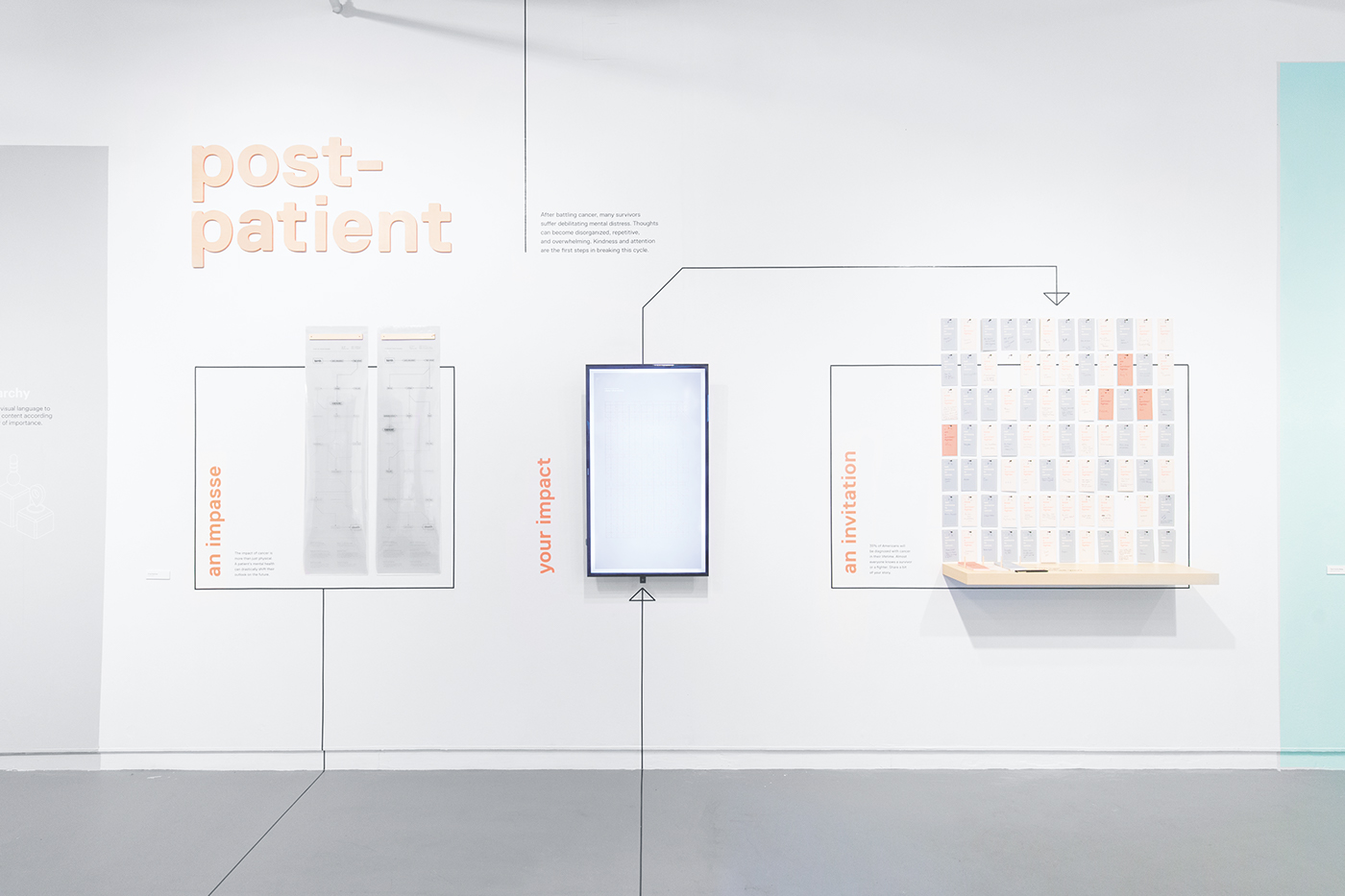
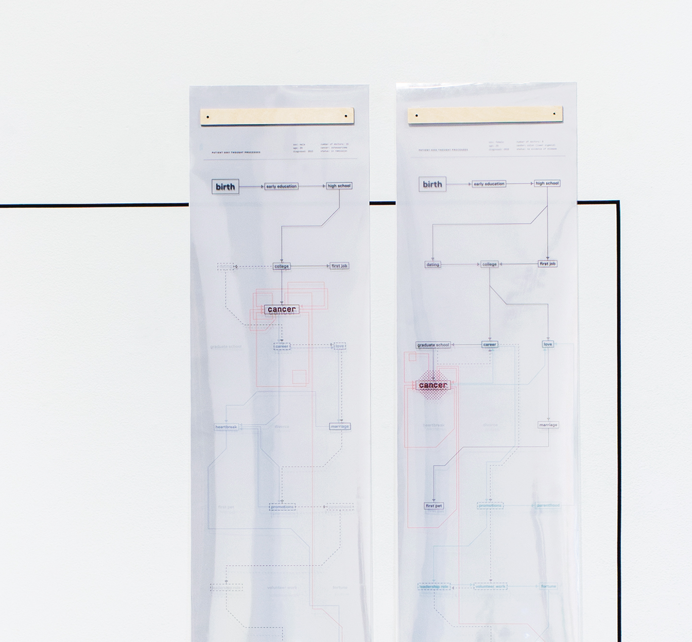
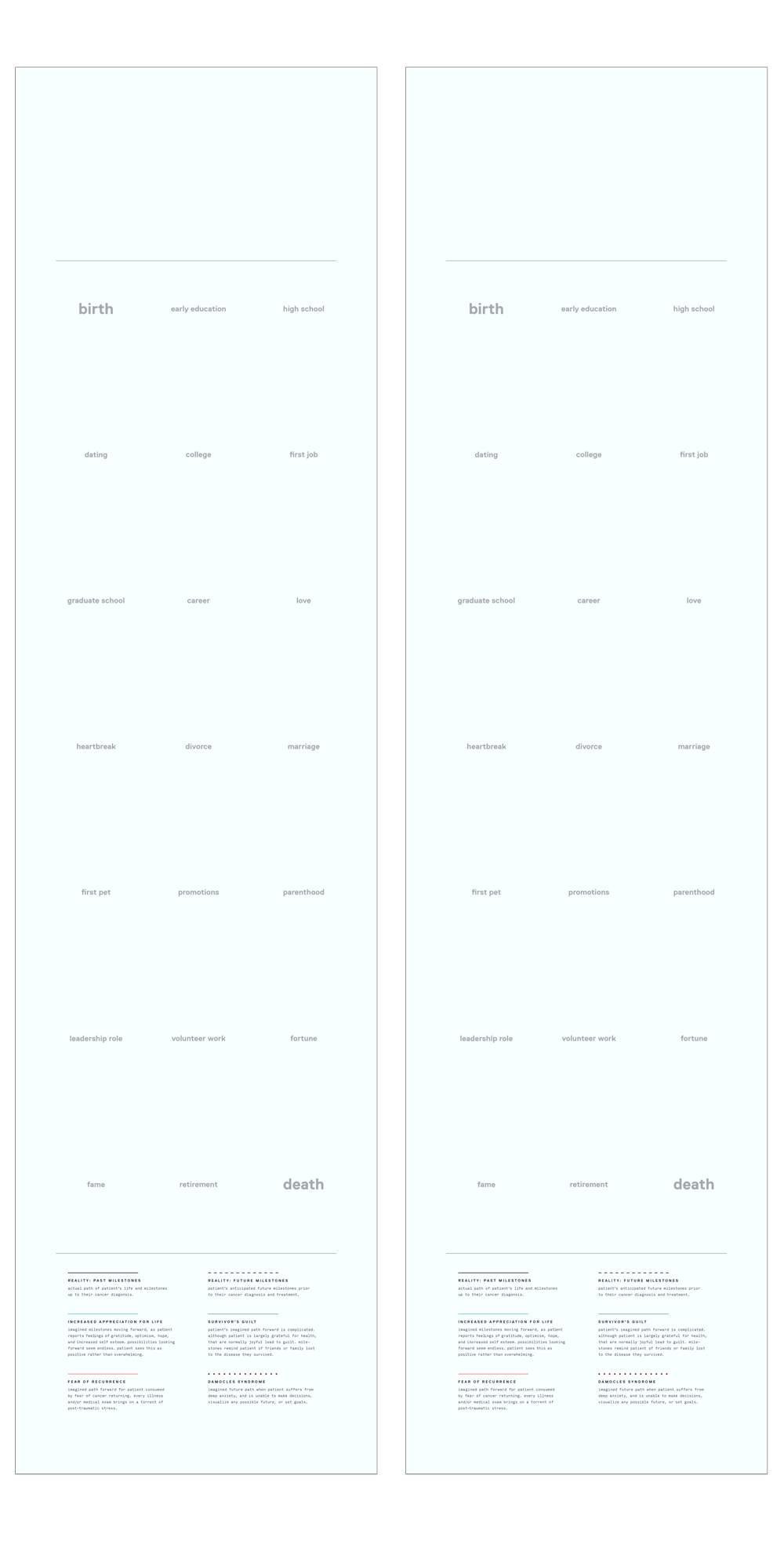
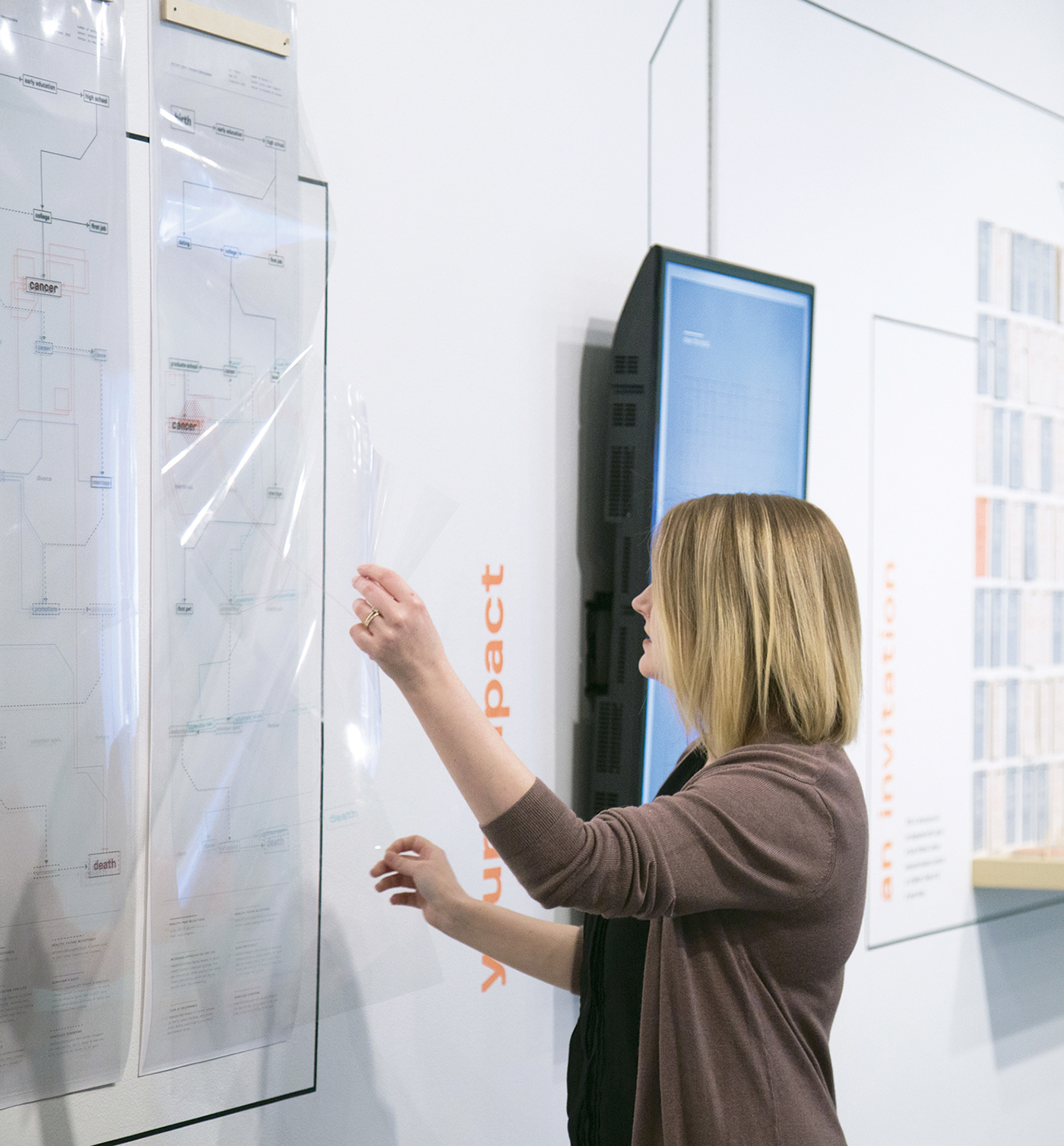
section one: an impasse
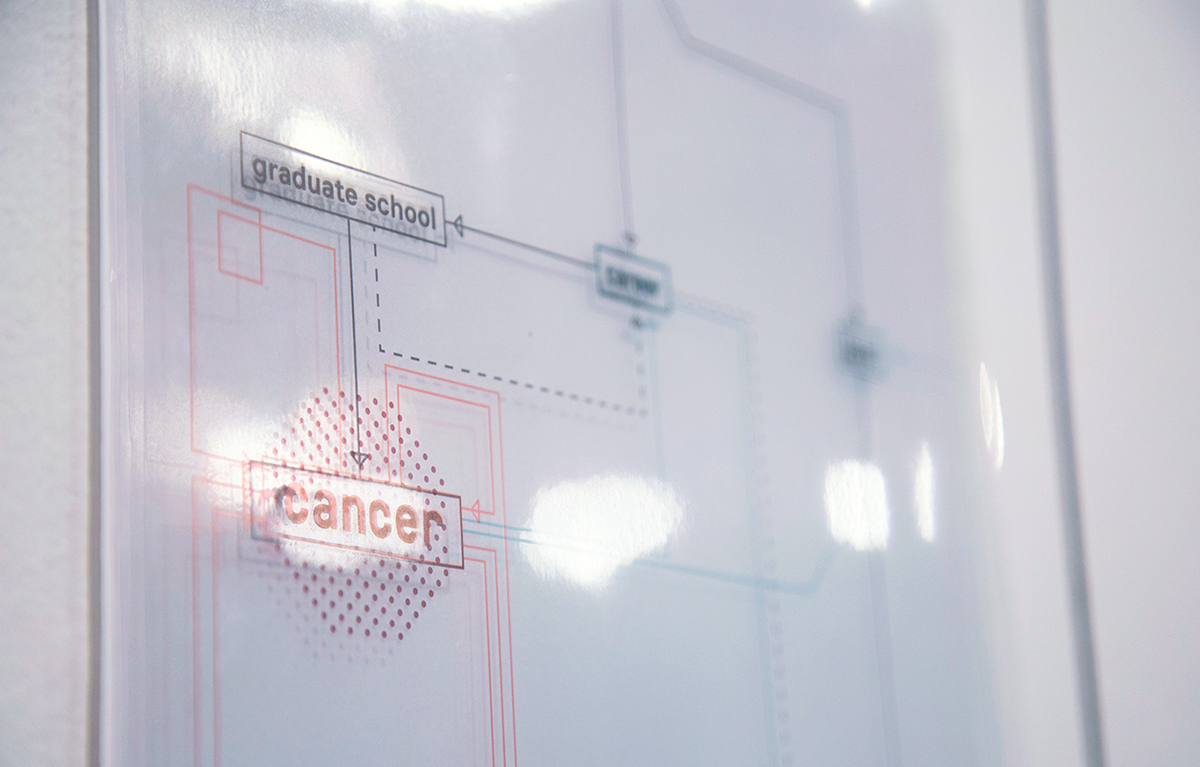
After cancer treatment, one may feel as if anything is possible. But for some survivors, that’s not always a good thing. There are three common mental health diagnoses for cancer patients: fear of recurrence, survivor’s guilt, and Damocle’s syndrome. In order to visualize how a mind can wander under these distinct diagnoses, a system of transparent timelines were created. Patient milestones based on real survivor feedback are overlaid with imagined future paths. These are not their potential futures; rather, they are the wandering thoughts a patient may experience under different mental states.


_____________
section two: your impact
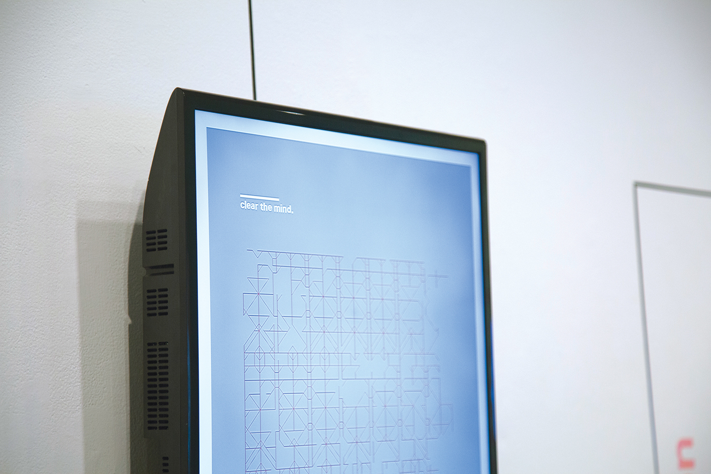
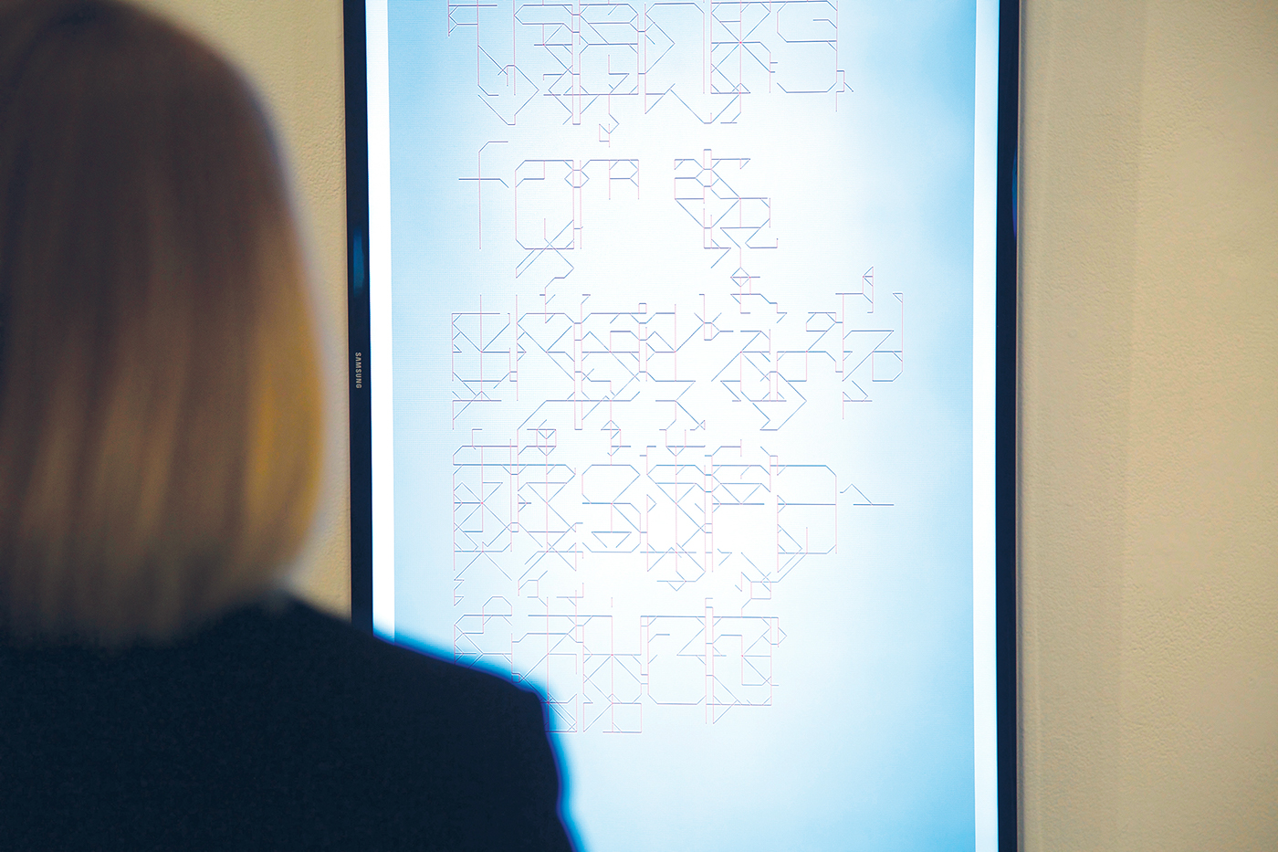
Next is an interactive digital poster. As in the timelines, lines forming this grid represent thoughts; in this case an overwhelming tangled grid of thoughts. But the messy lines shrink away as a viewer approaches, leaving only one clear, positive, thought. These final messages change regularly, and the direction of the growing lines evolves every time it animates. Hence, a viewer’s physical presence affects the visuals.
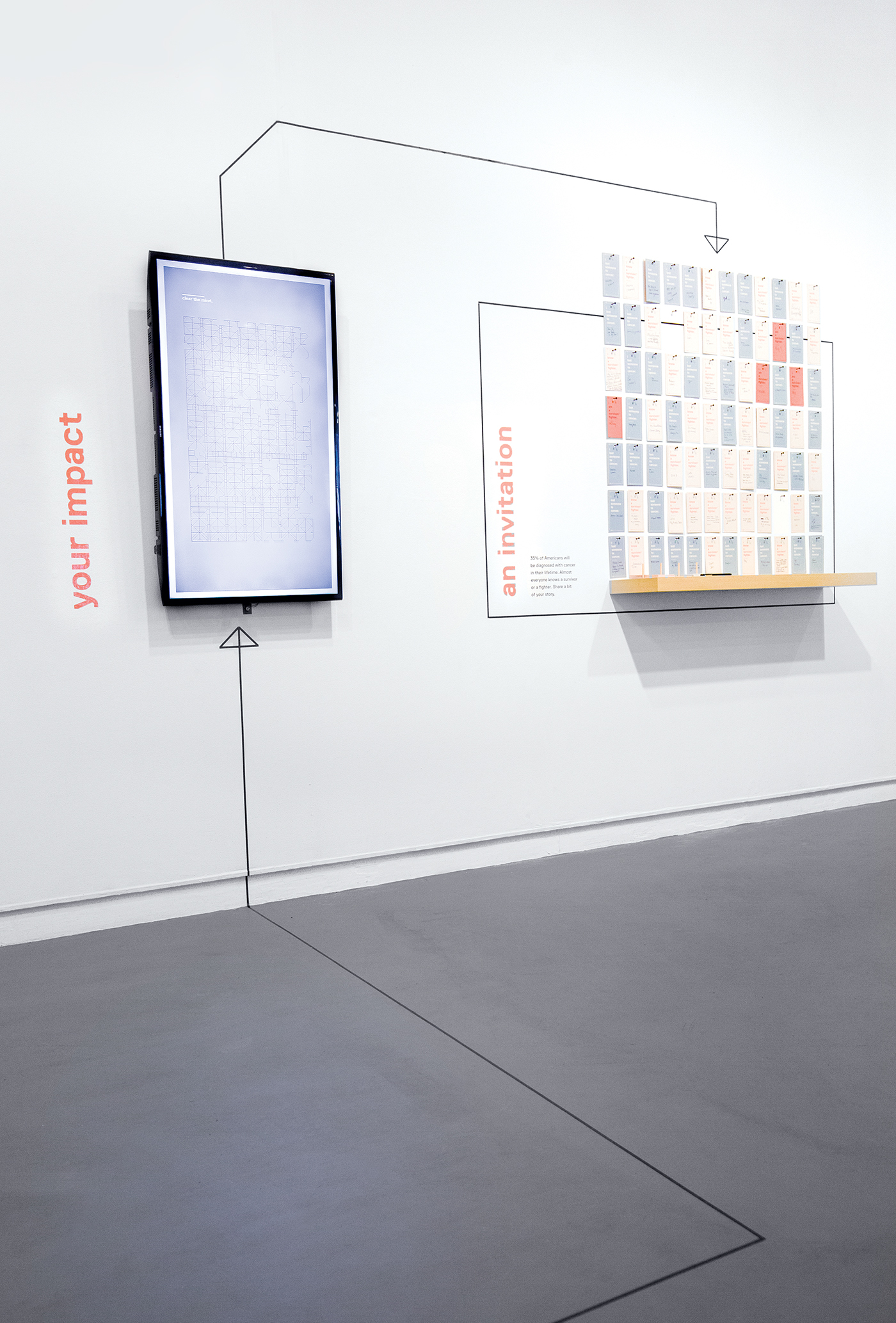
The purpose of the interaction is two-fold: on one hand it acts as an entry point to a difficult topic. When viewers realize they impact the piece, they spend more time with it. Second, the interaction serves as a metaphor: your presence in a patient or survivor's life makes a difference.
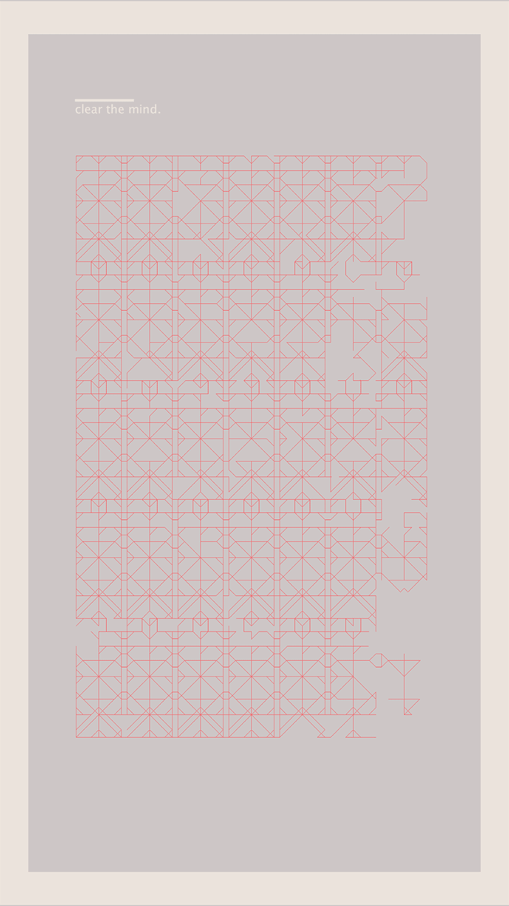
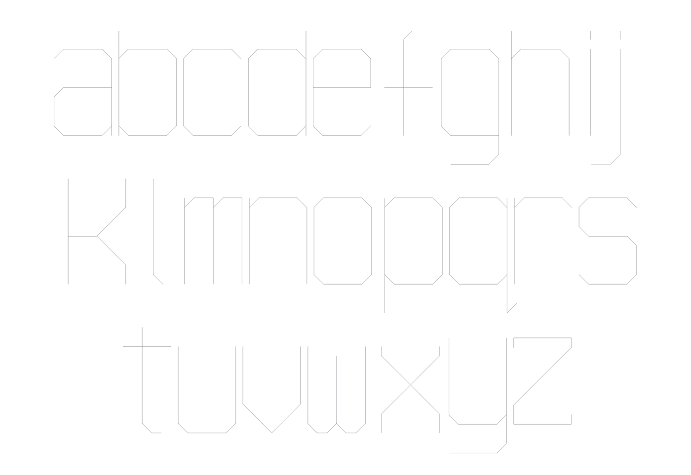
This custom typeface was designed using only 90- and 45-degree angles. This means overlaying numerous letterforms (representing thoughts) ultimately creates a web-like grid. The tangled grid slowly clears away as a viewer approaches, representing a clearing of the mind.

_____________
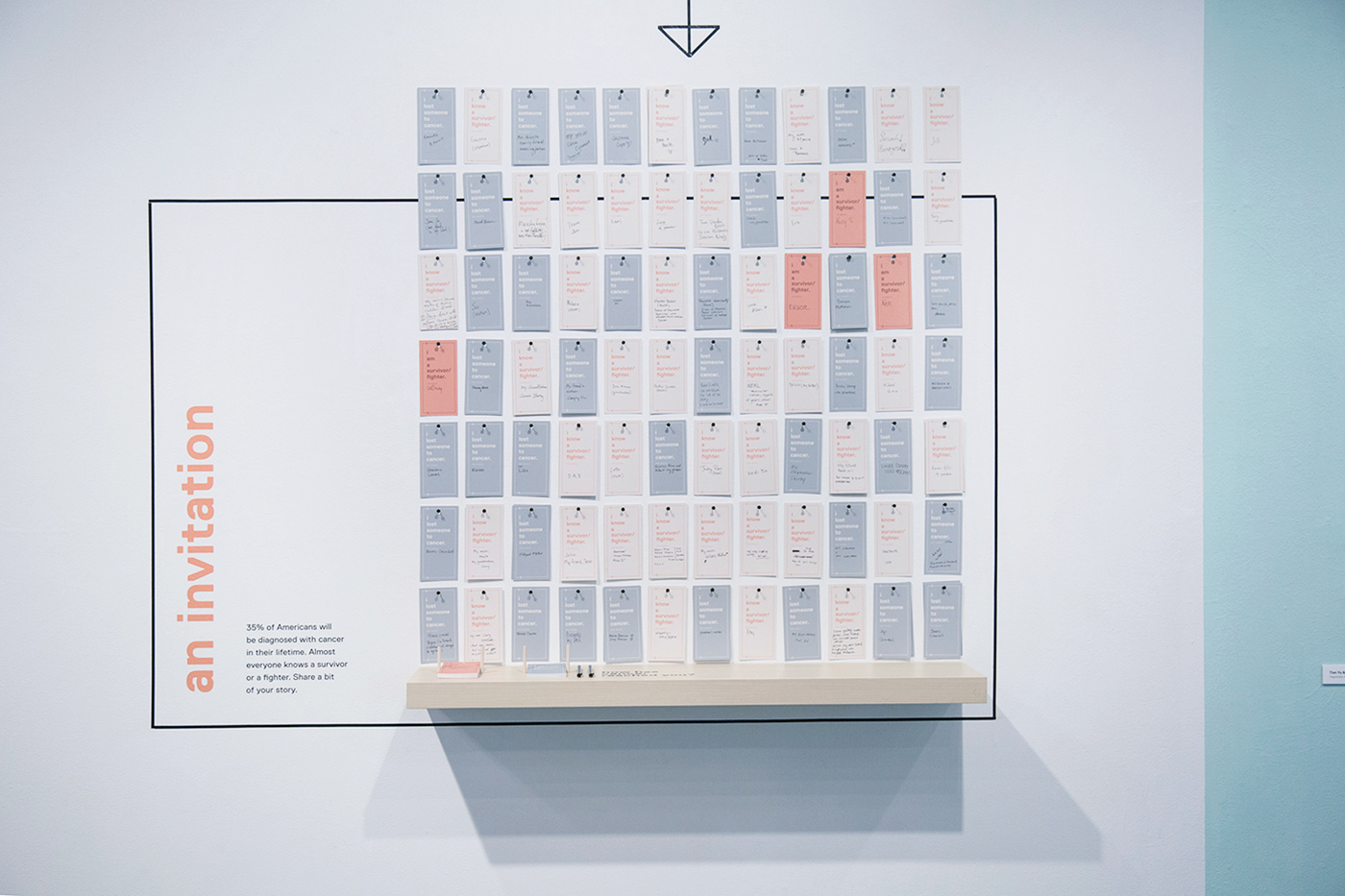
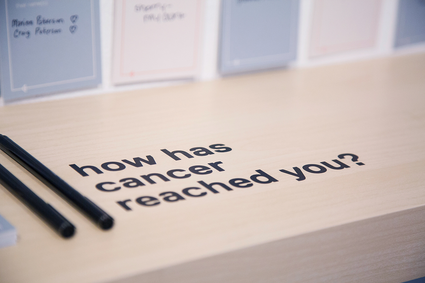
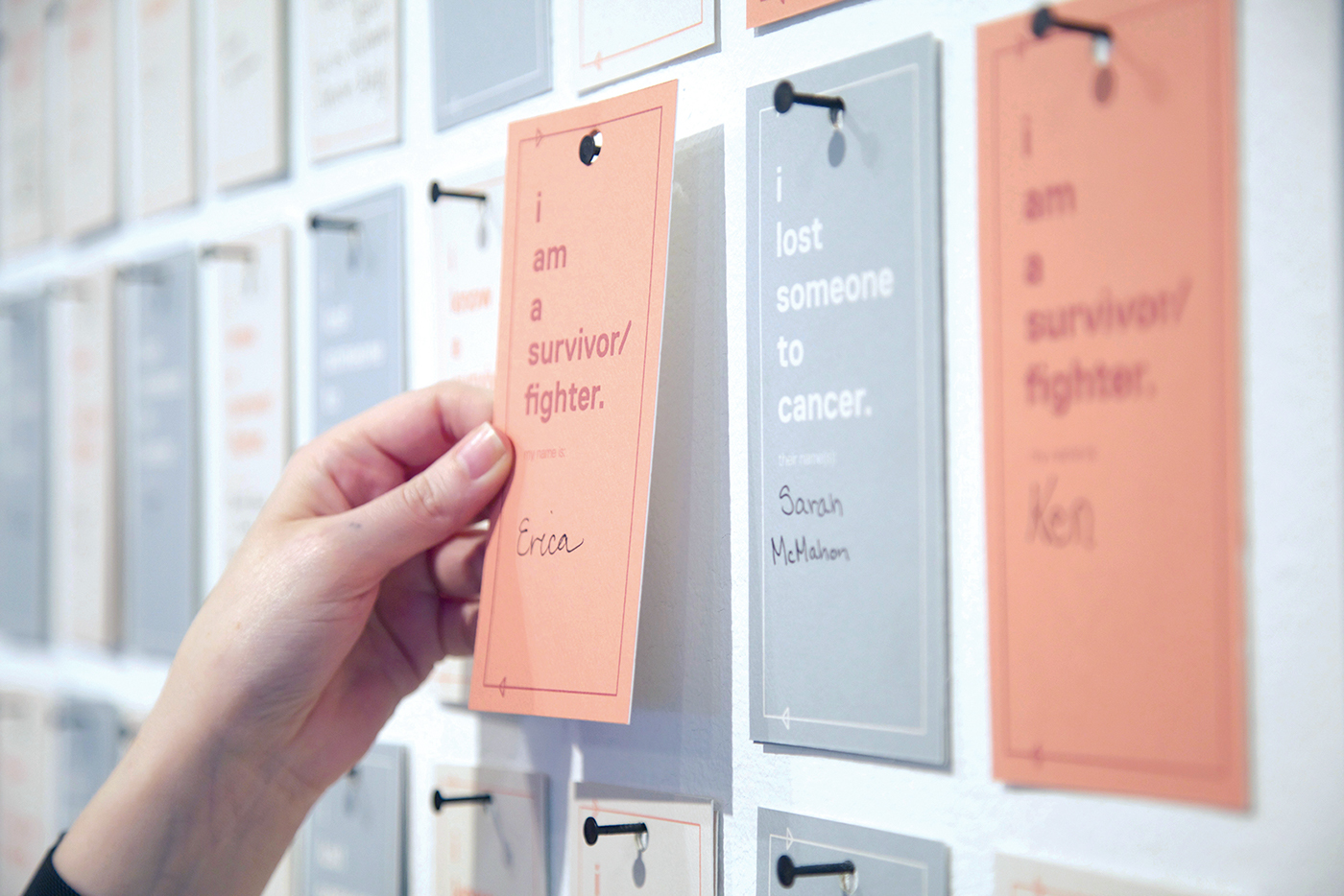
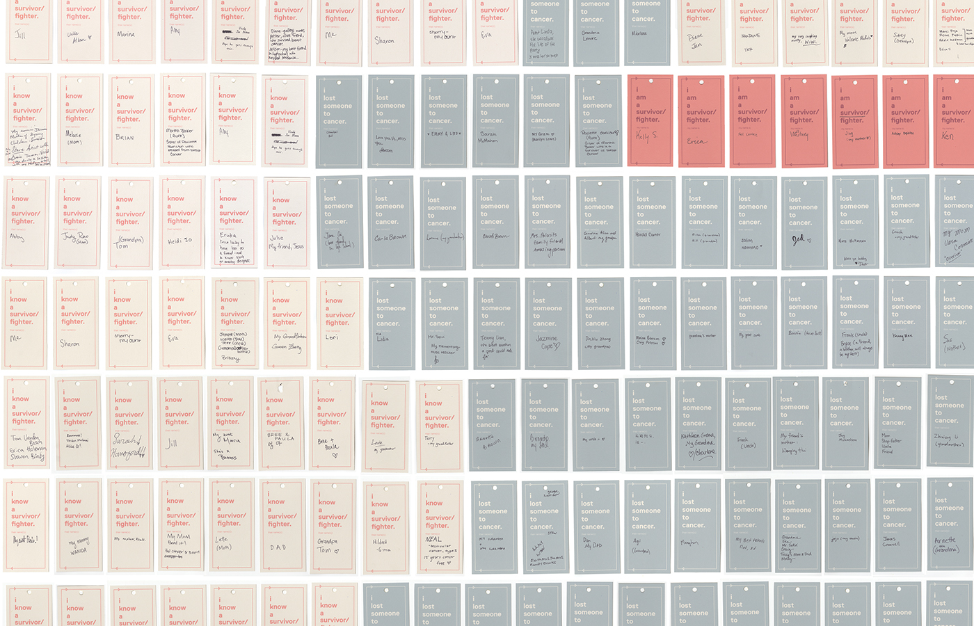
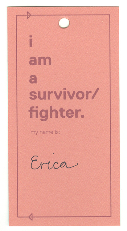
section three: an invitation
After viewers heard from patients and saw their own impact, they had a chance to respond — to add their voice to the piece. In the final section of this exhibition, visitors left the name (or names) of those they know affected by cancer. During the two-week show, visitors left more than 120 responses.

_____________
development process


_____________
Completed as my Graphic Design thesis project at the Maryland Institute College of Art, 2016-2017. Special thanks to mentors Jason Gottlieb, Ellen Lupton, and Jennifer Cole Phillips. With support from Abraham Burickson, Lili Maya, and the entire MICA GDMFA class of 2017. Guidance from visiting critics Jessica Helfand, Zach Hobbs, Jeremy Hoffman, Ayden LeRoux, Abbott Miller, Rianne Petter, and Mark Mulder.


