
How do you talk with Russians about something as important as HIV literacy? We are not the ones for quilts and hands across anything.
Face it. There are only two things than can unite us. Being at war and riding a public bus. We are at war. People are dying. It’s a silent war and people at the spid.center are hard at work to educate the combatants. That is, every single person.
#shukadesign 2017

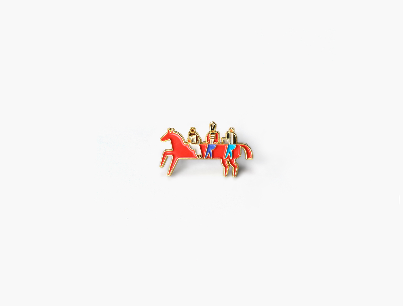
They tasked us with creation of their new identity, that would unite every person living with HIV and without it. But how do go about a task like that in a conservative society such as Russian?
The identity we have created is both reminiscent of the HIV/AIDS solidarity ribbon and the Bathing of the Red Horse by Petrov-Vodkin. It reminds me of those who still stand and those who fell in the endless battle. The horse is Death itself, tamed and subservient through the awareness. It is ridden by multiple characters at once — just like a bus.

The identity is truly dynamic. If you like it to, it can be a shortbus. But it’s a grower, if the size matters to you. The characters come from all trades of life, united only by the war they fight and by the death they have tamed.
After all, what is more Russian than solemn victory? We are cowboys. On a red horse we ride. Dead or alive.


SHUKA
layout → shuka.design
creative direction → ivan velichko
design and typography → ekaterina sedunova, mary yudina
design and typography → ekaterina sedunova, mary yudina
designed by shuka®
© all rights reserved


