Nestlé Club dark chocolate
Welcome to the dark
Packaging design rebrand of Australia’s dark chocolate experience with everyday indulgence within a dark chocolate destination.
Nestlé Club Dark Chocolate has been an icon of Australia’s confectionary aisle since 1935. Made in Australia, Club has been a popular, entry-level product to the world of dark chocolate. It was once perceived as both high-quality and indulgent. However, since it was launched Australian consumers have been exposed to many new dark chocolate brands from overseas. This has seen their taste and palette evolve, eroding the relevance and popularity of Club.
Blind product tasting showed that the product taste of Club was still loved. But, the packaging design was out-dated and out-of-touch with Club loyalists and dark chocolate consumers. The design lacked appetite appeal and didn’t capture the sensuality and richness of the dark chocolate experience. Nestlé asked us to modernise the Club brand and recapture the hearts and minds of chocolate lovers.

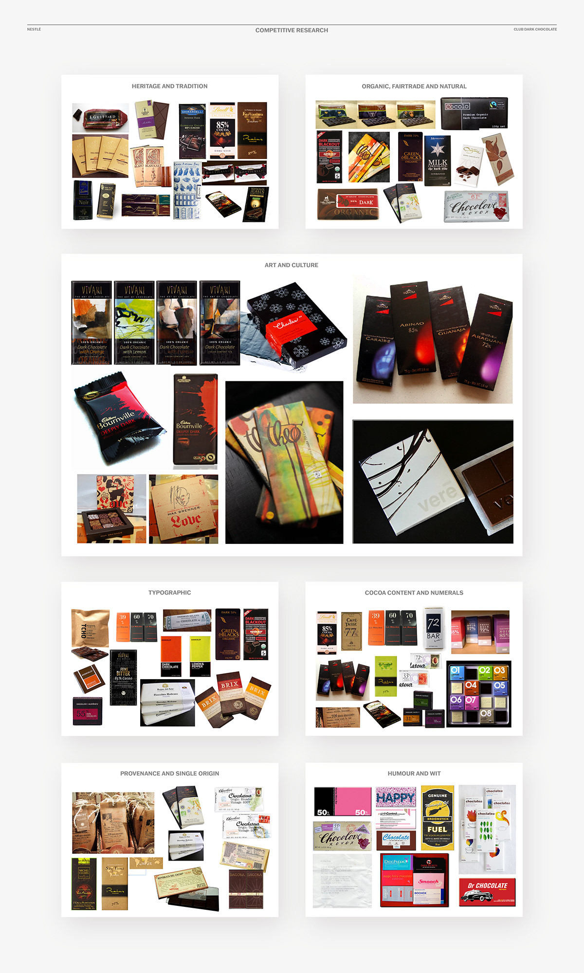
Competitive brand audit
The number of dark chocolate brands has grown immensely since Club was introduced in the 1930s with new brands being launched every year. We identified seven key brand and product territories; from the traditionally styled to designs which employed humour and wit. This research helped us determine the best positioning for Club.
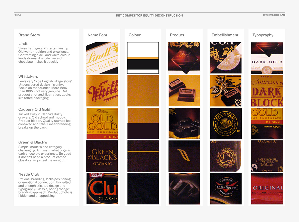
Immersion and repositioning
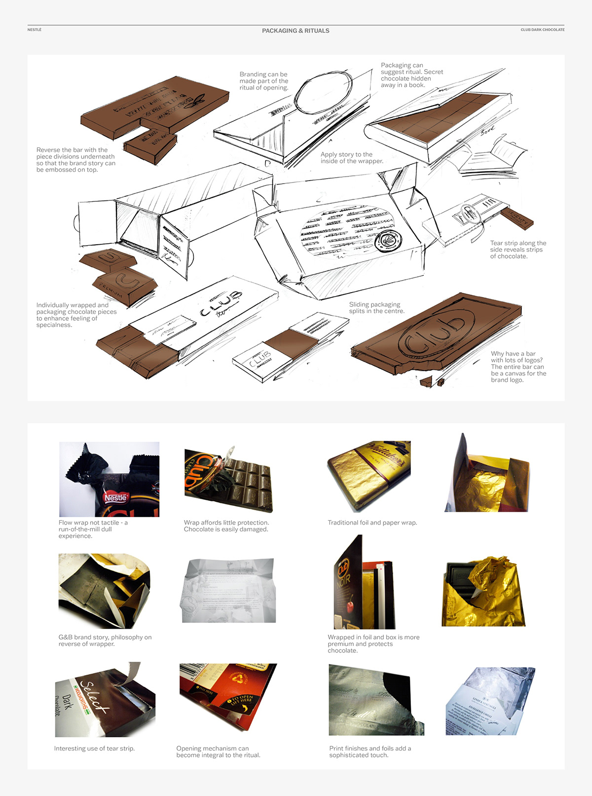
We conducted a global review of the world of dark chocolate and the many brands on offer (which was a huge undertaking!). We examined customer insights and product rituals; and explored ideas for positioning, design territories, structure and materials.
This immersion would eventuate in repositioning ‘Club’ as far more than another dark chocolate, but as a rich and sensual ‘destination’ brand where a love of dark chocolate can be indulged and enjoyed.

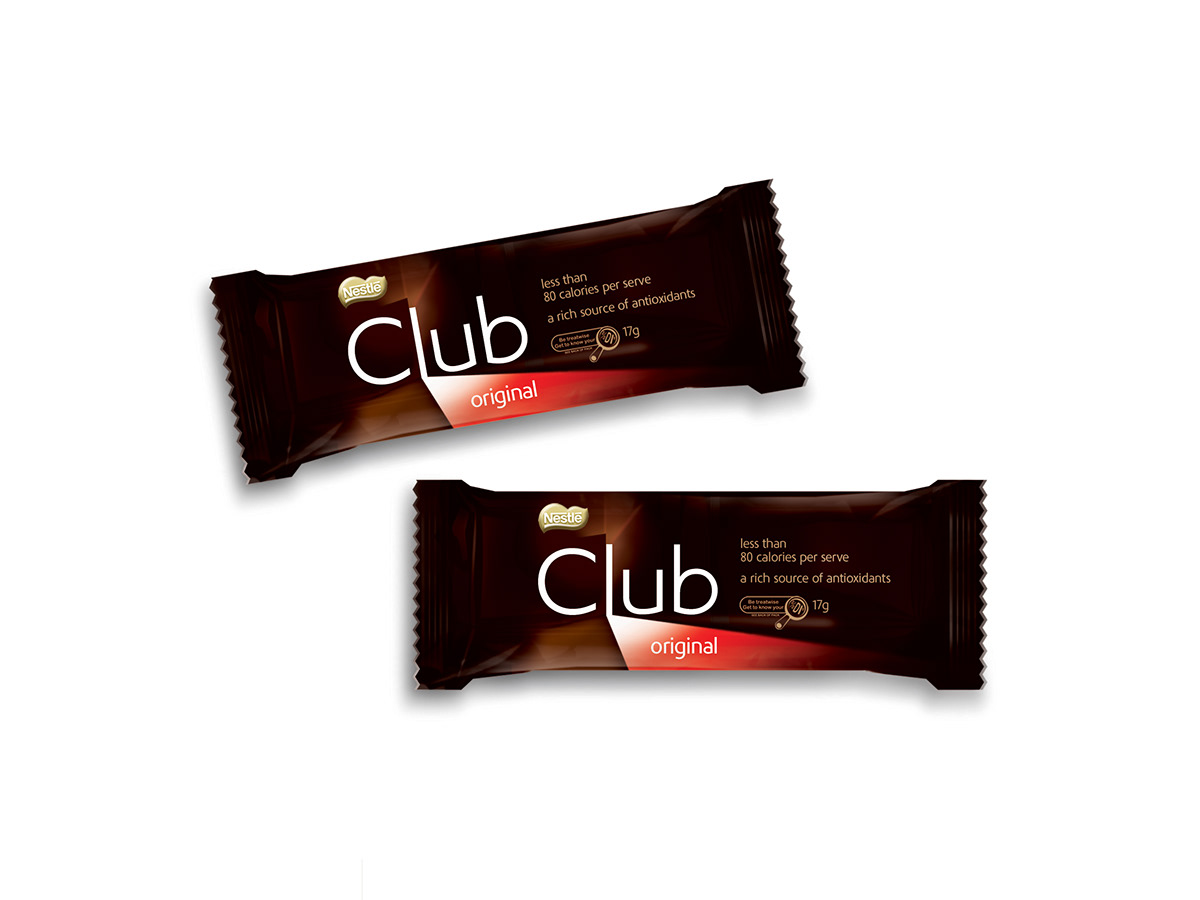
Welcome to the Club
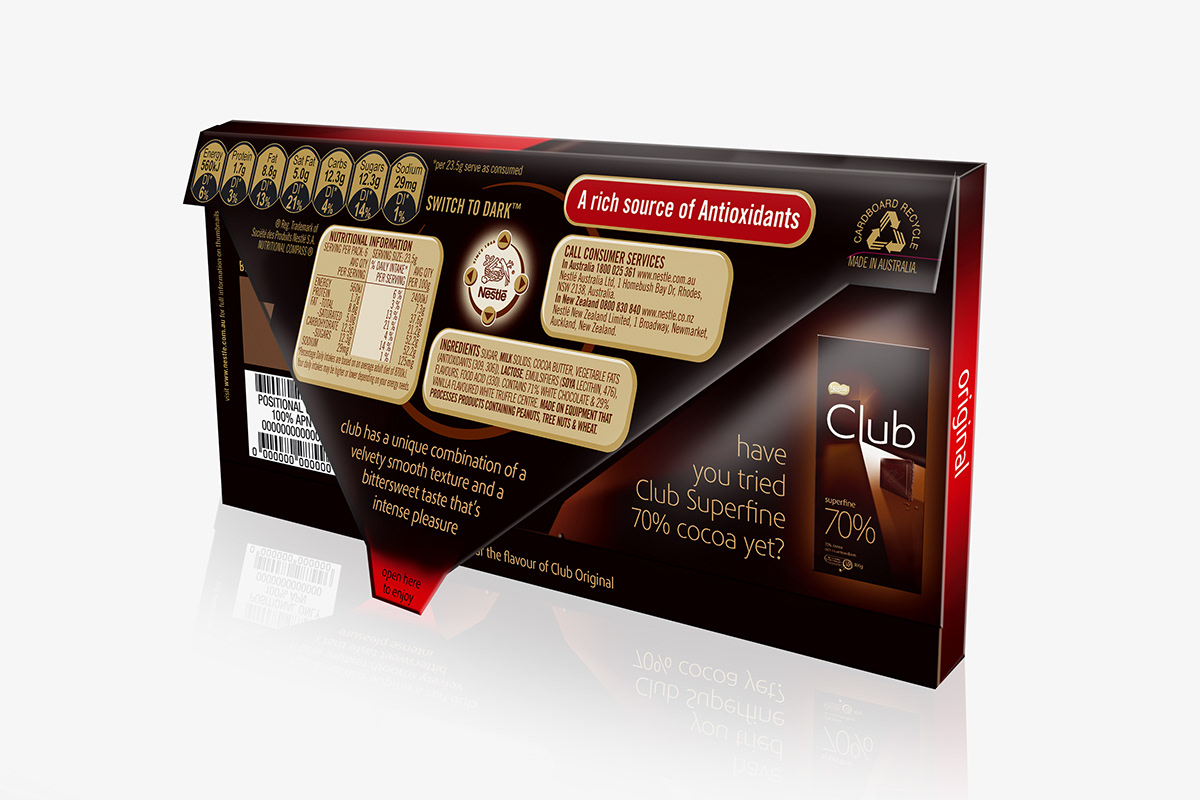
The graphic idea of a door opening onto a room (as if Club Dark Chocolate were an actual club) invites people into a rich dark chocolate world. A colourful light shines across a cameo of a square of chocolate to support ingredient flavour cues. The dark chocolate colour tones in the background help reinforce a sense of luxurious indulgence.


Point-of-sale impact
From the point of view of impact, the shaft of light shines a dynamic graphic across the shopping aisle which draws the eye of consumers to the chocolate. This is emphasised with simple and elegant application of typography, supporting graphics and a gold foil, embossed Nestlé logo.
Project outcome
The idea was universally loved by consumers in research groups who said they “felt like they were being invited inside an exclusive dark chocolatey space”. According to Ian Bell (ex Nestlé marketing manager for chocolate), “The baseline sales results were revolutionary, increasing by more that 50% since the relaunch of Club despite some heavy discounting within the market segment.”
Acknowledgements
If any team members have been
omitted please click this link
and email the new details.
Project Date
2009
Design
Gary Broadbent Creative Director
Stacey Ayers Senior Designer
Kassi Isaac Senior Designer
Jon Clarke Senior Designer
Production
Isabella Sweet
Agency
Cowan Sydney
Client
Andrew Potter Director of Communication
Ian Bell Brand Director, Confectionery
Thank you!
Your likes and comments
are much appreciated.
Based in Sydney, Australia
we work on projects big and small
all around the world and we’d love to
talk to you about yours.
For all project enquiries
media and PR requests
or job opportunities, please