


Design Statement
Antipodes are parts of the earth diametrically opposite to one another. The purpose of the Antipode Museum is to present the cultural contrasts between two cities which are on opposite sides of the Earth. My designs here are for the museums that would be located in Tokyo and Rio de Janeiro. The museum would be underground, and its opening hours would be the same as the museum in the antipodal city. Visitors will compare two cultures through curated exhibitions, and connect with people from the other side of the world by participating in interactive activities.
About the Logo
Two points around the logotype symbolize locations of two antipodal cities on the world map. The logo changes depending on which pair of antipodal cities two museums are locate in.

Logo Reveal
Visual Communication
I designed two versions of exhibition poster, event ticket, and volunteer card. One for the museum in Tokyo, another for the museum in Rio. I kept the branding language and the use of typography consistent, and showed both contrast and connection between two antipodal cities.
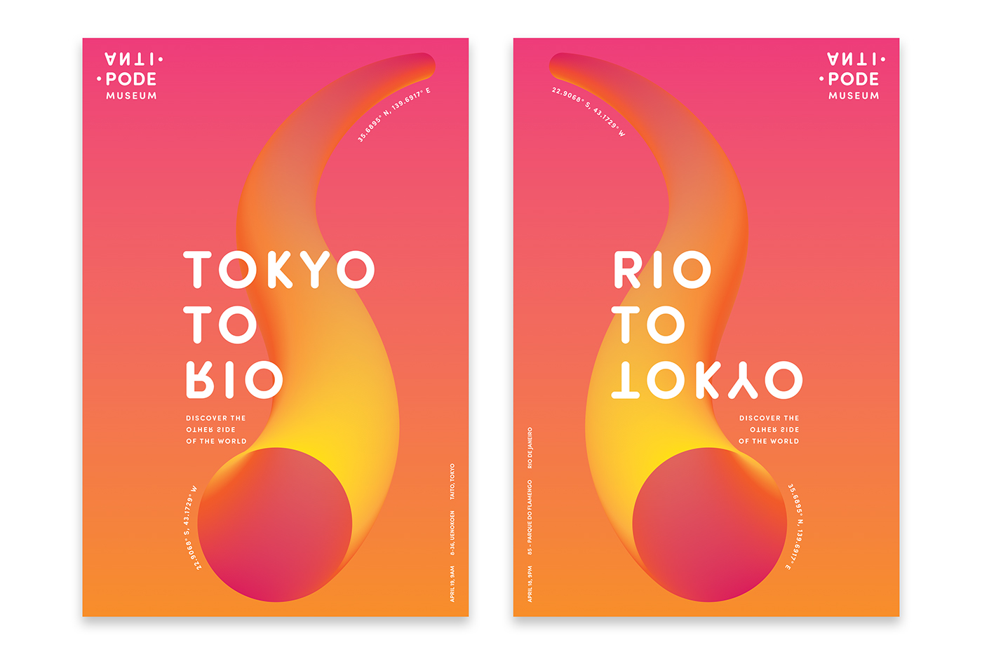
Grand Opening: Poster for Tokyo (Left), Grand Opening Poster for Rio (Right)
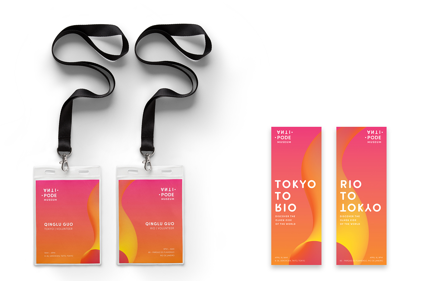
Grand Opening Volunteer Cards (Left), Grand Opening Tickets (Right)
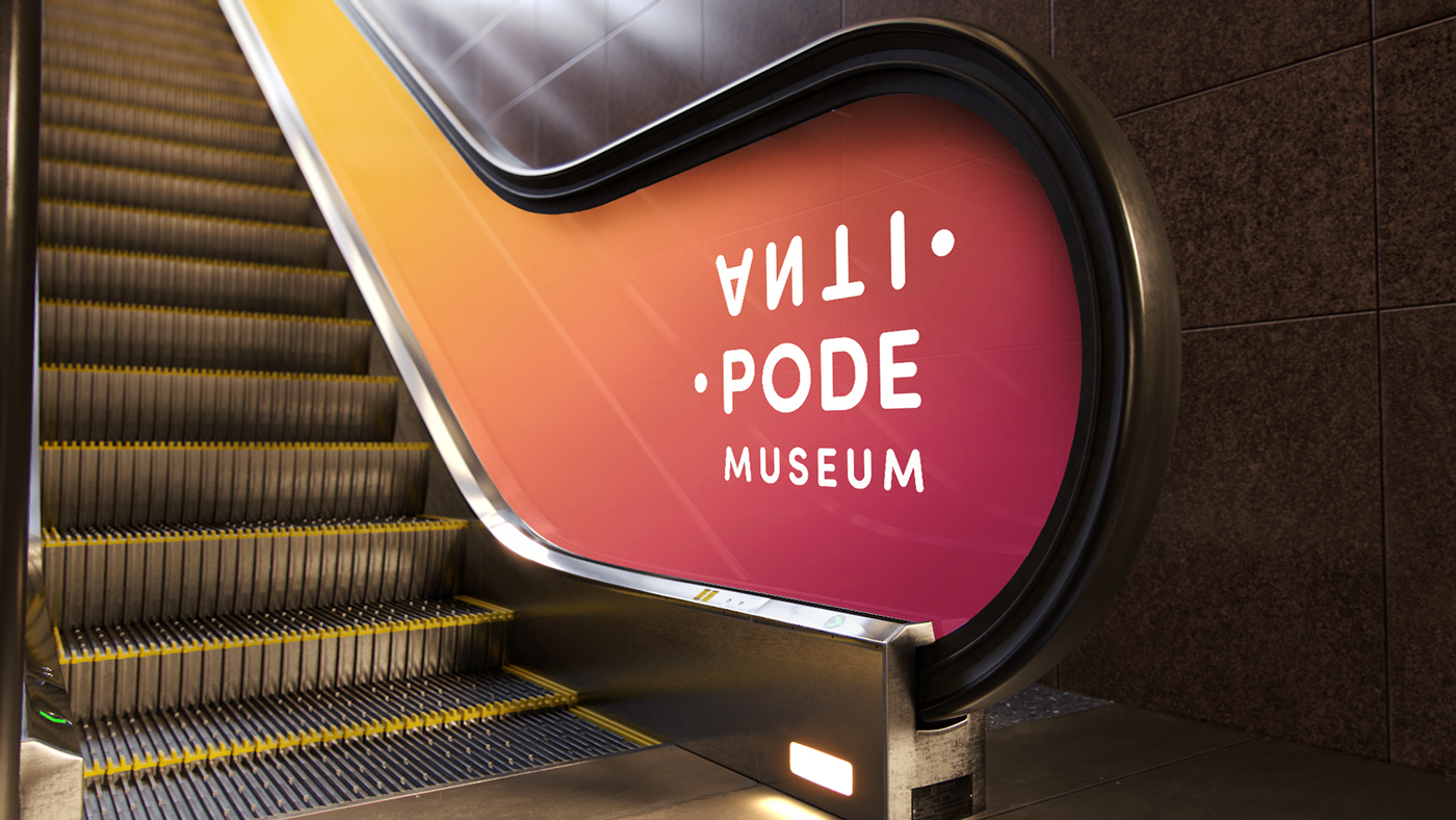
Logo Signage

Tagline Signage
On Their Table
This exhibition will show visitors the food and daily necessities of the antipodal city and reflect a different contemporary life.

Exhibition: Poster for Tokyo (Left), Poster for Rio (Right)
Sake and Caipirinha
Antipodal cities have opposite seasons. Japanese love drinking hot Sake during winter time and Caipirinha is a famous summer cocktail in Brazil. This exhibition will show the contrast of their drinking cultures in different seasons.
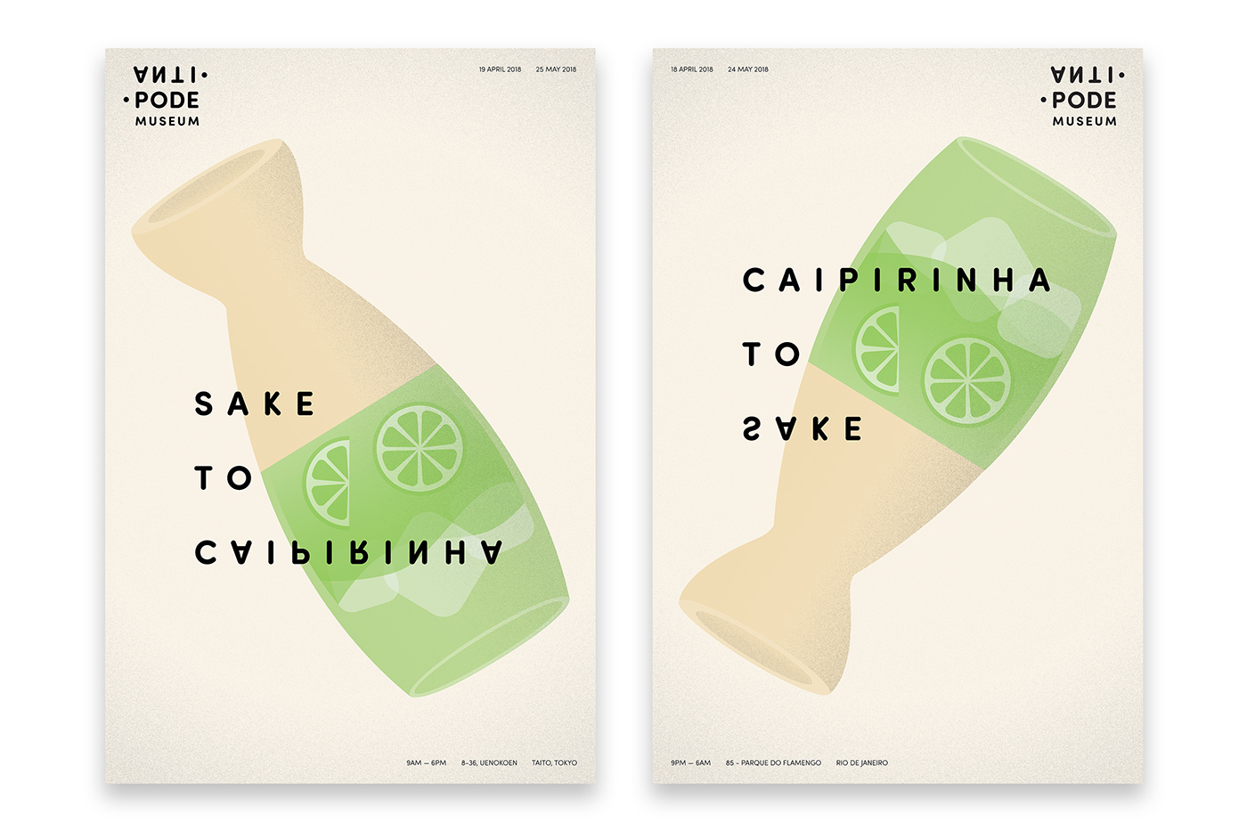
Exhibition: Poster for Tokyo (Left), Poster for Rio (Right)
Interactive Activity: Reaction Time
Reaction Time is an interactive experience in which one visitor from each antipodal city will watch the same trending video at the same time. The camera will record their reactions, and two participators can start a conversation after watching the video. A large screen in the lobby showcases the videos of various visitor interactions and reactions.

Interactive Activity: Reaction Time
Museum Trailer


