


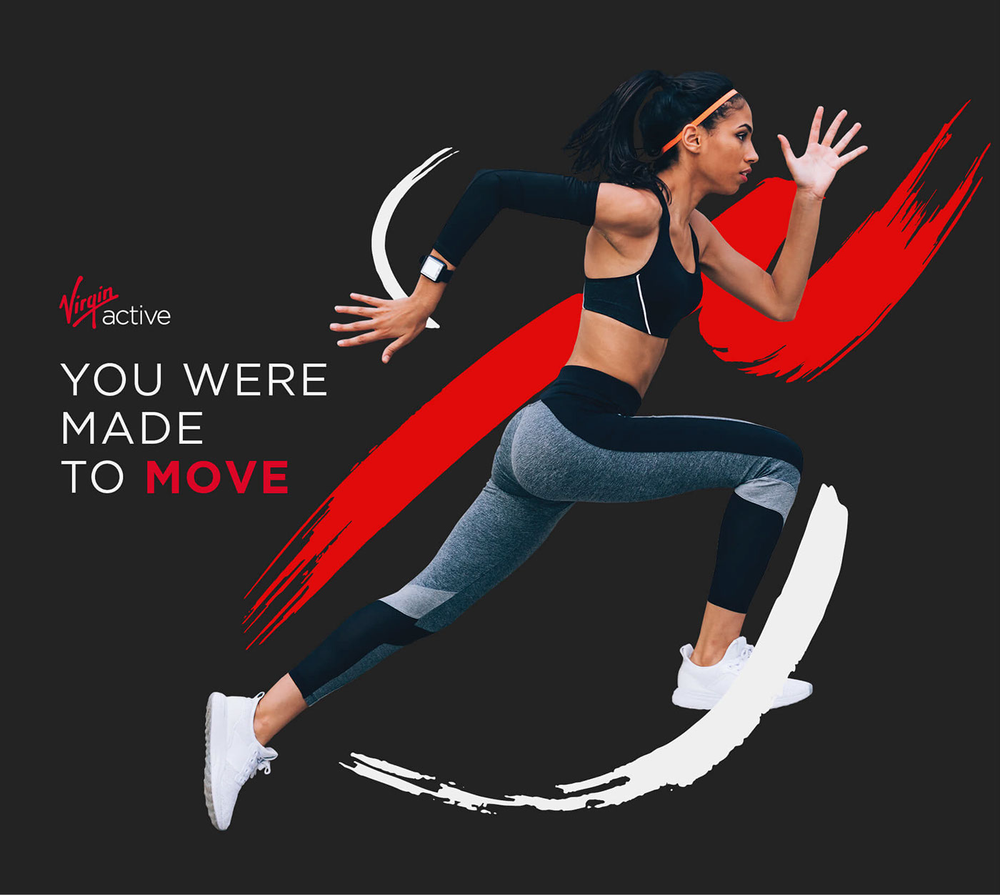
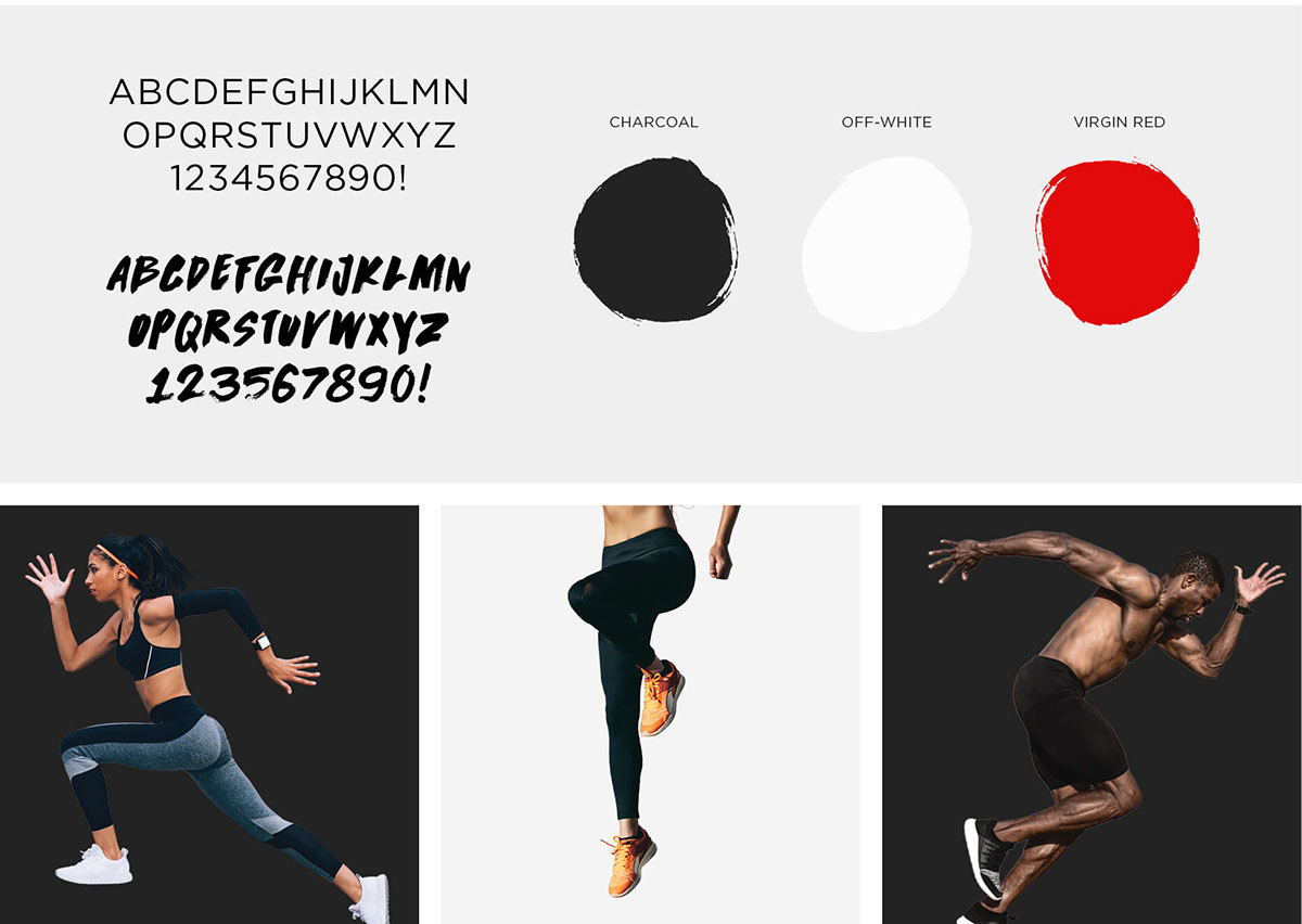
Virgin Active has grown to be Africa’s leading health and fitness club, helping clients get committed by making going to gym as fun as possible. Their main mission to make exercise irresistible, and they have a reputation for doing things differently. We we’re tasked to create an identity for their ‘You we’re made to move’ 2018 Campaign. Everything we created had to be templatised/easy-to-use as they have their own in-house design team that rolls-out all the necessary Campaign work for the year.
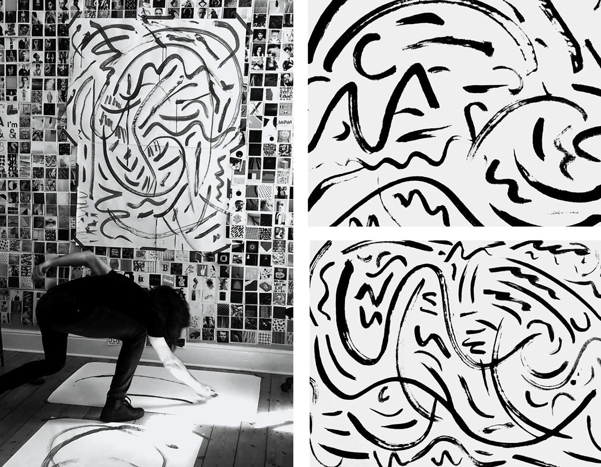
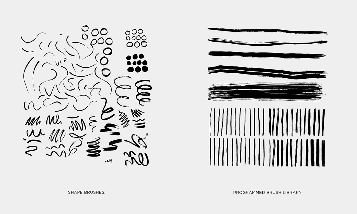
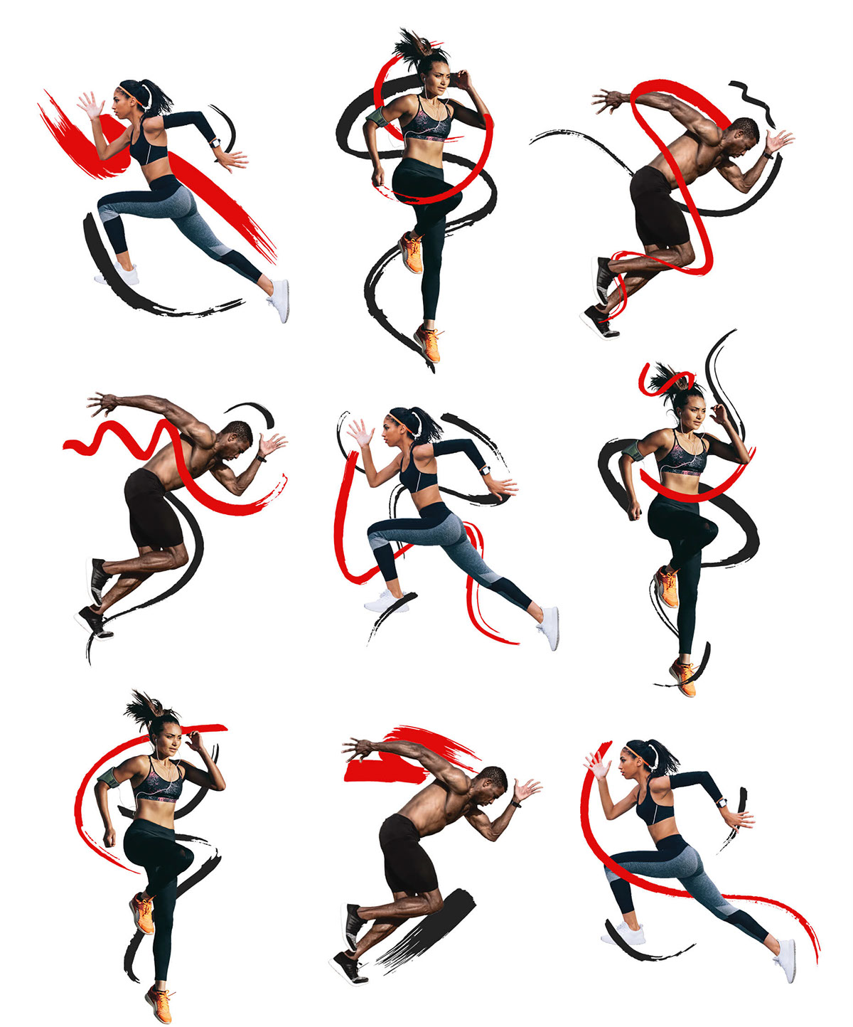
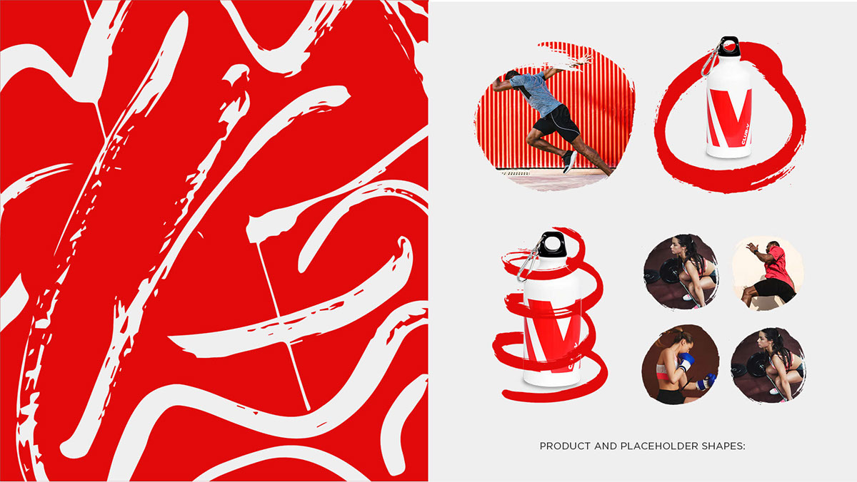
The Campaign essence was focused on the bodys’ natural, primitive, inclination to move. Spontaneous mark-making is one of the most basic and ‘human’ ways to visually portray movement. With this insight we took the raw, primal energy of movement and translated it into visual graphics using bold, dynamic brush strokes. We created a ‘bank of graphic strokes’ (by hand) which was based on physical movement e.g. mark-making whilst lunging, squatting, stretching etc. This ‘alphabet of movement’ became our visual language for the 2018 Campaign.

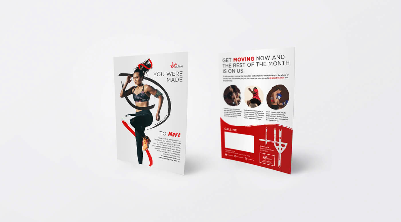
Flyers
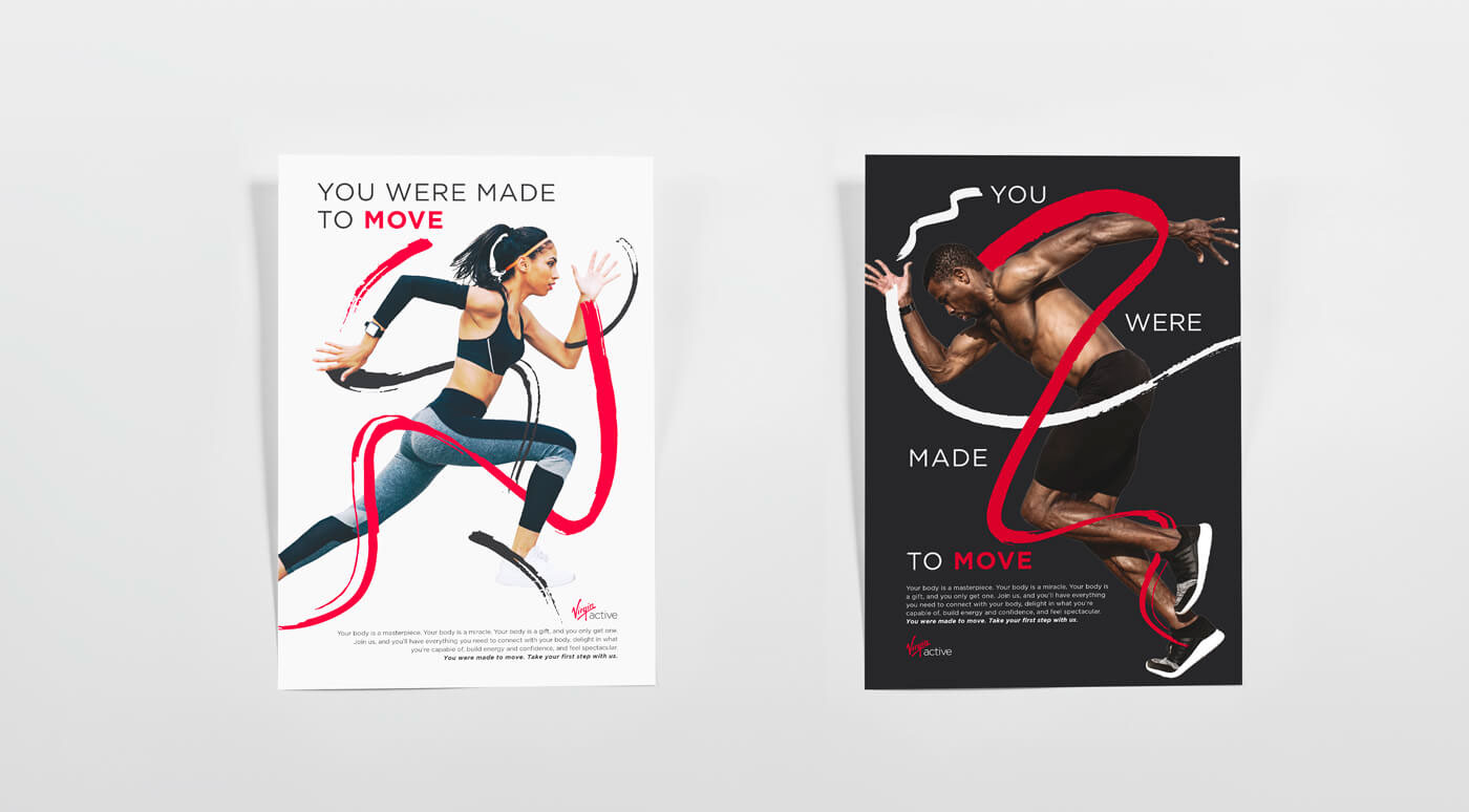
Posters
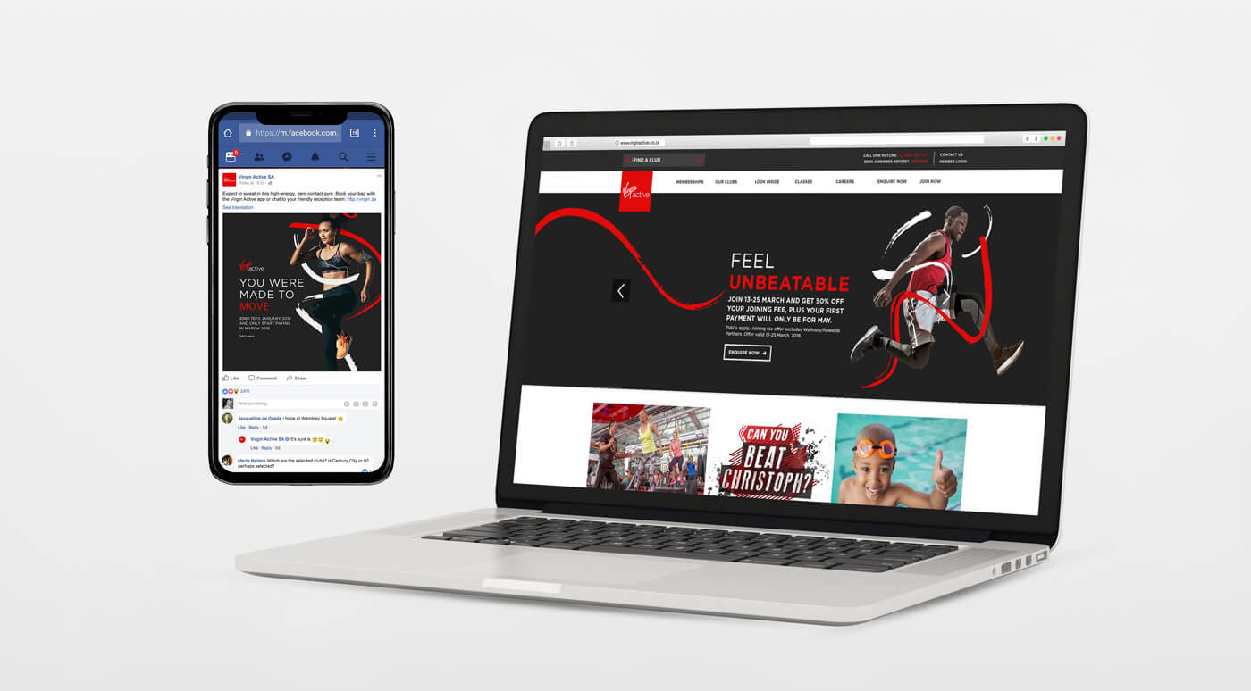
Various Digital Media (All Social Media to Prospecting Banners)
SPACE

Design + Visual Concept for Campaign Identity: Blood, Sweat + Polony
Creative Direction: Blood, Sweat + Polony
+ Jonathan Warncke Virgin Active
Thank you for viewing, we appreciate it.


