


Design Statement
This is a school brand shift project. Penhaligon’s is a British perfume house founded in 1870. The original packaging design is famous for having different illustrative labels for different scents. I thought it would be interesting to see how contemporary packaging design can work for this vintage brand, so I came up with a new packaging idea. To address the problem that it's always hard for non-professionals to interpret the specification of perfumes from their unorganized labels, I designed a simple and intuitive system to label fragrances. I used an arrangement of gradations to signify various concentrations of scents for products.
Branding and Visual Language
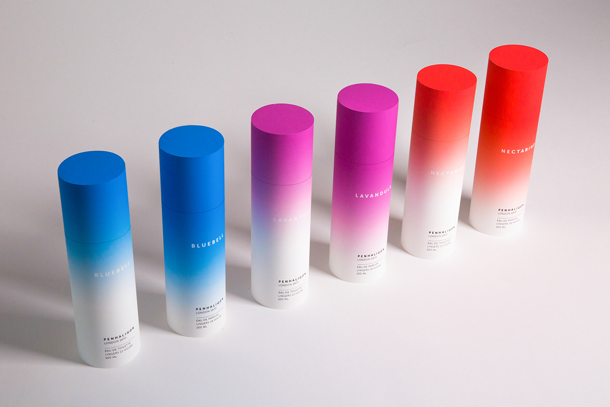
I used color gradients, which visually feel like scents and sprays, to represent different concentrations of perfumes (Eau de Toilette and Eau de Parfum). I used minimalist typography and only put essential product information on the package. I believe that cylinders can best show the design of gradations. I also applied the visual language to perfume tester stripes.
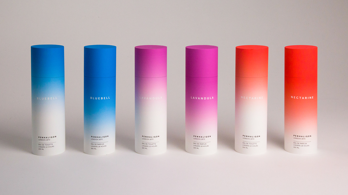
100 ml Fragrance Collection
100 ml Fragrance Collection
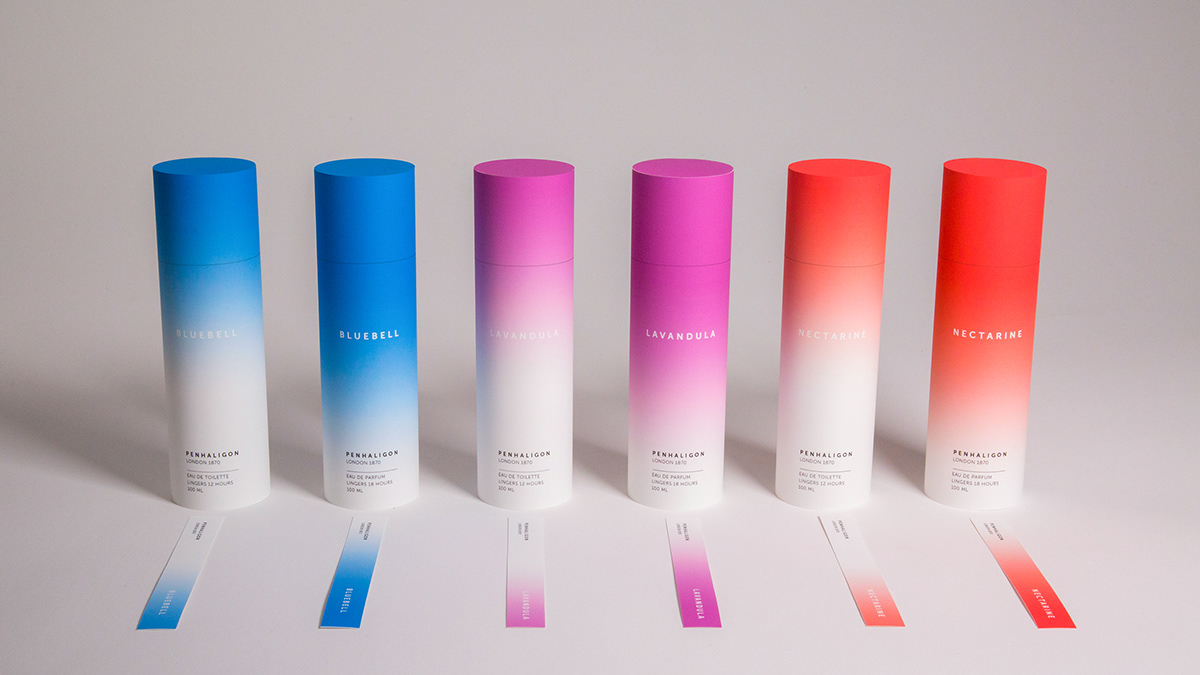
100 ml Collection and Perfume Tester Strips
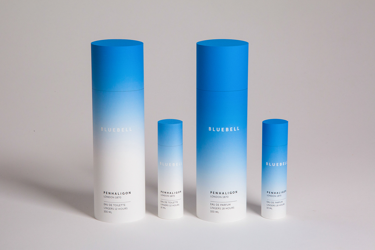
Bluebell Collection
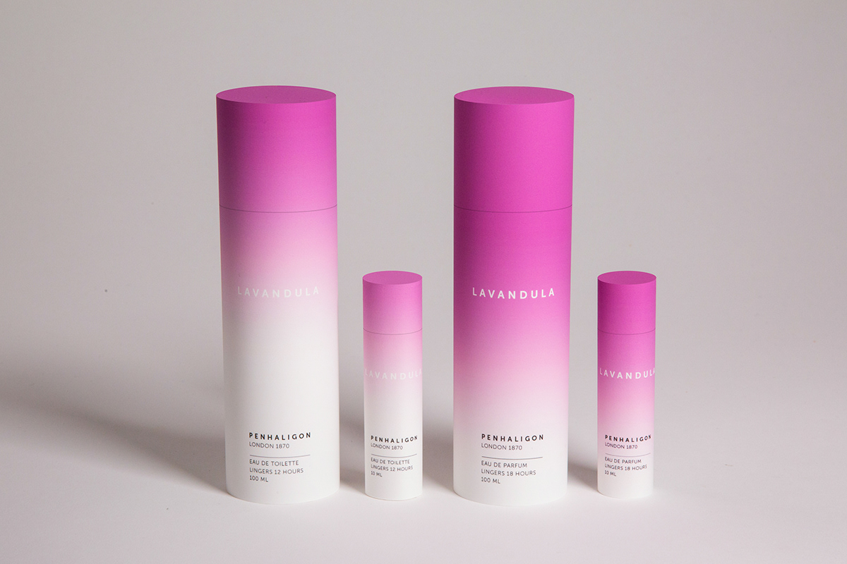
Lavandula Collection
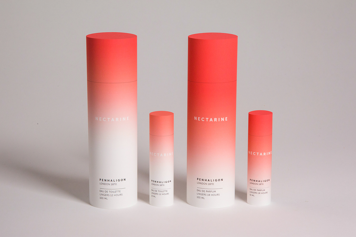
Nectarine Collection
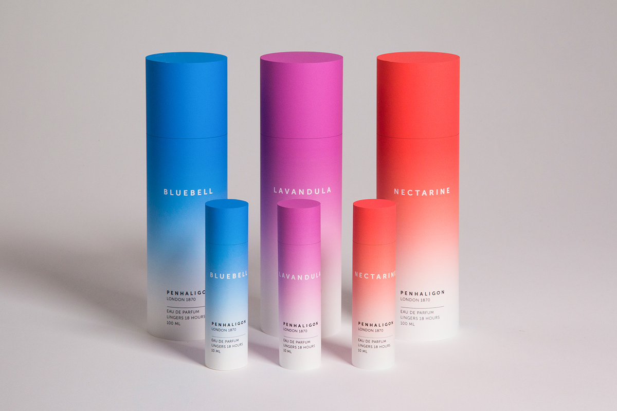
Eau de Parfum Collection


