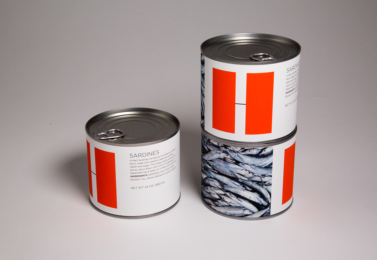
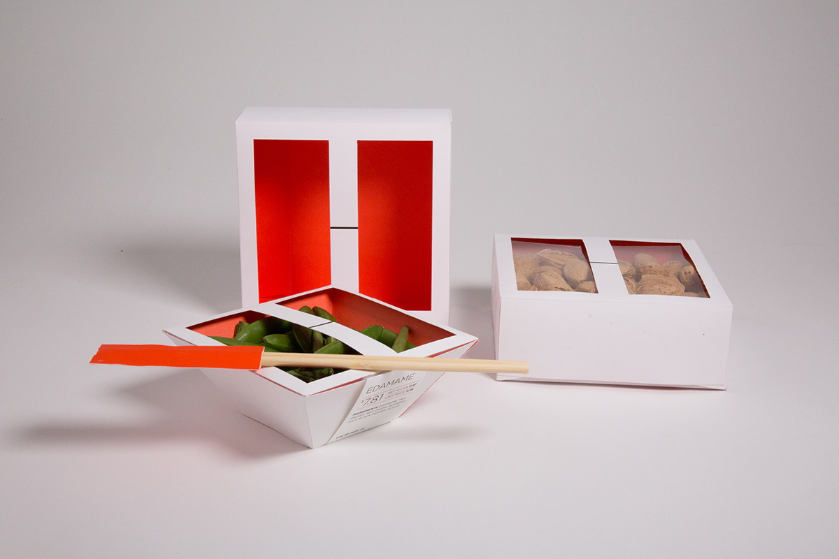
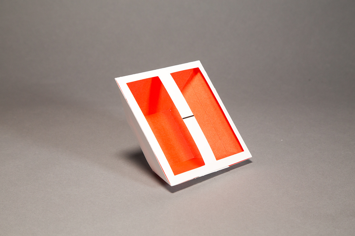
H Mart is an Asian Mart selling various food from all over the world. I recreated the logo mark red H to a square shape, to make a sense of trusting and modern. I emphasized the big H shape and applied it to the packages. I opened an H window on the food box to show the freshness and beauty of the food.


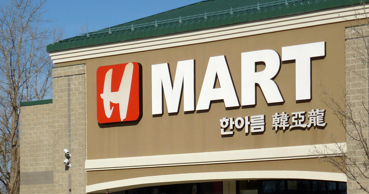
H Mart old visual identity.