


_
Branding Livsta
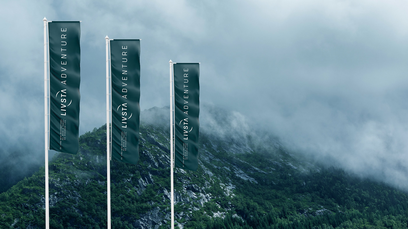
Travel Experience
_
Client: André Lucchesi e Felipe Sampaio
Where: Brazil / Norway
Year: 2018
Agency: Nacione™ Branding
Animated Logo by Pimientos.co
_
Client: André Lucchesi e Felipe Sampaio
Where: Brazil / Norway
Year: 2018
Agency: Nacione™ Branding
Animated Logo by Pimientos.co
_
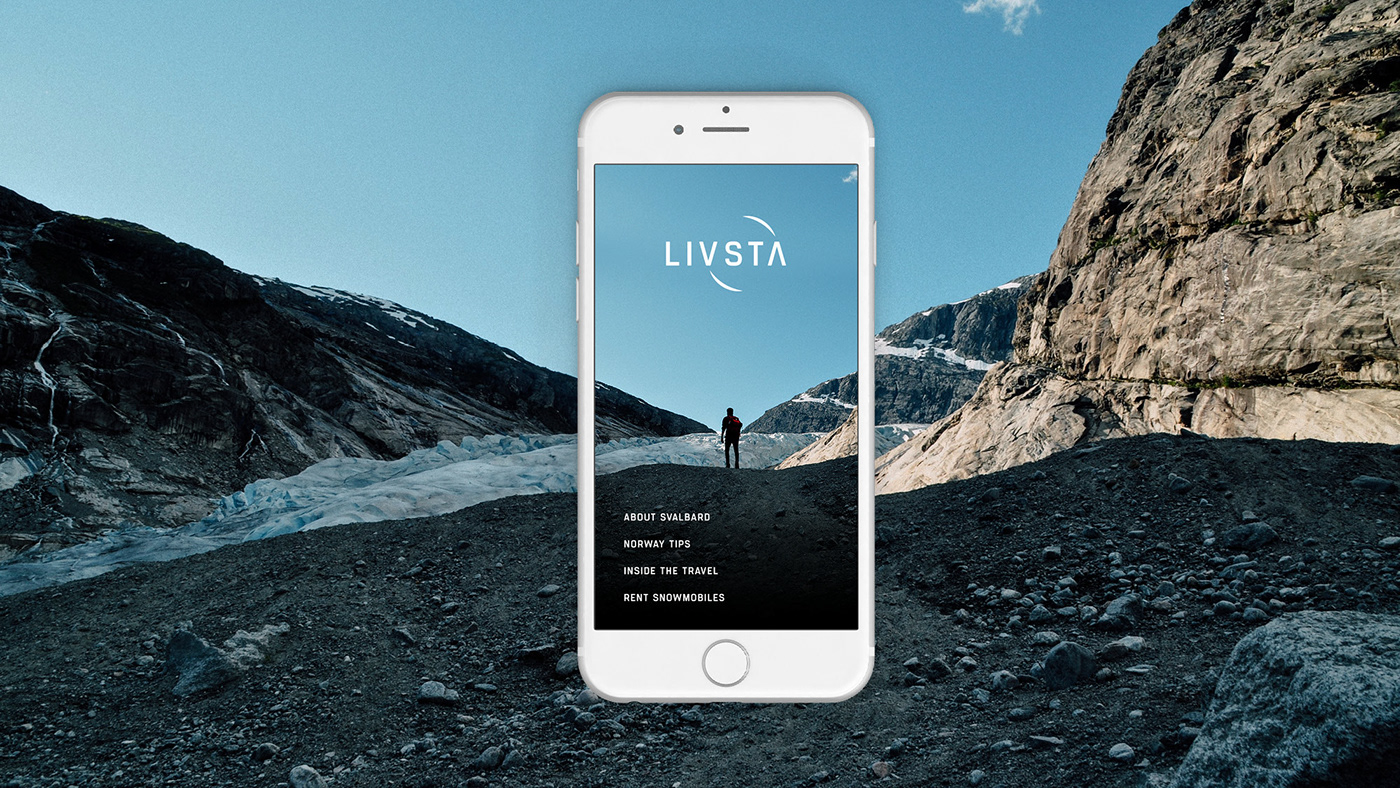
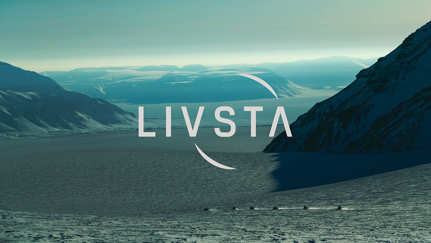
A B O U T
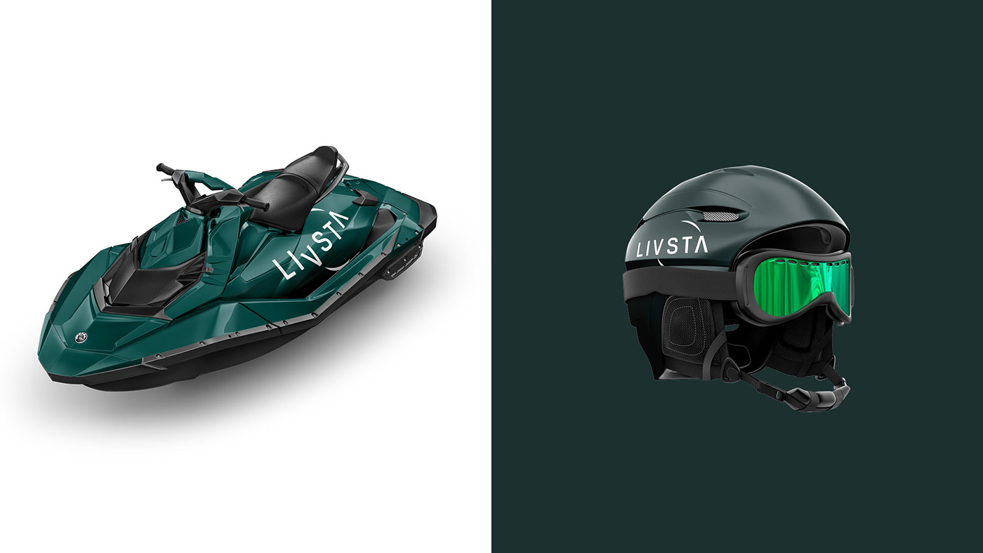
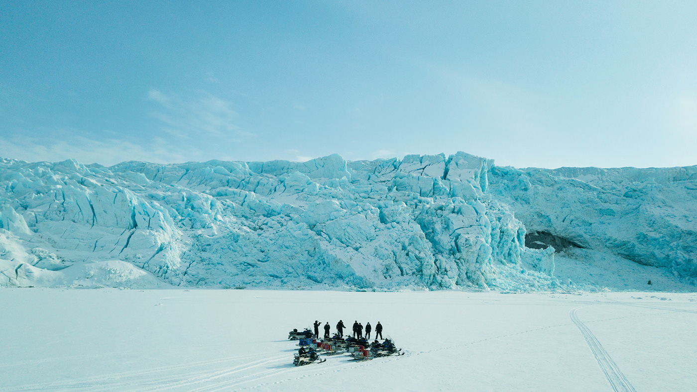
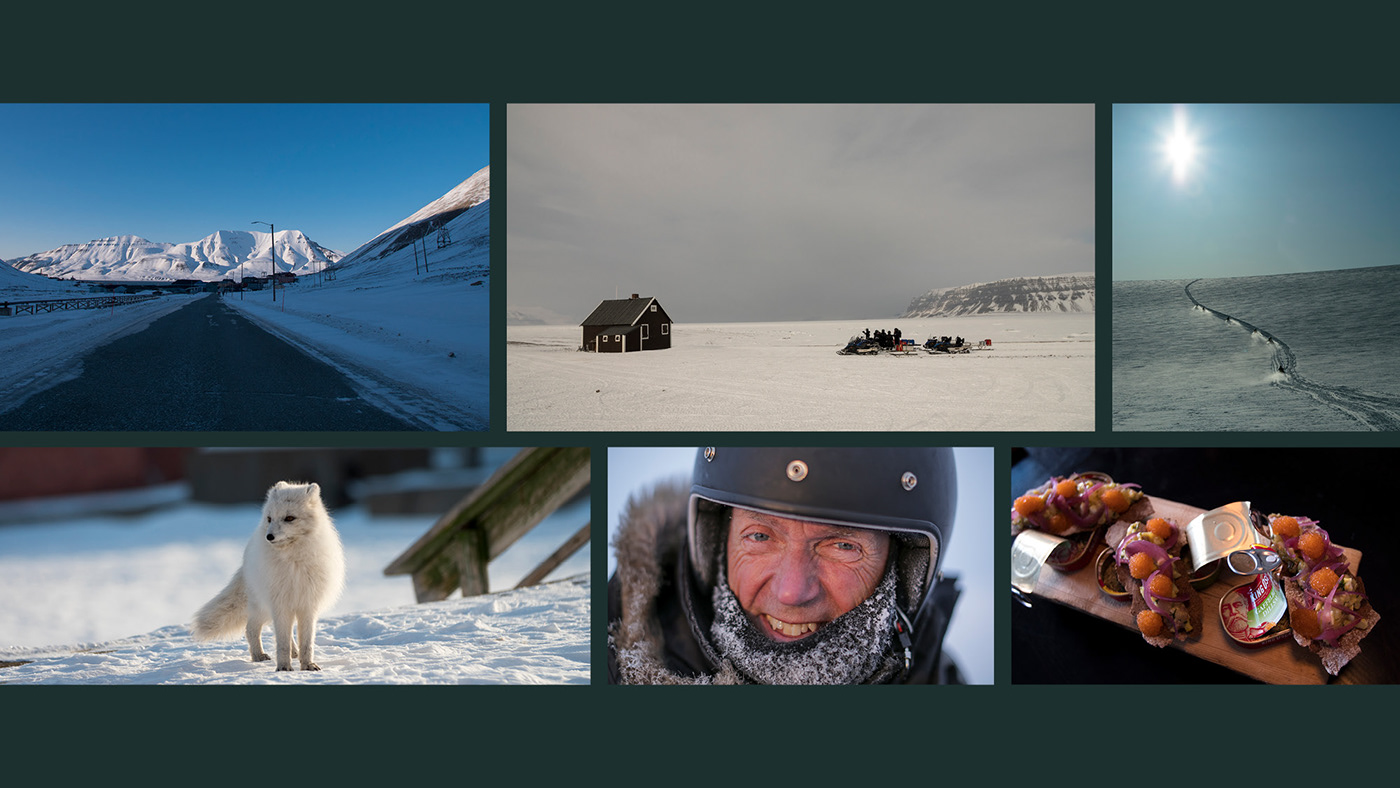
Livsta is a travel brand born to explore unique travel experiences. With the most unique destinations, Livsta aims to discover a new way to enjoy life. Livsta comes from the combination of two words: Live + Stay. The name is the living memory that stays in the mind. Livsta was born for those who wish to share the most unique experiences in the world.
Livsta is a travel brand born to explore unique travel experiences. With the most unique destinations, Livsta aims to discover a new way to enjoy life. Livsta comes from the combination of two words: Live + Stay. The name is the living memory that stays in the mind. Livsta was born for those who wish to share the most unique experiences in the world.
W H A T W E D I D
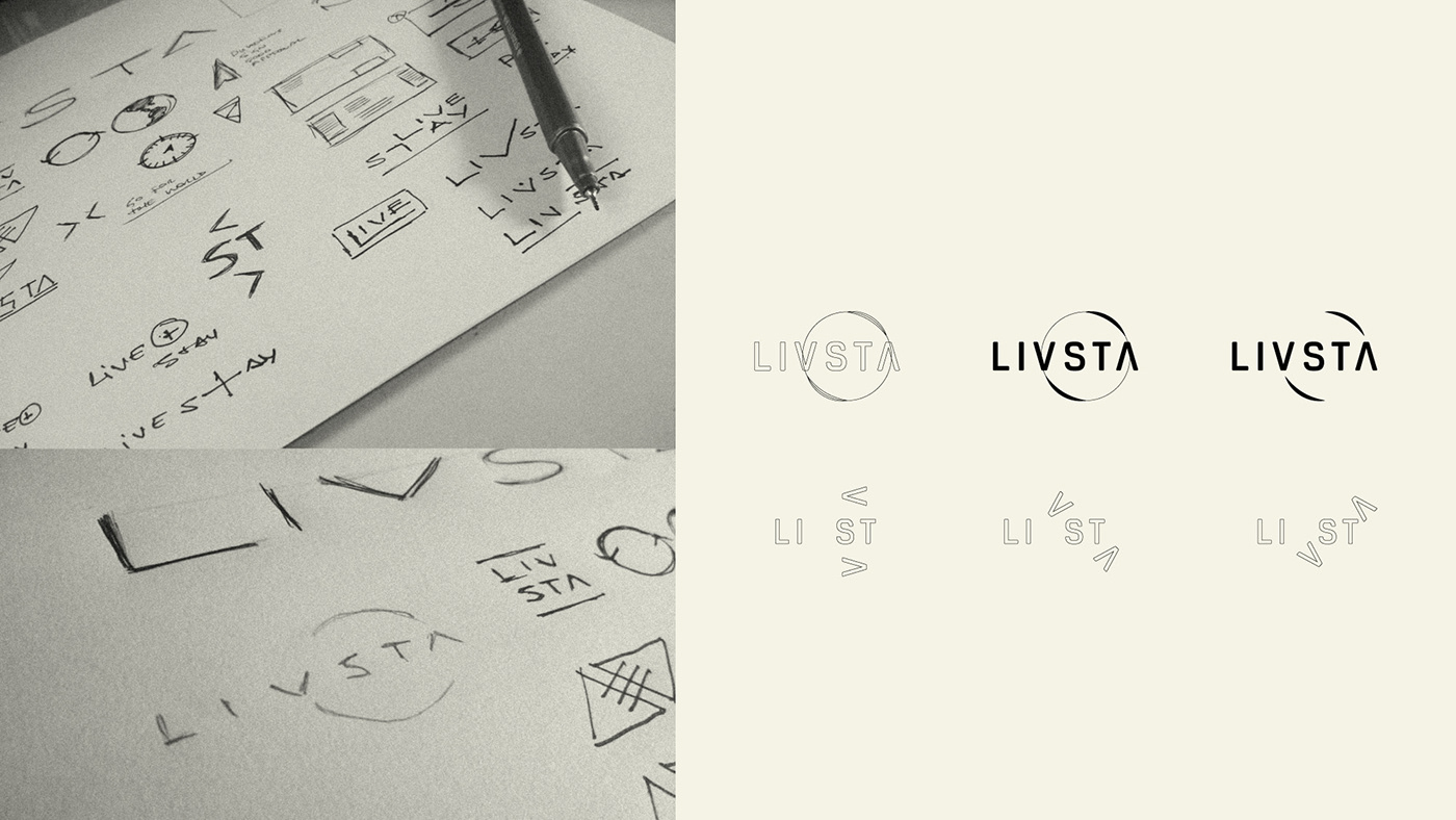
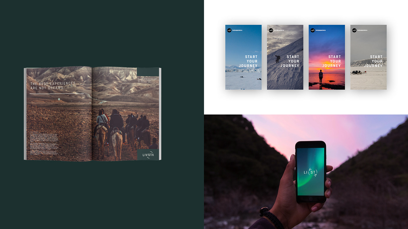
Nacione™ Branding was responsible for creating the Brand Strategy, Brand Platform, Naming, Key Visuals, Creative Direction, Brand Identity and Brand Book. The challenge on this project was to create a disruptive approach in an overexplored market. So we dug into the scenario and created a brand positioning based on the product which is the experience and then we came up with a brand identity that evokes the act of exploring and creating stories through experience.
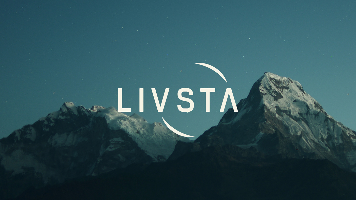
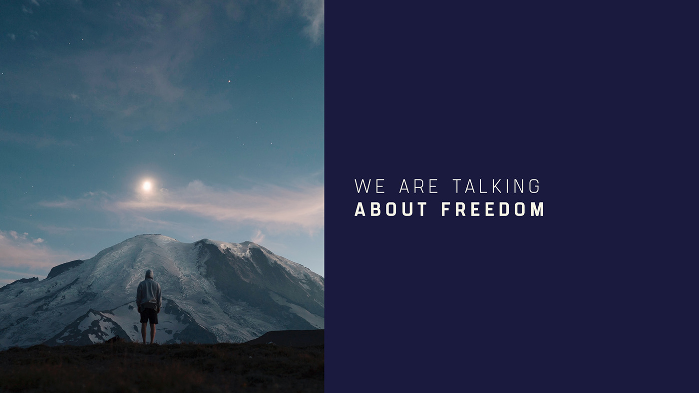
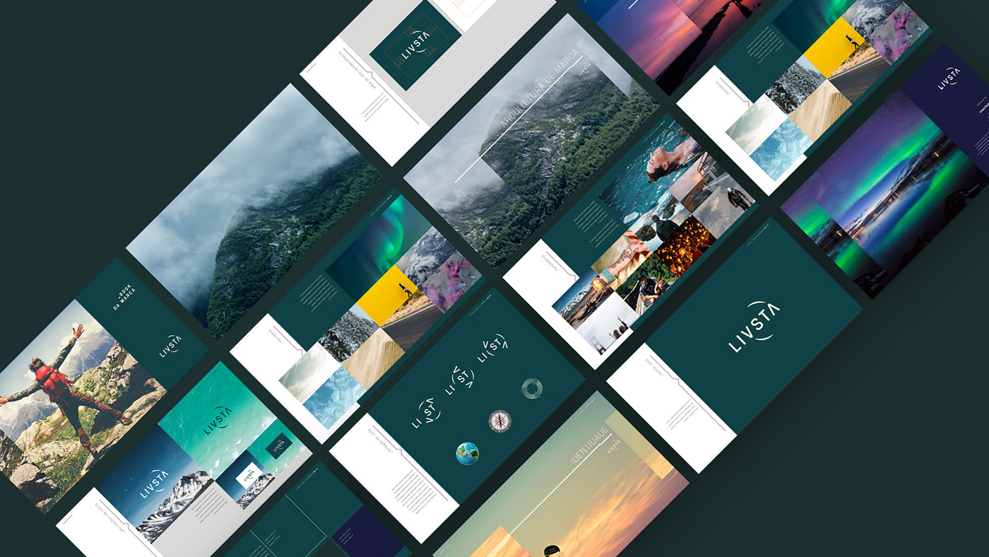
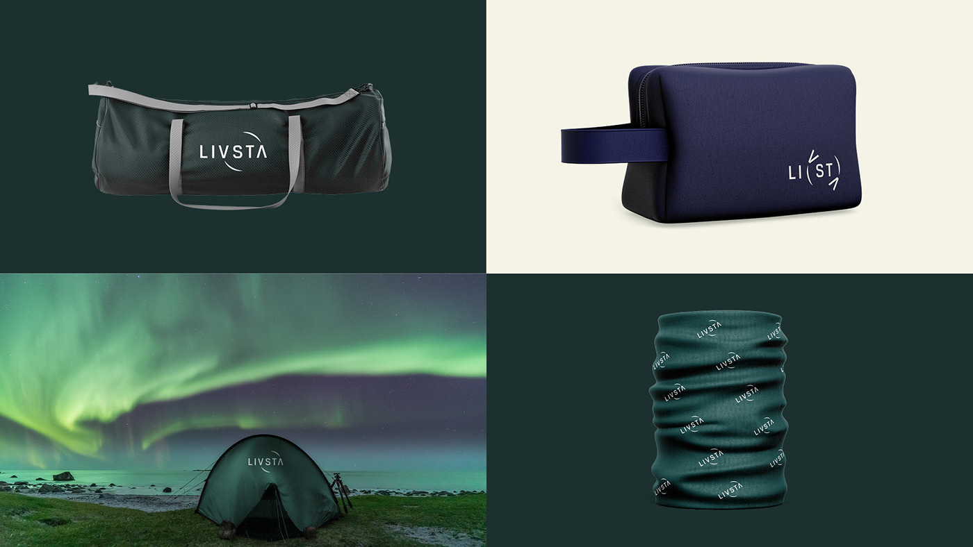
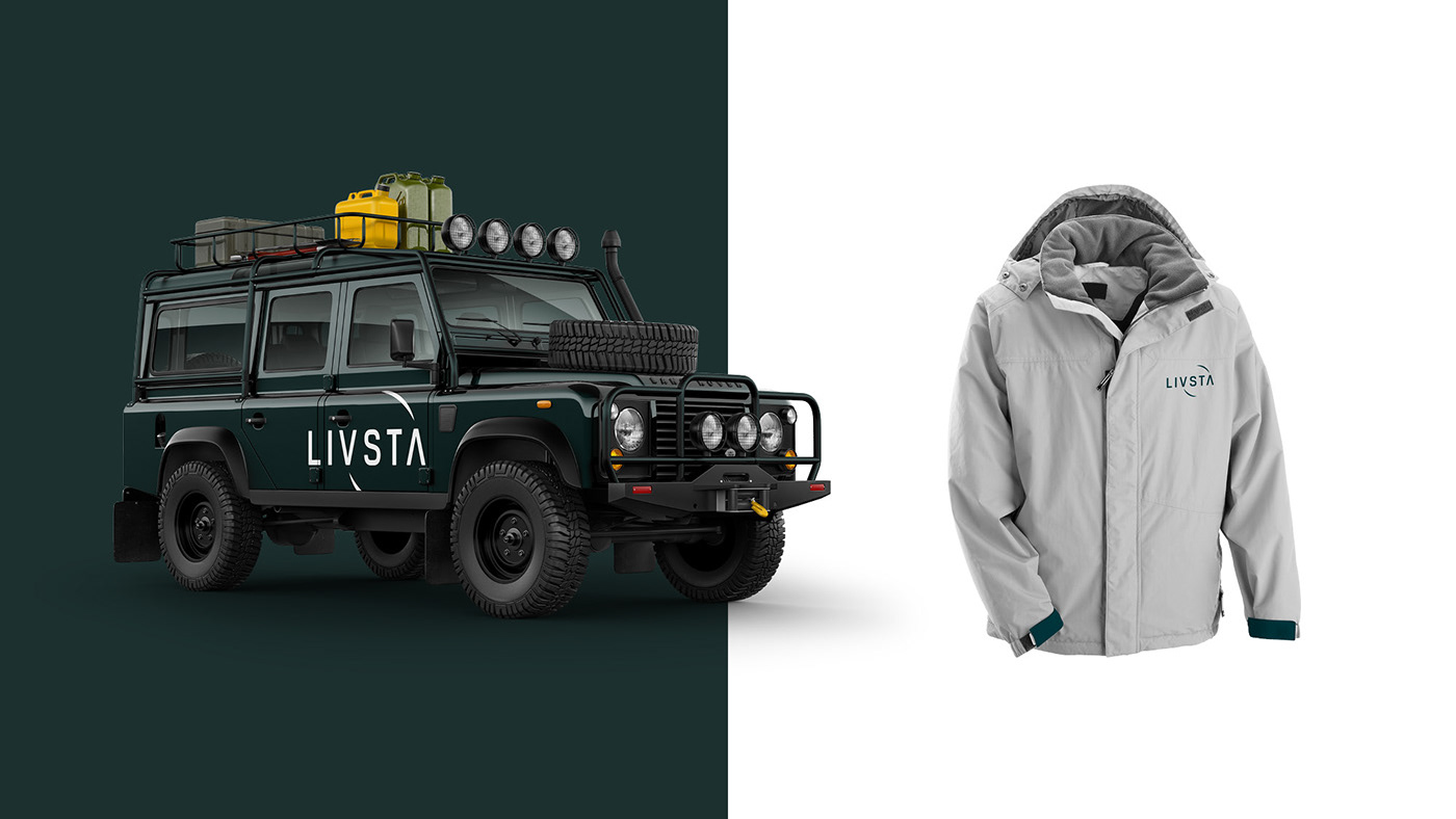
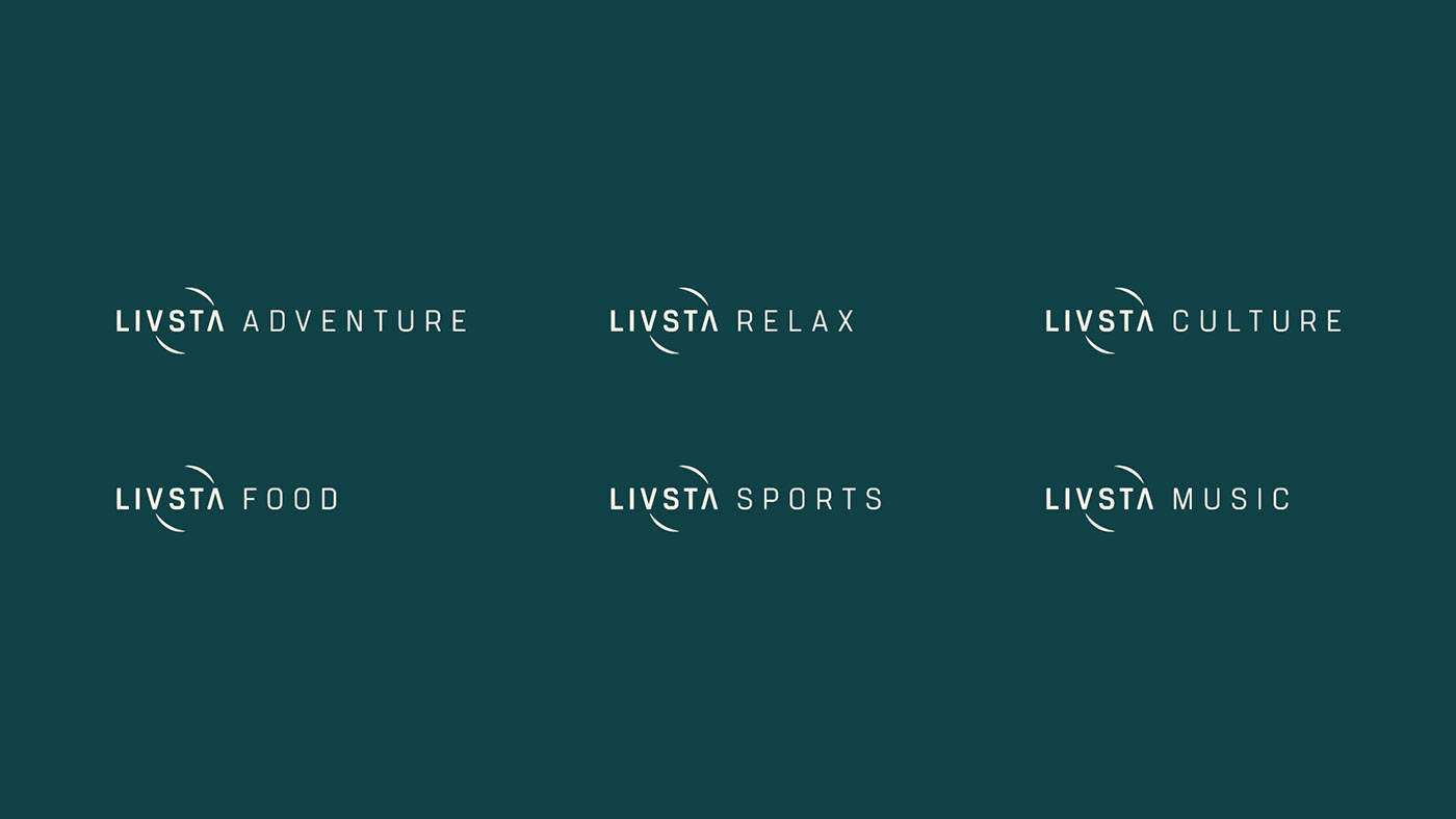
We have created a brand that breathes new directions, new destinations and behaves like a classic travel tool. Using the circle with the arrow letters and behaving like a compass, has resulted in an interesting visual aspect that highlights the main asset of this brand. The result was a powerful brand with a unique proposal and expression.
We have created a brand that breathes new directions, new destinations and behaves like a classic travel tool. Using the circle with the arrow letters and behaving like a compass, has resulted in an interesting visual aspect that highlights the main asset of this brand. The result was a powerful brand with a unique proposal and expression.
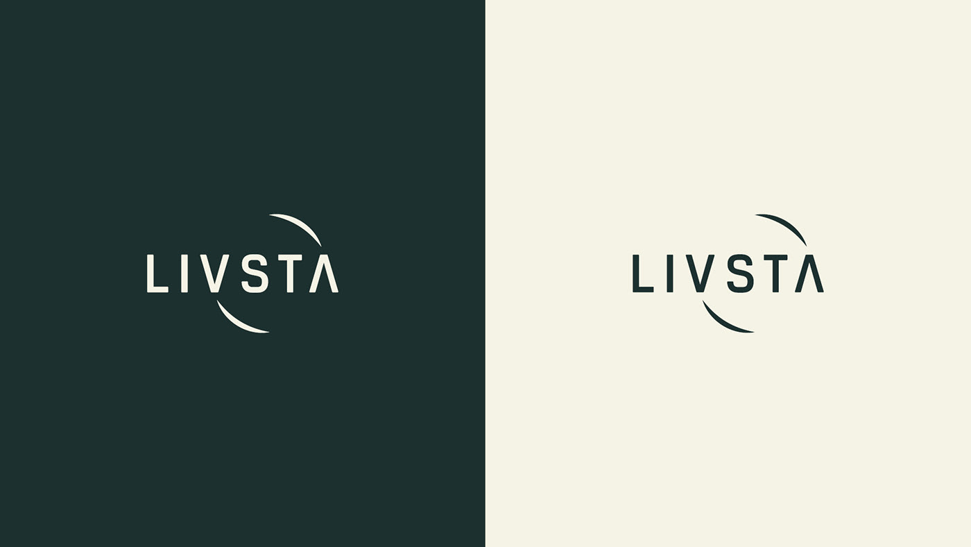

"We have created a brand that breathes new directions, new destinations and behaves like a classic travel tool. Using the circle with the arrow letters and behaving like a compass, has resulted in an interesting visual aspect that highlights the main asset of this brand."
Ricardo Carvalho, Creative Director


"The challenge on this project was to create a disruptive approach in an overexplored market. So we dug into the scenario and created a brand positioning based on the product which is the experience and then we came up with a brand identity that evokes the act of exploring and creating stories through experience."
Wagner Adão, Design Strategy Director
Wagner Adão, Design Strategy Director

"I was greatly impressed with Nacione's creative process. They fully understood our feedback and needs, and delivered on spot! It's also important to mention they were extremely professional during the entire process, and also afterwards. They really became brand ambassadors and created a close relationship, always ready to help with whatever we need."
André Lucchesi, Client

O conteúdo apresentado neste projeto é de total responsabilidade de seus autores e não representa os interesses de terceiros.
The content featured in this project is a responsibility of the authors and does not represent the interests of third parties.
The content featured in this project is a responsibility of the authors and does not represent the interests of third parties.
We’re a consulting firm specialized in branding and strategic management for entertainment, sports and tourism industry.
Visit our website: www.nacione.com
Visit our website: www.nacione.com
General Enquiries, Media & PR:
info@nacione.com
US: +1 209 6915 094
UK: +44 7511 656068
BR: +55 11 98455 0190
MX: + 52 1 55 3222 9661
© 2018. All Rights Reserved.
The content featured on this page is a responsibility of the authors and does not represent the interests of third parties.
Images are only to promote discussion and illustrate concepts and ideas.


