artistic total
experience for concertgebouw
brugge.
experience for concertgebouw
brugge.
the metamorphosis
into art institute.
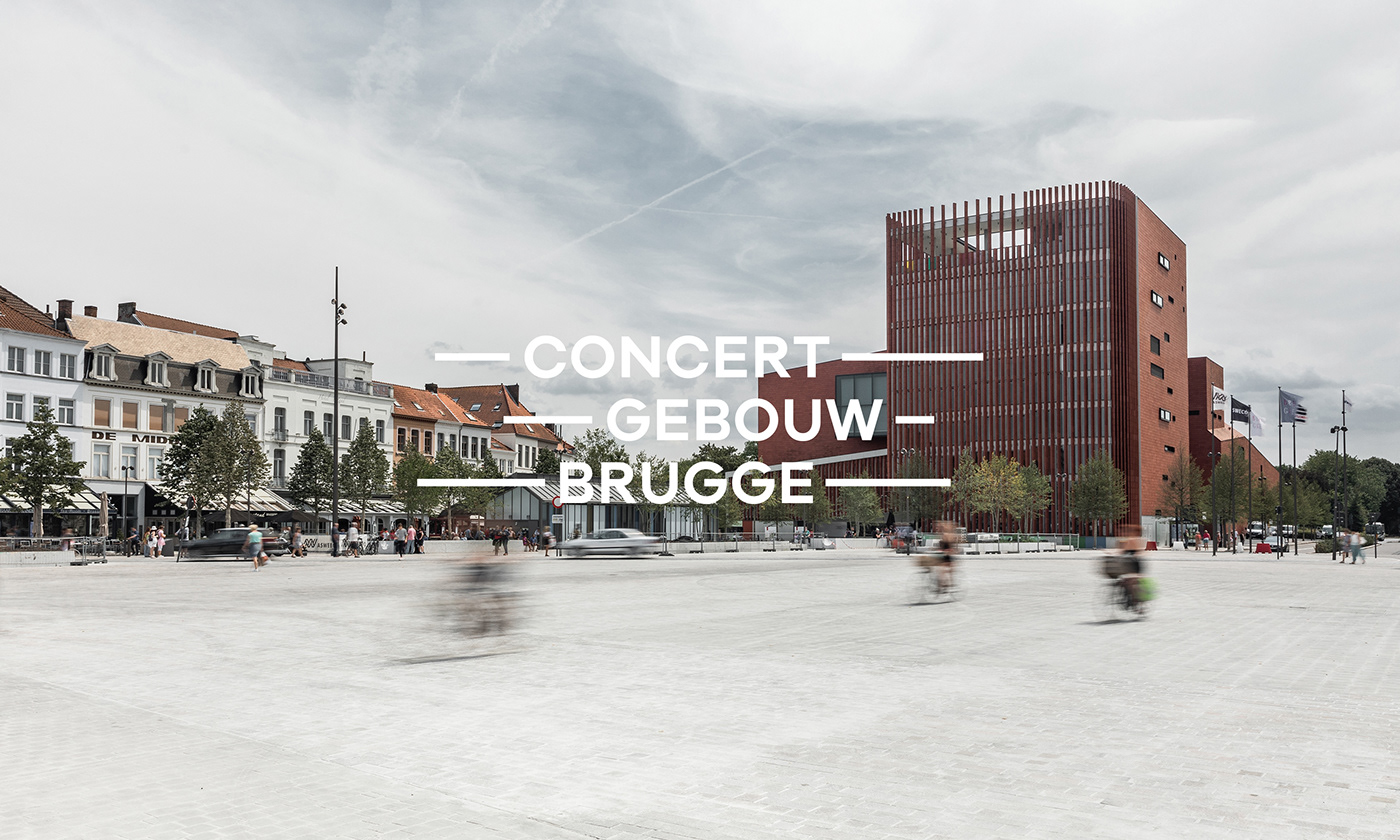
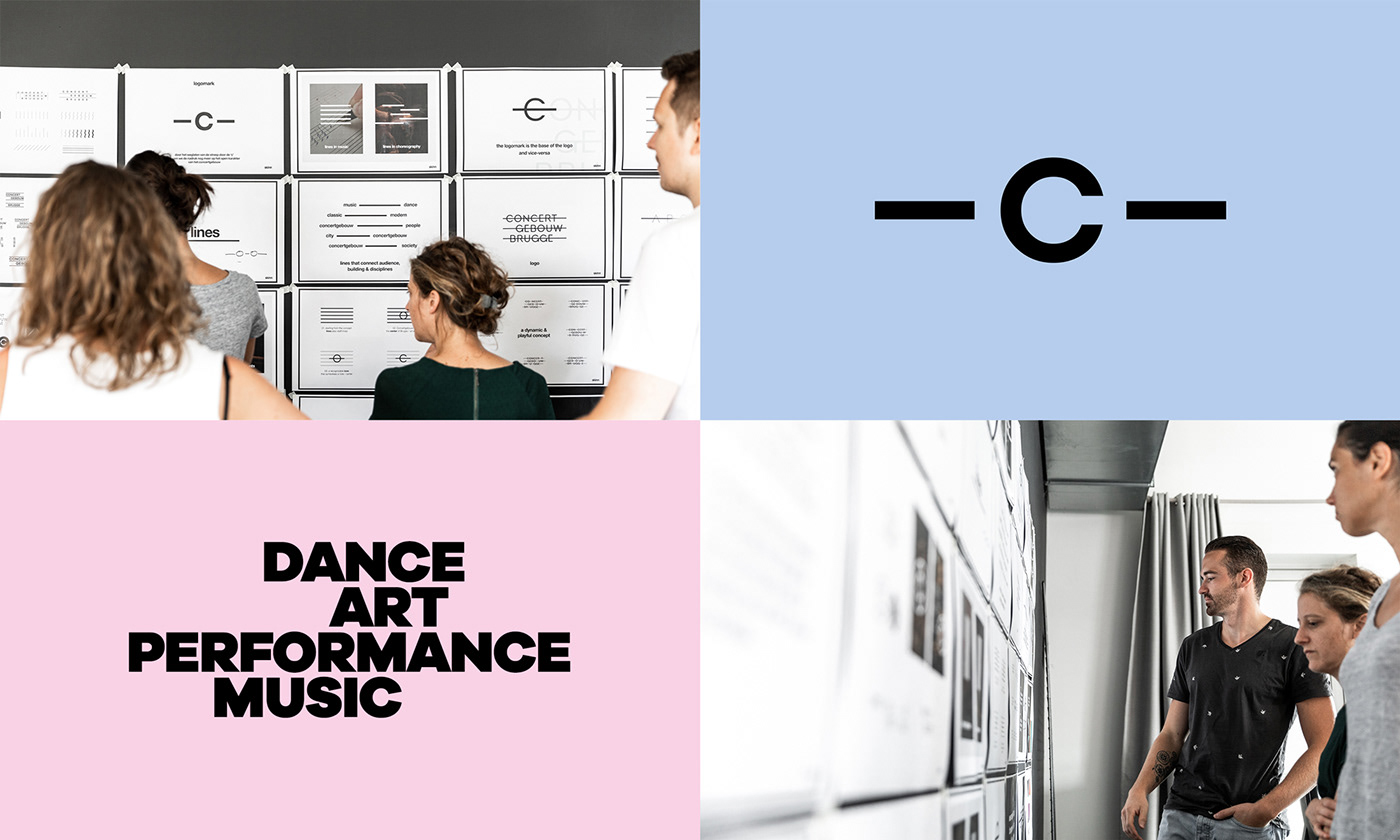
Ever since Concertgebouw Brugge’s recognition as an official Flemish Institute of Art in 2015, there has been a pressing need for a radical update to its brand. The title bestowed on it boosted its role as the cultural centre’s ambassador, which also brought a whole new set of challenges and responsibilities along with it. Cultivating its international image, providing promising young artists with a platform and diversifying the visitor base are just a few examples of what lie on the road ahead. We've stepped in to take care of the rebranding, also acquiring the distinguished title of long-term partner in communications in the process.
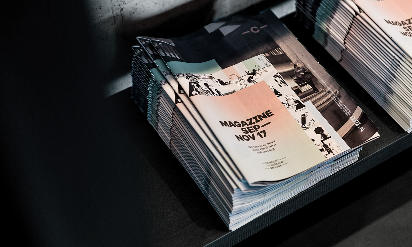
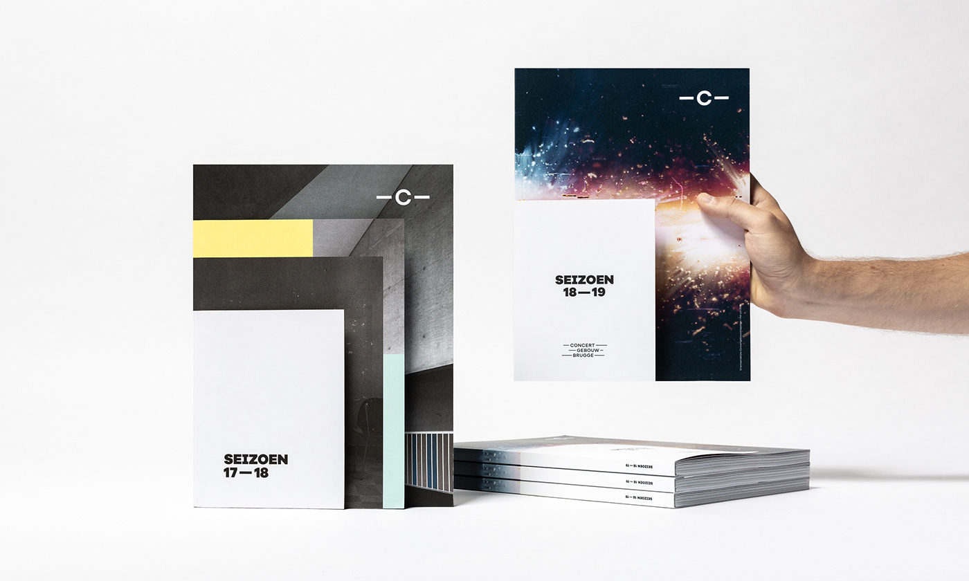
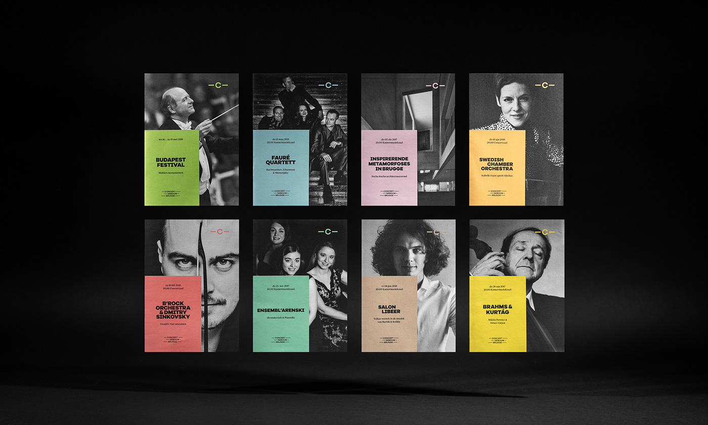
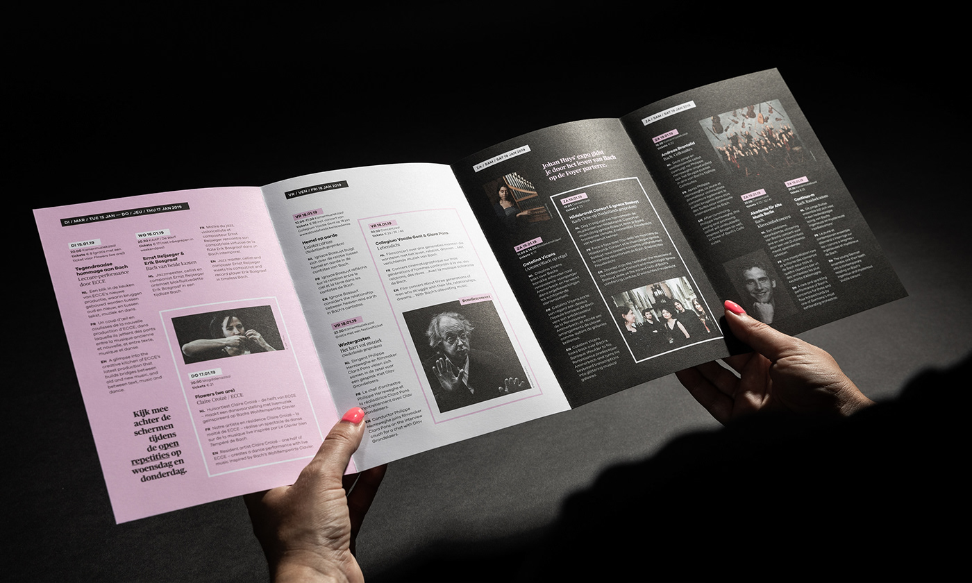
a sophisticated
interplay of lines.
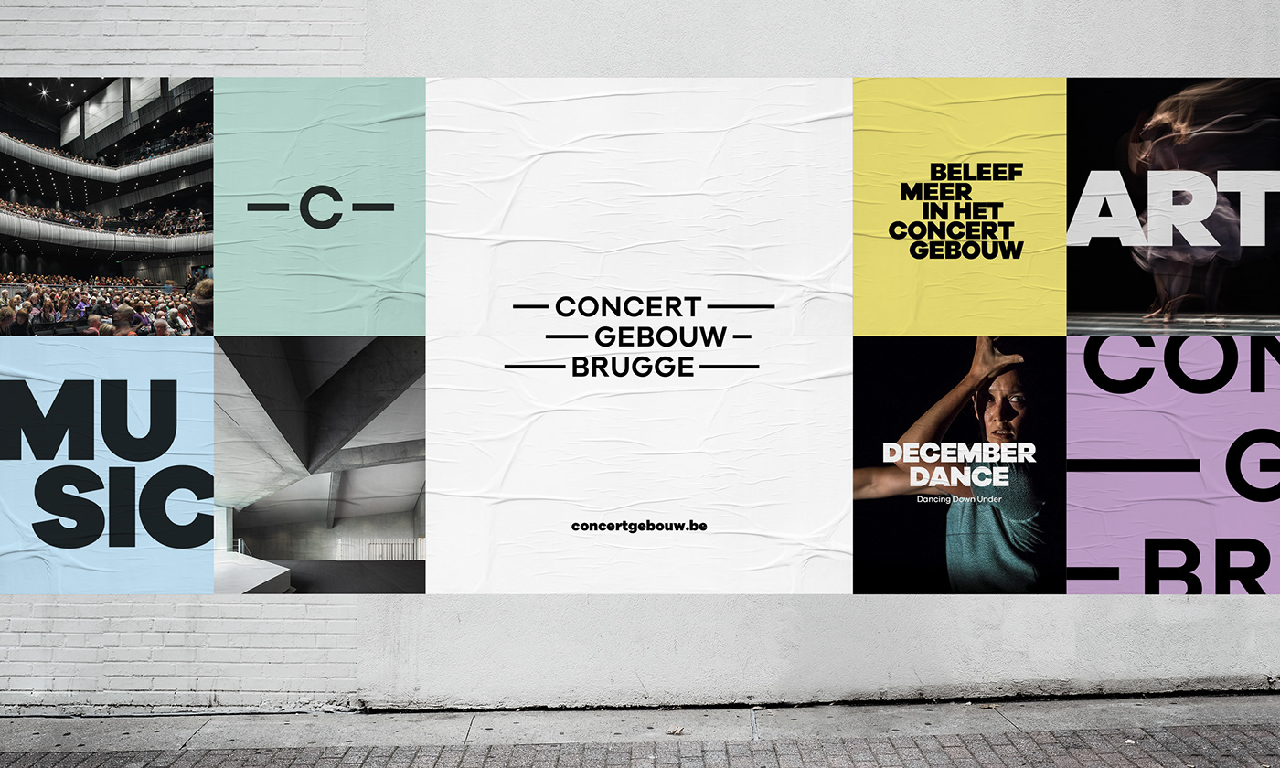
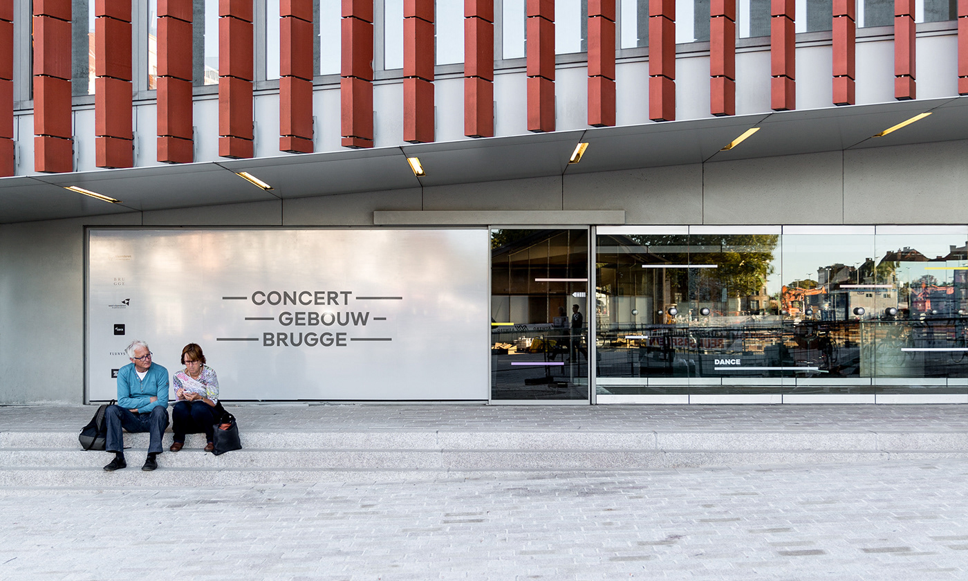
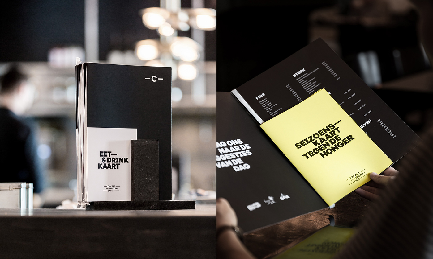
The brand's transformation went from the drawing board to a clear visual identity, where lines play the leading role and are also what form the keystone of the new logo. These lines characterise the building's architectural highlights along with the myriad lines to be found strewn across sheet music, in the choreographed flow of a dance or a theatre piece, and in the shapes of instruments. They are the symbolic ties that link artist to audience and vice versa. Not only the characteristic line work, but also the soft colours, purity and openness of the spaces are recurring graphic elements. These became the building blocks of a uniform brand experience that works equally well for every communication tool.
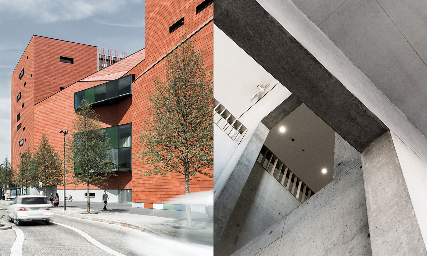
the ambitions of a
bruges landmark.
More than ever before, the brand's new dynamism is connected to the centre's future and its growing ambitions. From the very start, the intent was to reflect the layered quality of the Concertgebouw (concert building) in the new graphic style. In the past, the style was a little too cramped. The only real option for reaching the diversified audience sought after and creating an offer that transcends the limits of classical music and modern dance beyond anything ever achieved before, was to come up with an accessible style, capable of evolving with the times, and that doesn’t sacrifice its uniqueness.

from motion
to experience.
The Concertgebouw has worn many guises over the years and has always succeeded in transforming itself: for every performance, every festival, and every season. This characteristic adaptivity provides a glimpse of how the brand is created for full fluidity in motion. Dancing lines, shifting surfaces and impressive text effects coalesce and create a unique motion style.
Getting the brand and audience in motion is a non-negotiable where the cultural centre’s core message is concerned: experience is always where it’s at.
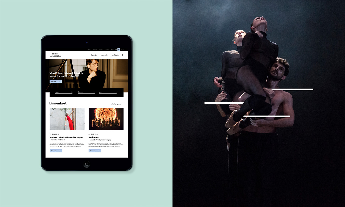
a website meant
for exploration.
We are convinced that communications via offline and online tools should merge seamlessly. We designed a matching look and feel for the site and meticulously assisted in UX, wireframing and other essential trajectory elements throughout website development.