TASK & SITUATION
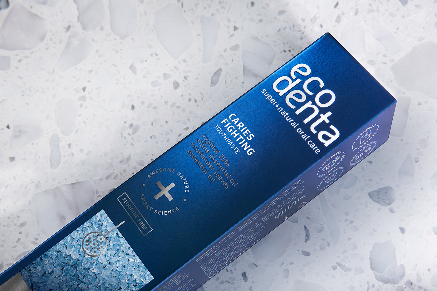
Created in 2011, Ecodenta is the hero brand of the BIOK Laboratorija. The expert line includes products that fall in the semi-premium category, which often has a solid focus on science. Toothpastes in this line are made by having nature’s finest ingredients mixed to perfection through modern science. The line is for people looking for professional products of oral care, that’s why on occasion dentists are invited to join the lab team to create oral care products. For example, the caries fighting toothpaste with xylitol was created in collaboration with dentist I. Misiūnienė.
Ecodenta is the third most popular brand in Lithuania among toothpastes and mouthwash. Export sales are growing rapidly not only in the Baltics but also in Western Europe. The main markets for export with the biggest growth in sales are Great Britain, Poland, Benelux countries, Germany, Finland, Denmark, and Austria.
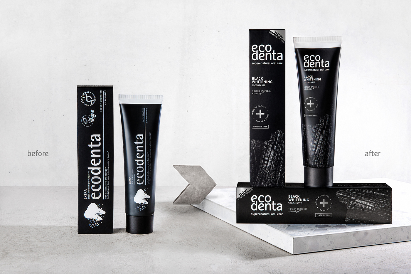
However, the brand’s design concept from 2011 doesn’t fit today’s trends and therefore can’t properly reflect the strengths of the product line. That’s why a few goals were set before going global: the logo and packaging had to be renewed; a consistent identity of the brand had to be established; the USP’s of the products had to be reflected clearly; the dilemma of the horizontal and vertical placement on the shelves had to be solved. Also, recognisability had to be preserved, but the look needed to be more premium.
SOLUTIONS
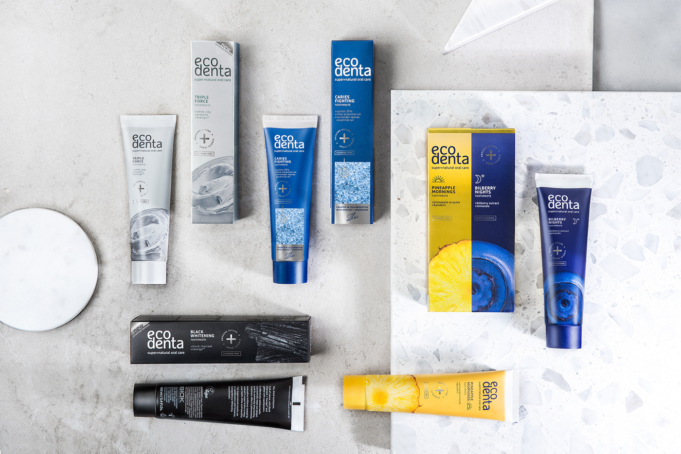
We’ve renewed the logo of Ecodenta: two lines made it compact and comfortable to use both horizontally and vertically. We’ve basically created two principal display panels (PDP) for the packaging. The vertical PDP hints towards cosmetics, in other words, we used the look of a more expensive category. Whereas the horizontal PDP is great for the typical placement in Baltic supermarkets chains.
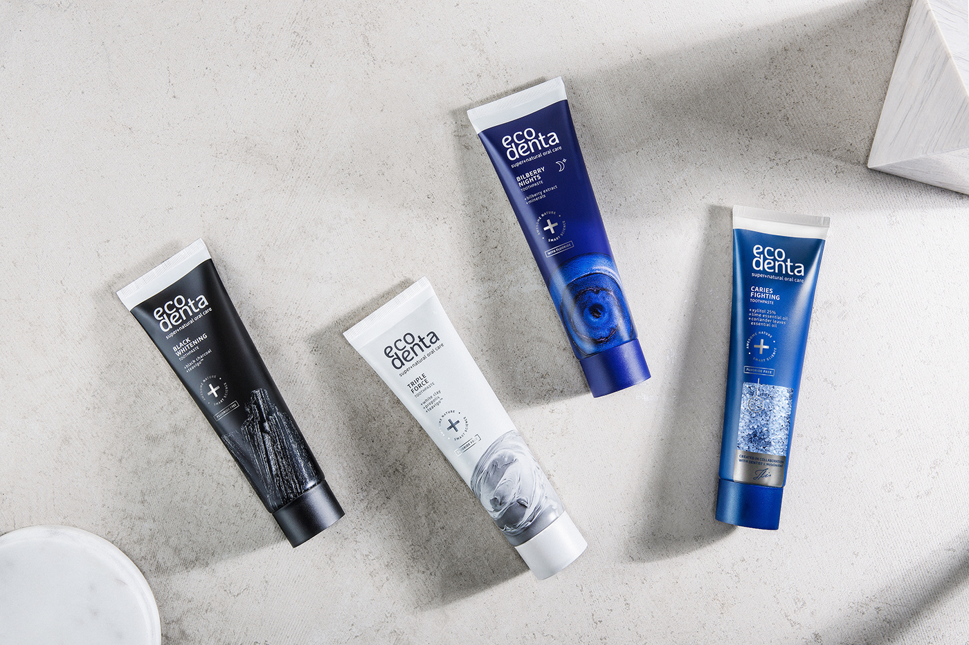
Ingredients get the most attention in the expert line, so they became the axis of the graphic solution. Superstars, if you will. We’ve created a clear system of describing ingredients and their exceptional qualities, at the same time strengthening associations with science and innovation by designing a cross element that looks quite medical. We’ve also used metallic surfaces and silver foil that the target audience loves.
We’ve focused on the packaging as well as the tubes themselves, which spend way more time in a buyer’s home. The main difference separating this product from other toothpastes is that the backside of the tube doesn’t have an enormous amount of unreadable information on it. Instead, the tubes are supplemented with stories about toothpaste – a pleasant and comfortable read.
Client: BIOK Laboratorija
Head of marketing: Ieva Čepononė
Brand manager: Ugnė Steliulionytė
Agency: étiquette
Design strategy: Edvardas Kavarskas
Art direction: Gintarė Marcinkevičienė, Edvardas Kavarskas,
Irmantas Savulionis, Gordana Lucic / 210KG (NL)
Graphic design: Gintarė Marcinkevičienė
Prepress design: Žymantas Abromaitis
Account management: Estera Tamošaitytė
Copywriting: Roger Matena / 210KG (NL)
Printing manufacturing: Albéa, Garsų pasaulis
Product photo shoot: Martyna Paukštė
-
-
© étiquette, 2018, Vilnius


