

To create a thorough brand translation of Netflix, I had to fully understand the personality and concept of the brand. Therefore, I spent a good amount of time on simply studying the brand itself through not only their websites but also articles written from the perspective of “the others.”


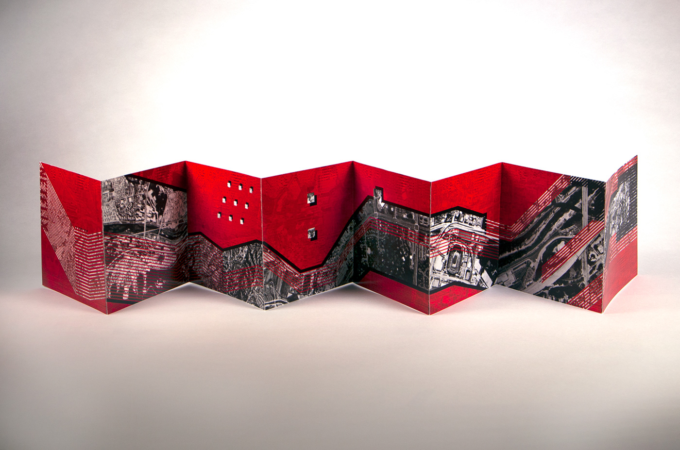
With the gathered materials, I created multiple studies attempting to portray the qualities Netflix contains. Taking a very abstract approach, I developed a symbolic representation of the brand with sequential change. The process of designing the accordion book was pure experimentation of vectors, pixels, and both combined together.
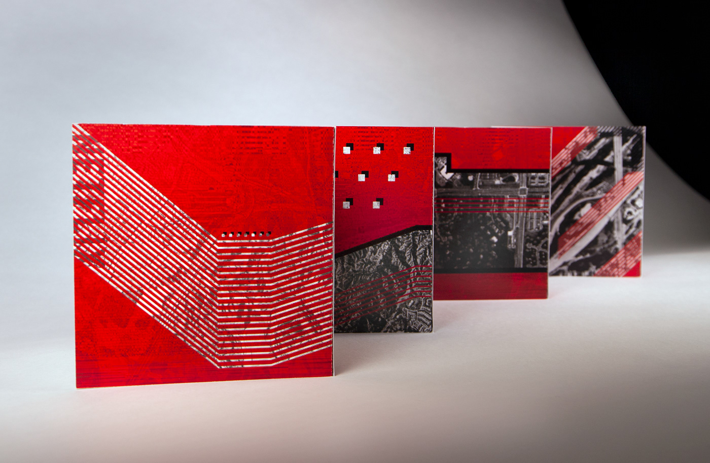
Because the brand I have chosen did not have a physical product that would represent them, I had to take an abstract approach to their qualities. It was a challenge for me to create my own designs from scratch, not being inspired by physical objects, and to develop an aesthetically pleasing graphic from them.
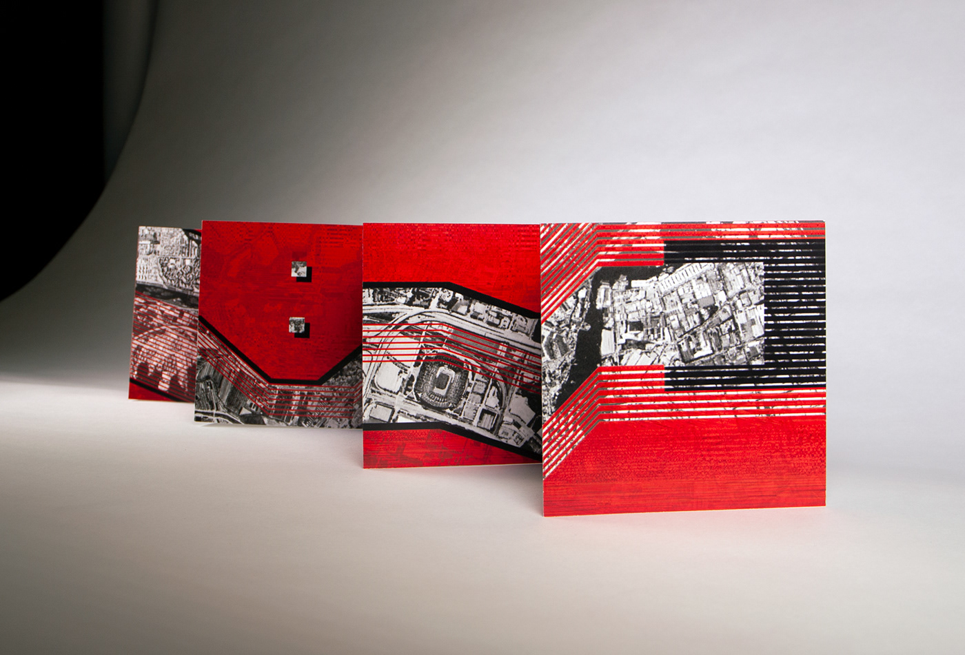
Making multiple variations and pushing myself to experiment more with the Adobe software eventually led me to a “happy mistake” which ended up becoming the foundation to my final design. With minor adjustments and refinements, I created my brand translation of Netflix.

Thanks for viewing!