artinformal
Relationship between two points
Relationship between two points
artinformal is expanding to a new space. The aim of the rebranding was to update and refresh the current format to a more dynamic, flexible, cohesive and modern approach when it comes to the identity. We took inspiration on how artinformal started where there is always a relationship between two (2) points - the artist and the gallery, the audience and the space, the collector and the curator, creative exchanges and encounters.
The basis of the word-mark is derived on the characteristic of the modified typeface. The logotype in a lowercase exude an approachable and casual vibe since we are revolving around the word "informal" which implies the characteristic of the gallery which is relaxed, friendly and approachable in nature.


The basis of the dots was derived from the abbreviation of "ai" since it has been the vernacular to ground-zero (artinformal greenhills) . The initials were dissected to create a visual cue, creating an unconventional approach or the absence of procedures (which is still related to the word "informal"). This element also supports the flexibility of the designs for all materials.


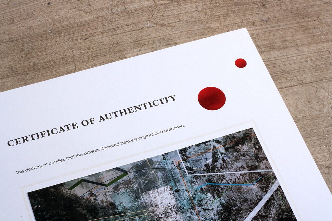
Certificate of Authenticity printed in Master Smooth White 120 gsm. with foil stamping and blind spot UV lamination. C4 envelope printed in Plike Burgundy 140 gsm printed in white ink. Business cards printed in Astro Bianco 230 gsm with blind emboss


artinformal curated show invite uses an allocated grid that accommodates various range of color combinations for flexibility and typographic layout for consistency

artinformal curated show invite uses an allocated grid that accommodates various range of color combinations for flexibility and typographic layout for consistency


