


Challenge
ENCE GmbH is a Swiss based manufacturing and engineering company completing projects with industrial equipment of leading world corporations.
We were expected to redesign an already existed corporate identity, so it would get a more neat and modern look.
Problem
To get started we were searching for a technique that would distinctly represent the character and occupation of the ENCE GmbH brand. Our concept was inspired by Swiss design school, which is based on principles of cleaness, clarity and objectivity.
Solution
Here we go. We updated colours of identity by making it flat and double-coloured. We also made green even greener in accordance with eco trends.
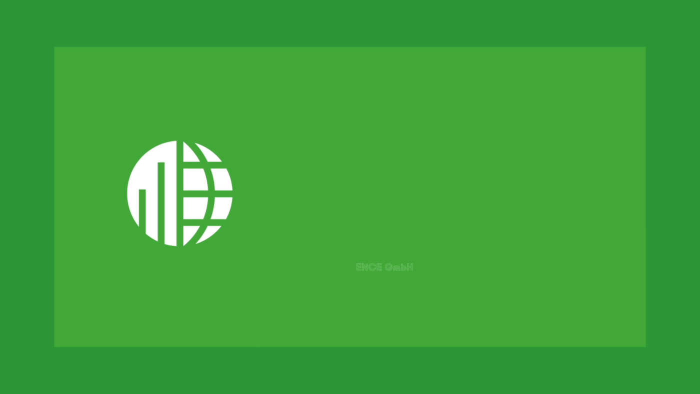
We simplified logo by rethinking it in minimalistic style. Though only circles and straight lines are used, sign is clear and readable. Pipes stand for industrial character of Ence GmbH business and the globe – for its internationality. “Striped” font also reminds of hollow pipes.


Combining simple geometric figures allowed us to make up modular grid, diagrams, graphics and contributed to variability of identity.
Helvetica font – another achievement of Swiss design which puts focus on content rather than on form.


Vladimir Kulikov — art director
Artem Lukichev — art director
Anna Svarovskaya — designer
Victoria Kuzmina — designer
Artem Lukichev — art director
Anna Svarovskaya — designer
Victoria Kuzmina — designer
Julia Tarnovitskaya — designer
Maxim Stekolshchikov — motion designer
Maxim Stekolshchikov — motion designer
Michael Tsvetkov — motion designer
Aleksandr Medvinsky — account manager
Aleksandr Medvinsky — account manager


