

Redesign MICA Enrollment experience
If you were a student, you would understand how stressful and inconvenient the enrollment experience is. Maryland Institute College of Art students including myself are not the exception. We have been struggling with our enrollment system and complaining about messy and outdated interface which makes the whole process unnecessarily complicated. Therefore, Allison Poon and I decided to redesign the interface and explore the way to improve the enrollment experience.
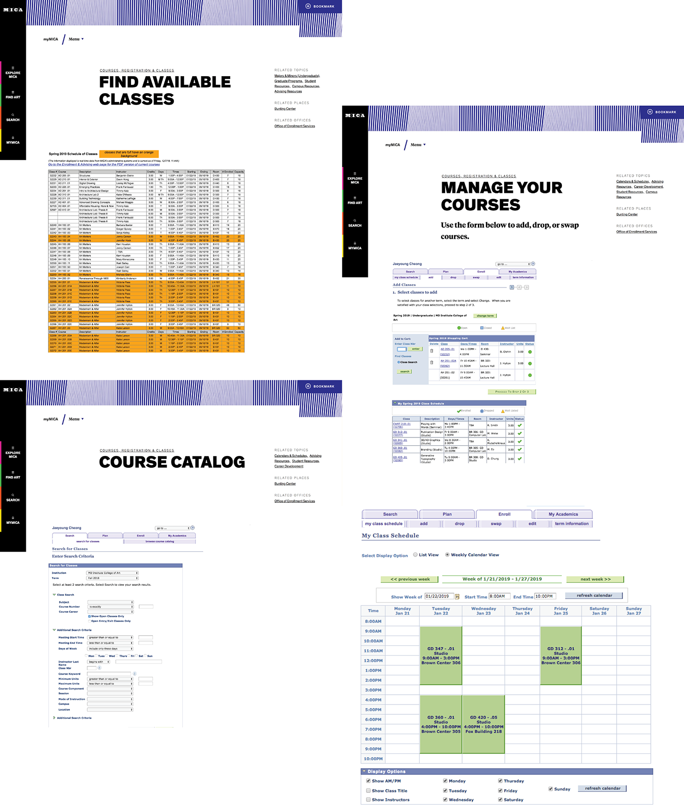
original MICA enrollment pages
These screenshot images above are showing our current system. We updated our school website recently, but they are still using old interface for the enrollment system. As you can see, it does not have good information hierarchy, and it is poorly organized. The students have hard time navigating and finding what they want through current system. For our 3 weeks long project, we narrowed down our goals to few important items.
+ create more emphasis on your degree plan
+ involve the calendar in the scheduling process
+ make the system look cleaner and easier to use
+ make the enrollment process easier
+ possibly try to make more consistent with MICA branding
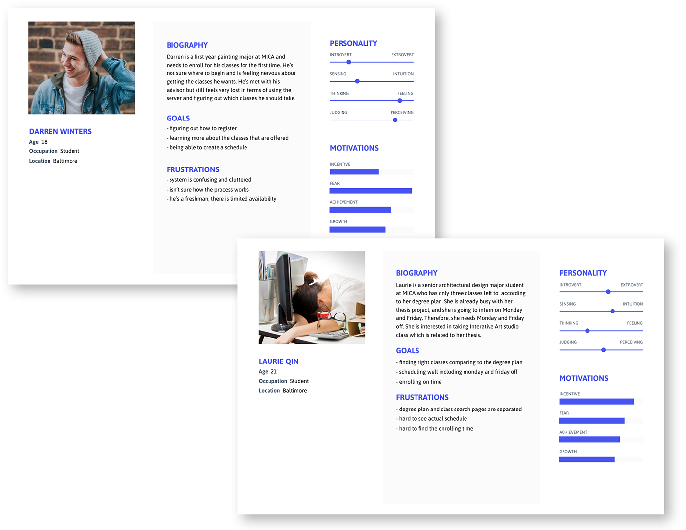
personas
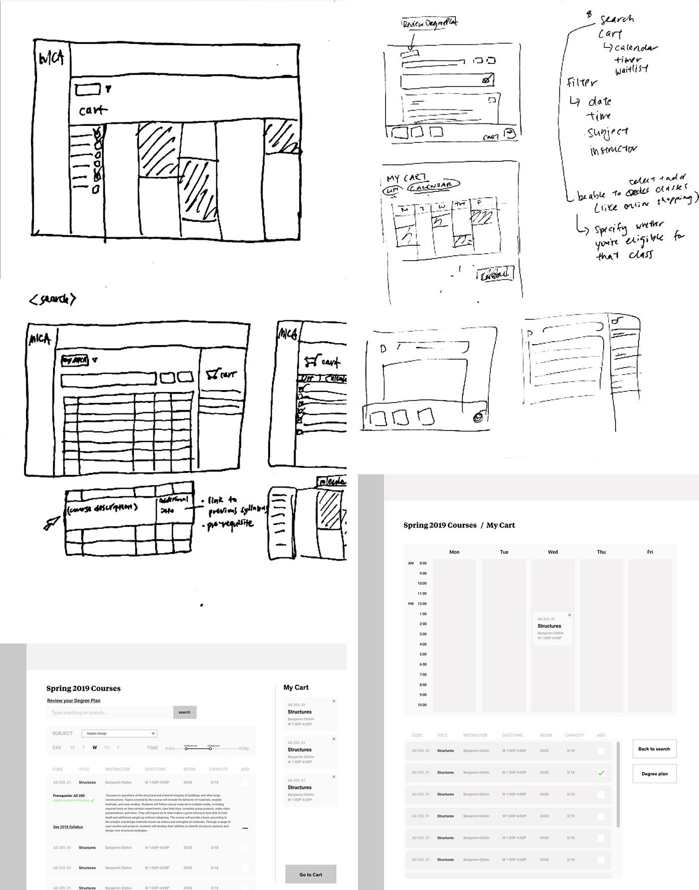
initial sketches
The personas that we created were a freshman and a senior to show the contrasting experiences. They brought up the several problems that we wanted to tackle. Based on that, we created some initial sketches and the wireframes. We conducted user testing with 7 people with our initial wireframe so we could revise and improve our final product.
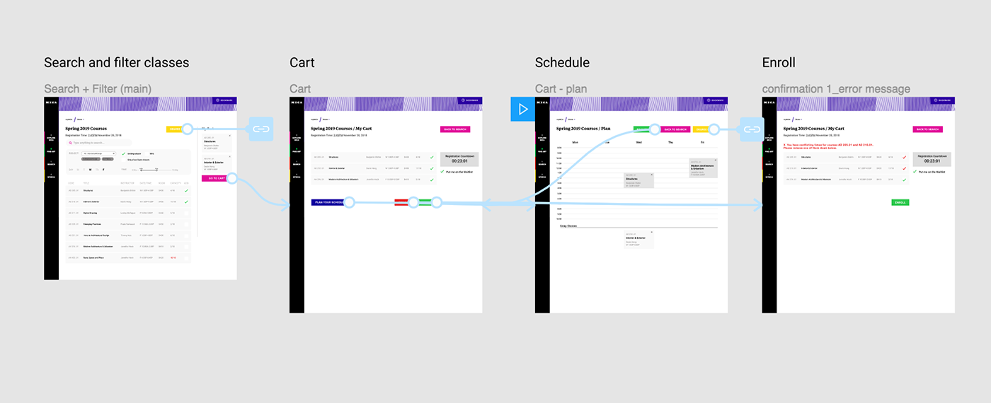
user flow
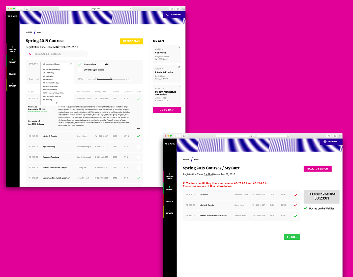
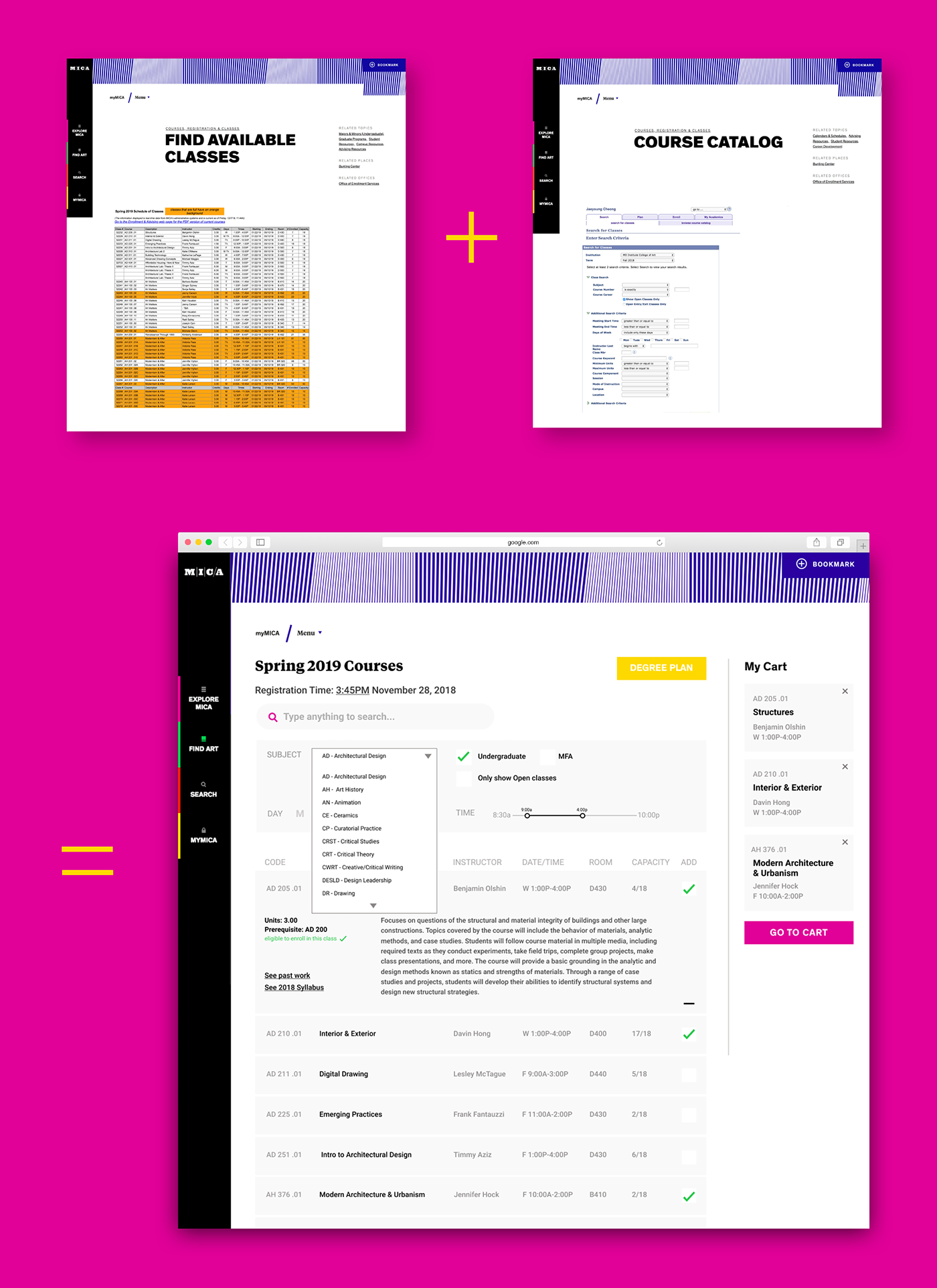
This page is the page that students can search for any classes and filter the results based on their subject, day, time, program. In comparison to the old system, students can directly add classes to the cart. We also included class description, past work and syllabus. Link button to the degree plan is another feature that we added. We felt it is important to check the degree plan for students in order to know what classes they need to take. On the cart page, we added warning message when they have conflicting times for the courses they added. Registration time and countdown is also new feature for students to easily find when is their designated time slot.
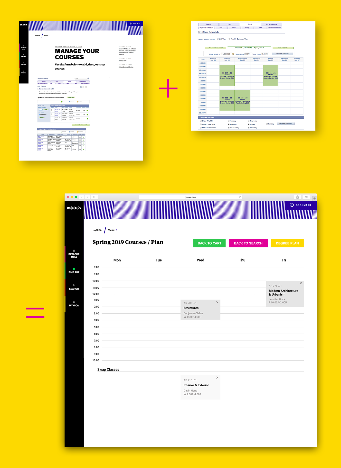
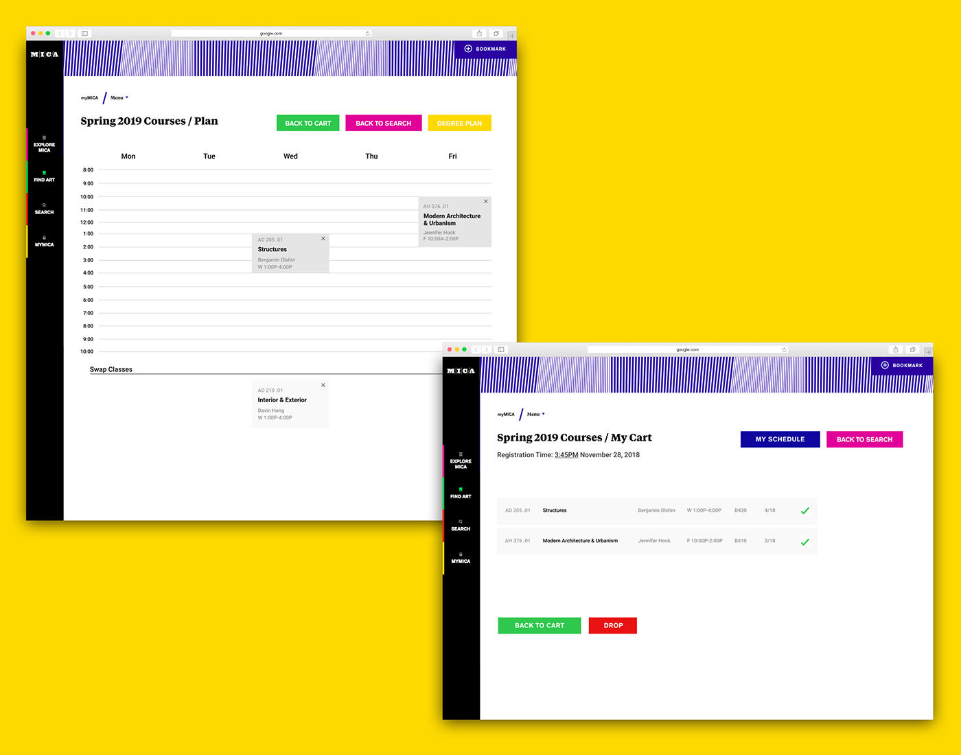
This is a newly made page from the research and our own experience. We found out that students usually plan their schedule ahead of time with google sheet, excel or writing down to visually absorb how their schedule would look like. So we created a space that students can do that during the process. They can add and swap classes in their cart and visually carve out them.
Test our prototype here > https://bit.ly/2PkVvxL (use full-screen mode)
Thank you for visiting 8^)


