ノンストップ
nonstop
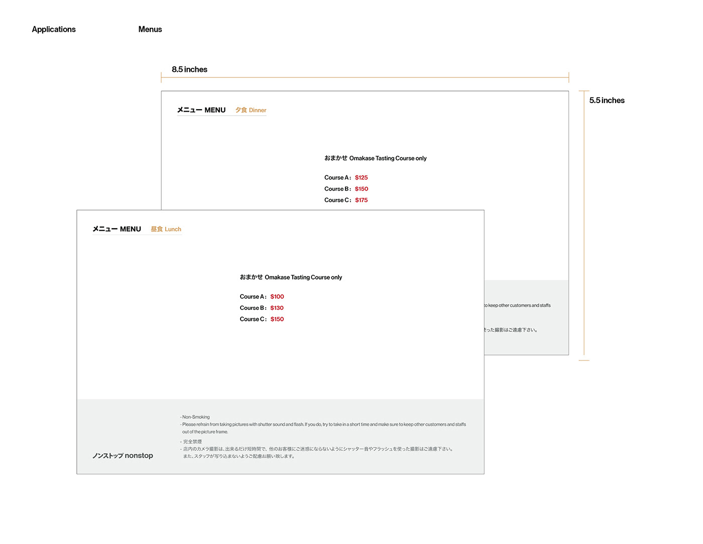
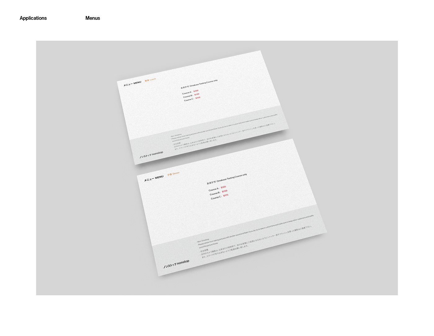
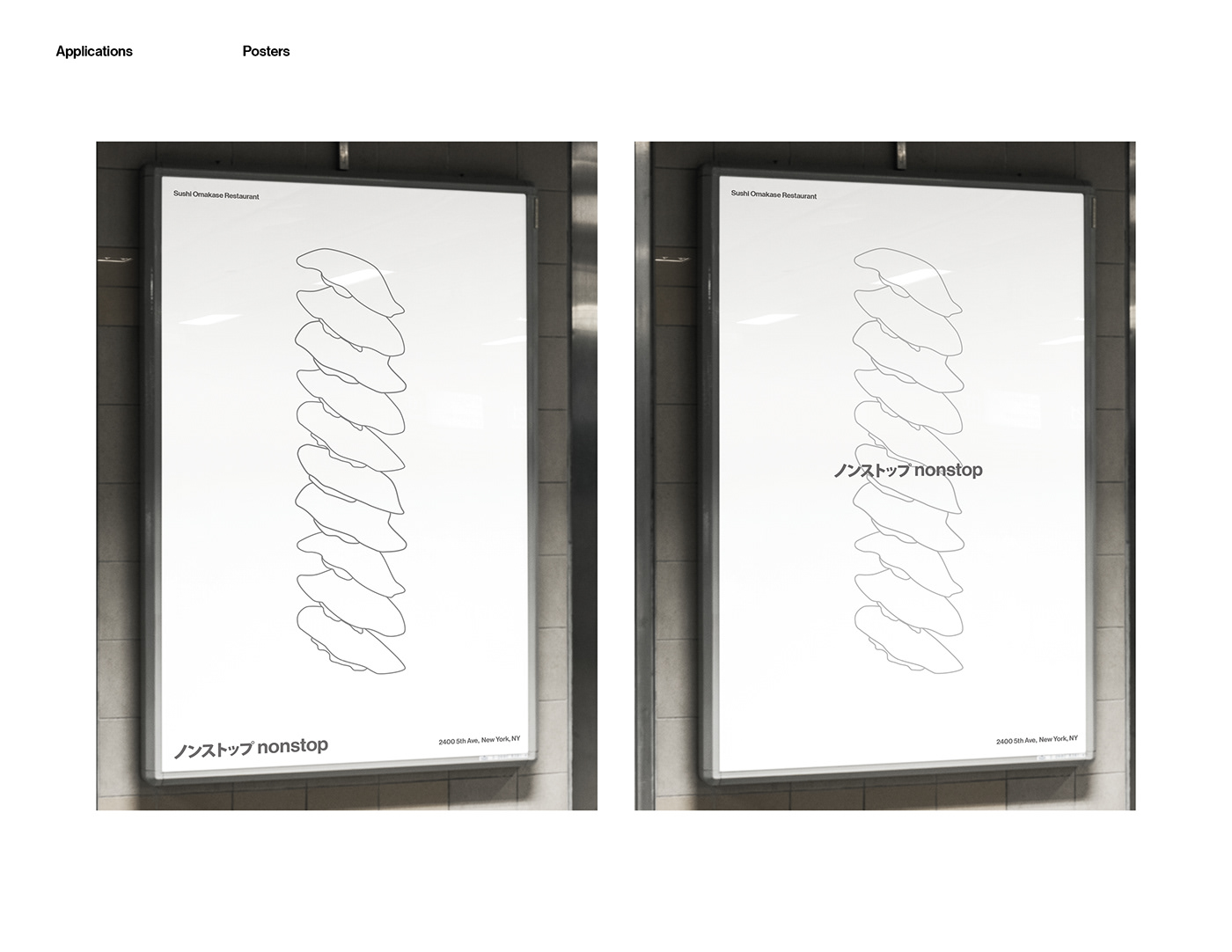
This project is about making a brand for a restaurant based on an interview with my typography instructor Maureen Weiss whose design works are very organized and clear. From my impression to her and the interview results, I decided to design a brand for a Japanese sushi omakase style restaurant. The name “nonstop“ means: as an omakase style sushi restaurant, the whole journey about eating is a united and continuous experience directed by the chef.
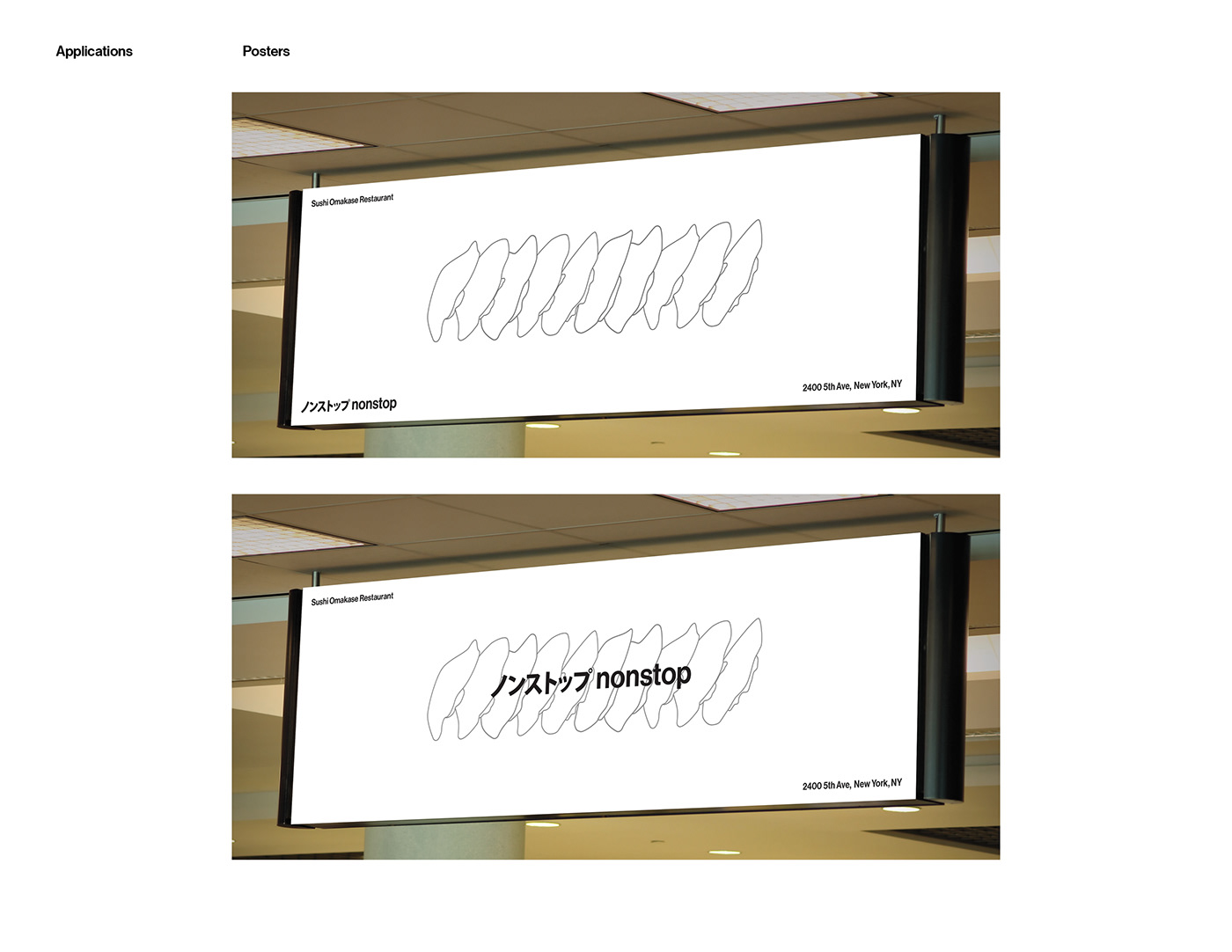
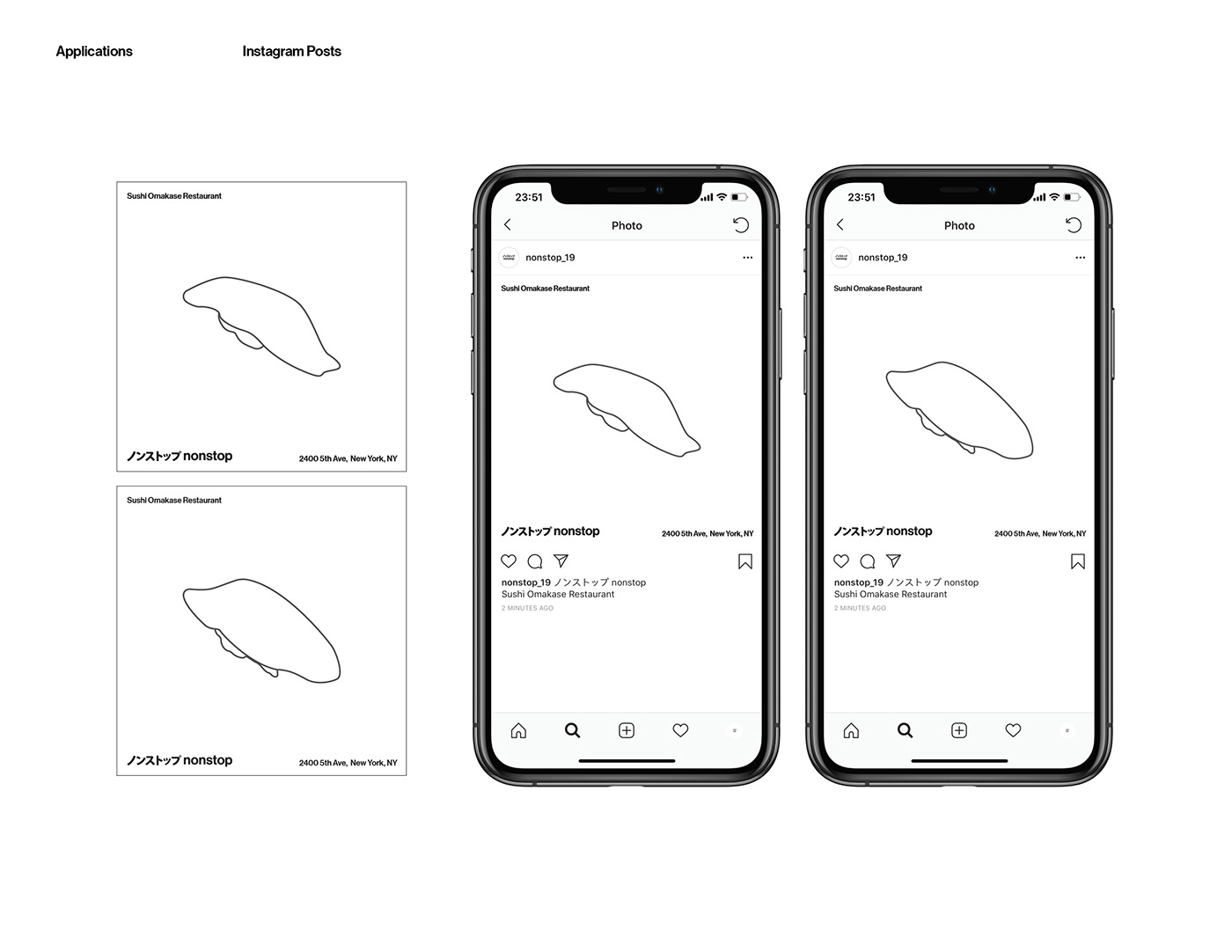
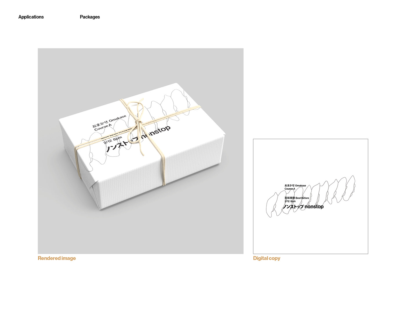
The goal of this design is to create a clean and simple sense to fit the restaurant’s identity. I want the design can be faded into the background when customers come to the restaurant. But it can also catch viewers’ attention by it’s extremely clean and simple design when advertising the restaurant.
The font used for Japanese characters in the logo is my customized version of Kozuka Gothic Pro.
Hiragino Sans and Neue Haas Grotesk Display Pro are fonts used in this project.