
OUTLOOK COMPANY SUMMER INTERNSHIP 2019
As a Design and Creative Intern for Outlook, I created various assets and concepts for the Kulipari Intellectual Property in preparation for their 2019 San Diego Comic-con panel where they announced and teased 5 new shows that expand on the main IP, as well as target audiences.
"Kulipari" is the name of the animated universe created by Outlook. The universe is a Tolkien-esque world where anthropomorphic and poisonous animals struggle to coexist.
Currently, there are two shows on Netflix that touch on different regions of the Kulipari universe. These shows were geared more towards a younger and general audience.
Find out more about the show here: http://jointhekulipari.com/
Due to my unique position as a Design AND Creative Intern, my assignments shifted between various pipelines.

The Kulipari Incubator Team in a storyboarding meeting.

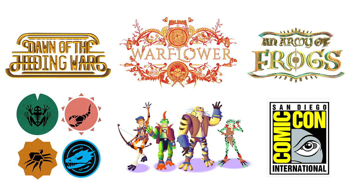
LOGOS:
Warflower
This logo is for a young adult and female-oriented branch of the Kulipari story, and was a
collaborative effort between myself and the other Design Intern, Peter Tak.
Process:
I began by translating "Warflower" into the original Kulipari logo style


Once made, the director wanted to see something a bit more decorative and illustrative. So I took a more dark and sinister approach to match the tone of the show, adding elements of menacing and threatening plant life.


The director liked the vegetation concept, but wanted to go in a more feminine and ornamental approach. After getting a better understanding of what the director wanted, I then collaborated with the other Design Intern, Peter Tak, to create a new logo.
We then assigned aspects to animate, and animated the logo in After Effects to serve as a reveal in the show's teaser.


An Army of Frogs


Process:
The director of Outlook wanted a logo for a new 3D animated Kulipari movie. He wanted it to feel grand and ancient like the Lord of the Rings and epic and vibrant like the Avengers.


I added "varnishes", shines, and framing elements to give it a metallic, archaic, and regal feel.


As this intellectual property revolves mostly around frog characters, I made the pupil reference the pattern of frog eggs. I added lili pads within the egg as well.


Once I was satisfied with the elements, I started to play around with how it looks with color.


I then tried adding a metallic gradient to mockup how it might look with metallic 3D texture.


Finally, I converted the vectors into 3D objects in Photoshop, and adjusted texture, shape, depth, and lighting.


Dawn of the Hiding Wars

Process:
This logo is for a sub-series of Kulipari that has a historical and chronicle-like mood, and I wanted it to translate through the logo. This was the original logo:


Outlook Logo
The director wanted a new logo for the company itself, and required that I include a png of a cubic Jacks as the "T" in Outlook. Although this final design was not used, a final variation of it was inspired from this process.

Process:
I began by trying many different ways of approaching the type setting.


As the company makes shows about frogs, I wanted to maybe hint at their eyes in the O's. However the eyes were too distracting next to the "T" png. I concluded that the "T" looked most balanced when the whole name was laid out horizontally.


I felt that the png of the "T" looked out of place due to its material.
So I tried creating a vectorized icon of the Jacks.


SUPPORTING GRAPHICS:
Faction Icon Loops
As supporting graphic elements for the Kulipari Comic-con panel, I created short
motion icon loops that present the factions and also hint at their characteristics.


Process:
I began by vectorizing each of the original still icons.


I then broke each icon up into movable puppet parts based around joints and limbs, then animated them on After Effects.


I also applied various textures to emphasize the qualities of each faction.


Comic-Con Panel Promotion
Comic-Con Panel Promotion
Comic-Con Panel Promotion


CHARACTER DESIGNS:
Kulipari United
The director wanted to experiment with a totally new show idea that can act as a transitional stage between very young and teen audiences. He wanted to go for a 3D animated style that made them feel fun and toy-like but still cool. Unfortunately the internship program ended before I was able to render the last character.


Process:
The objective of this project was to translate these existing Kulipari characters into a new style.
Process:
The objective of this project was to translate these existing Kulipari characters into a new style.
Process:
The objective of this project was to translate these existing Kulipari characters into a new style.


The director wanted to style to be some combination of these three references, once of them being a previous approach to the style.
The director wanted to style to be some combination of these three references, once of them being a previous approach to the style.
The director wanted to style to be some combination of these three references, once of them being a previous approach to the style.


I felt a fun combination between a flat graphic style and a 3D animated style could be fun, so I began by using vectors to create geometric and shape-based interpretations of the characters.
I felt a fun combination between a flat graphic style and a 3D animated style could be fun, so I began by using vectors to create geometric and shape-based interpretations of the characters.
I felt a fun combination between a flat graphic style and a 3D animated style could be fun, so I began by using vectors to create geometric and shape-based interpretations of the characters.


I then applied layers of shading and lighting gradients to give the flat vectors dimension.
I then applied layers of shading and lighting gradients to give the flat vectors dimension.
I then applied layers of shading and lighting gradients to give the flat vectors dimension.