Project Notes
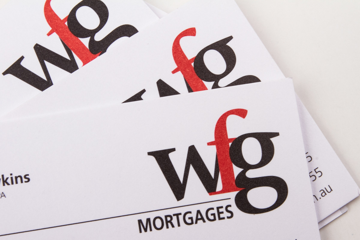
The client needed a design that communicated the type of business it is to the lenders and the quality of service it offers to the applicants. A simple but strong graphic is the perfect representation that the client was looking for. Done in flat colours, the logo is striking in its simplicity. Lower case was used to soften the logo a little to help the relationship between business and potential clients while still using a serif font which talks to the business sector