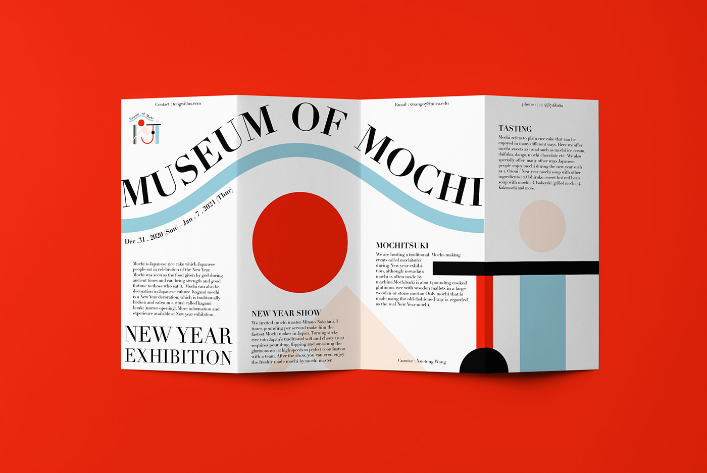
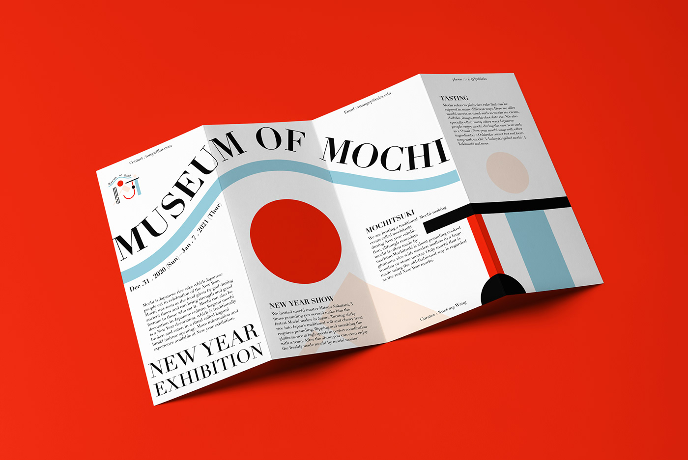
Museum of Mochi
Mochi is Japanese rice cake originated from China, Later become a traditional food eaten around Japanese New Year. In modern days, Mochi has already become a popular food that is eaten year-round and have been developed varietions around the world. Museum of Mochi dedicates to Mochi and Mochi making. The concept of the museum branding is not only to present variations and flavors of mochi, but also the tradition and culture behind Mochi to the world.
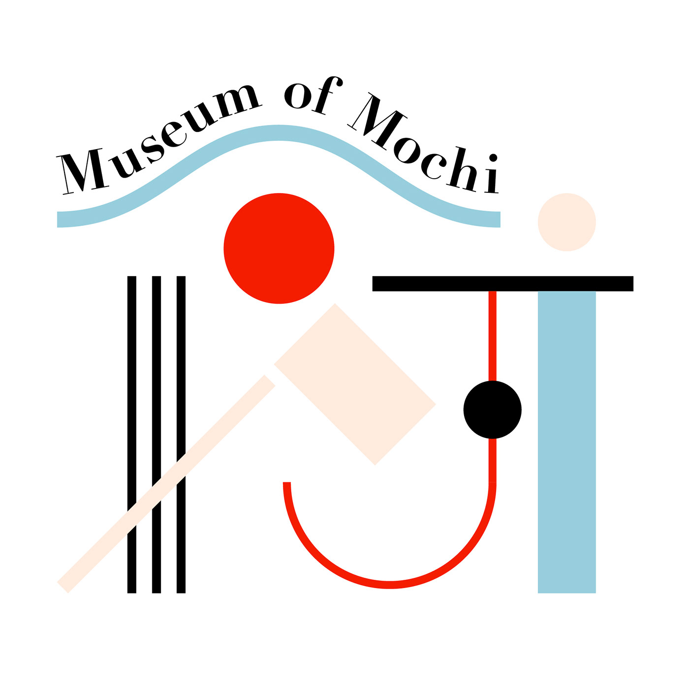
The logo design is based on Japanese Kanji character 餅, which means Mochi. This font design combines the basic Kanji character shape and some Japanese Mochi related elements such as Fuji mountain, sun, and Mochitsuki tools. The whole shape also can be seen as an architecture, which stands for museum.Color wise, Red symbolizes new year and Japan; Blue symbolizes Mountain and water. Cream symbolizes Mochi.
Logo Sketch

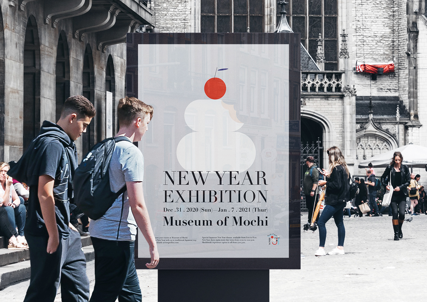
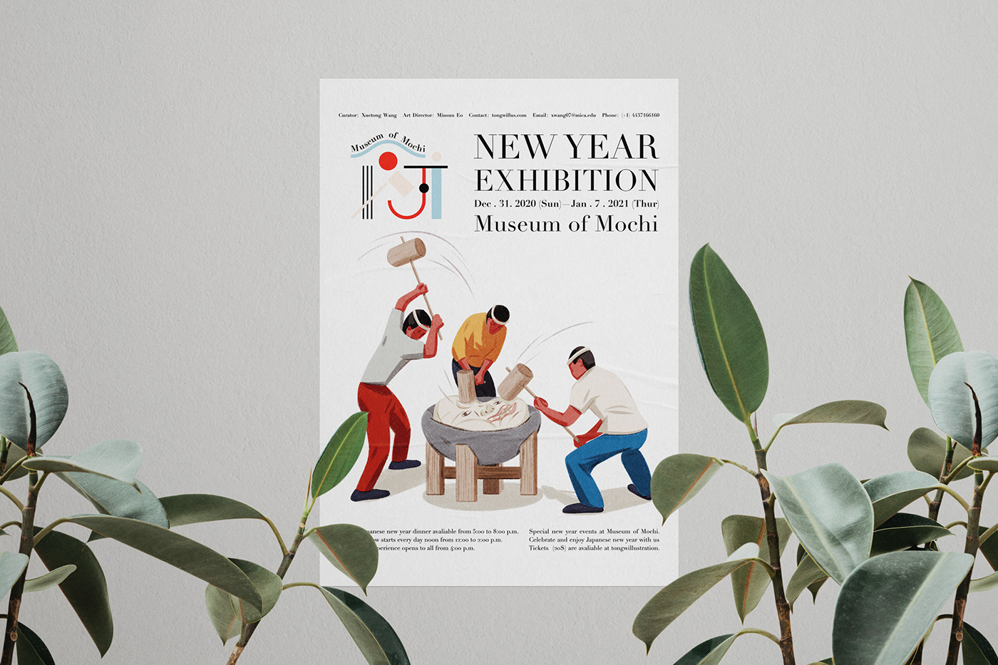
Poster
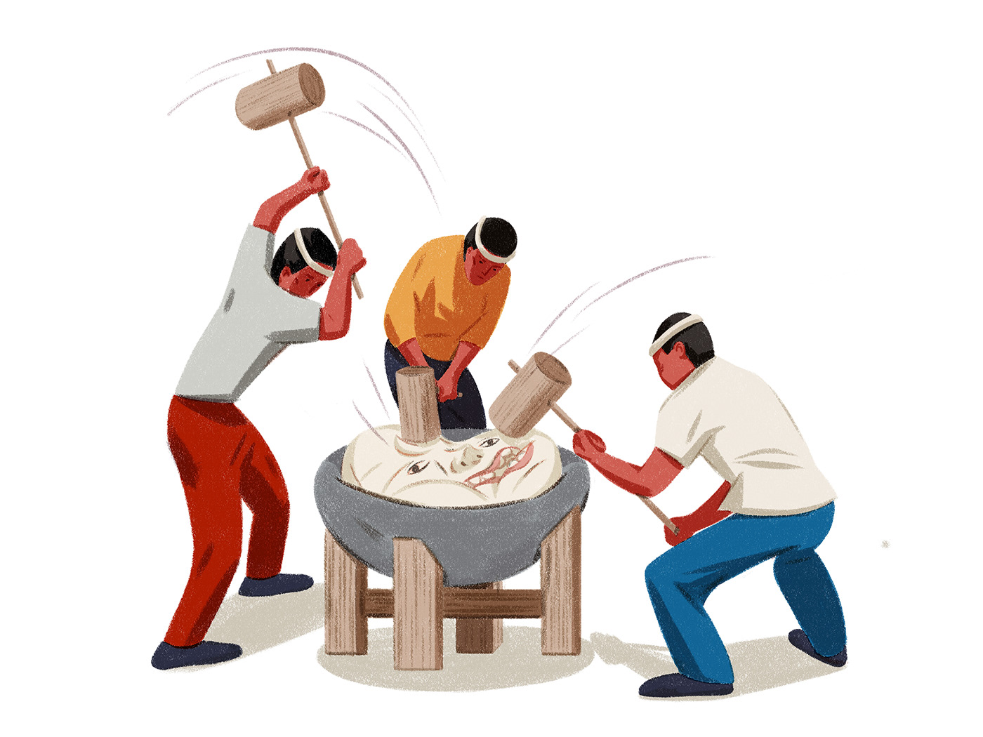
I designed 3 versions of posters, the first one is based on the logo of Museum of Mochi; The second one is the shape of Kagami (mirror) Mochi, which is a classic symbol of Japanese new year. It consists of one tangerine, a small Mochi and a big Mochi, symbolizing saying goodby to the last year and welcoming the next year. The third one is an illustration of Mochitsuki events.