

GREY AREA DESIGN STUDIO
The Grey Area is an imaginary design firm that is based on both the United States and South Korea. We provide creative solutions in the areas of branding and many other applications. We encourage conceptual approaches to the given prompts and will guarantee a successful build of an identity of your brand.
This individual design studio is for people who need help with establishing their own brand identity. We works with anything that is related to the graphic designing field. However, our focus in mainly on Branding, Motion Graphics and Printing Collaterals.
회색구역 스튜디오는 한국과 미국에 기반을 둔 가상의 디자인 스튜디오 입니다. 회색구역은 브랜딩과 다른 여러 시각디자인 분야에서 창의적인 해결책을 제공하며, 그저 예쁘기만 한 디자인 보다는, 보다 의미있고 아이덴티티가 분명한 디자인을 끊임없이 연구합니다. 이곳에서 잠재고객은 성공적인 개인 브랜드 이미지 설립을 기대할 수 있습니다.
회색구역 스튜디오는 자신만의 브랜딩 컨셉이 필요한 고객들에게 가장 적합합니다. 회색구역은 시각디자인 관련 모든 그래픽디자인 산업을 모두 아우를 수 있지만, 그중에서도 주력하는 분야는 브랜딩과 모션그래픽, 그리고 편집디자인 입니다.

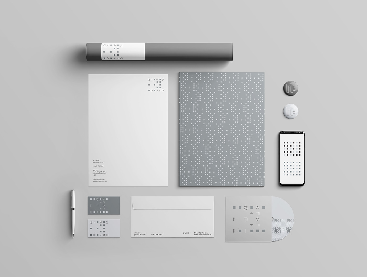
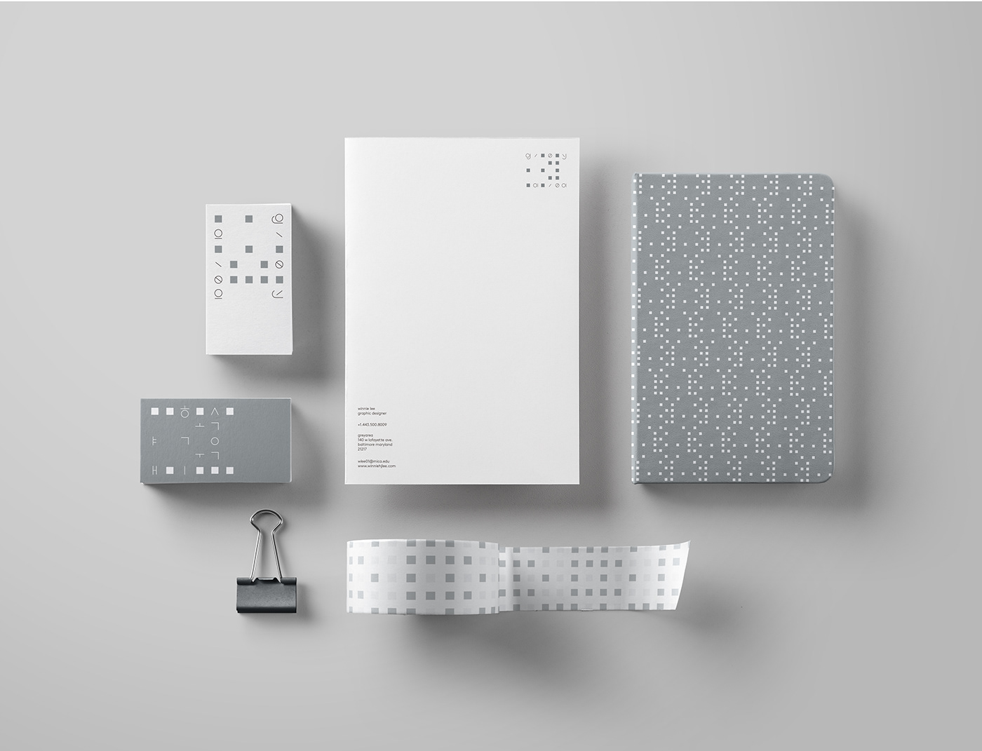
The Grey Area Design Studio’s logo has its own unique grid system. I first made a simple 4x4 grid based on the Korean letter system. Then, I divided those grids into two parts by vowels and consonants. After that, those two parts were combined together like puzzle pieces. Based on the new grid created, I made a 5x6 grid and placed different colored squares by whether space is empty or filled with a letter. Later, I inserted Korean letters in the area where it supposed to be and left the empty space with colored squares. English letters were applied the opposite way as the Korean ones.
회색구역 스튜디오의 로고는 독자적인 그리드 시스템을 갖추고 있습니다. 먼저, 한글의 특성을 살린 4x4 그리드를 기반으로 글자를 배치하여 기본 구조를 만들었습니다.
그리고 한글의 자음과 모음을 분리하여 기본구조를 두개의 구조로 다시 나누었습니다. 이후, 퍼즐조각 같이 그 두개의 구조를 비틀어 서로에게 끼워 맞췄습니다. 이후 생긴 새로운 모양으로 기반으로, 다시 5x6 그리드를 만들어냈고 기존 한글의 자음과 모음이 있는 곳을 제외한 나머지의 부분에 사각형을 배치하였습니다. 최종 그리드 시스템을 망가트리지 않을 맨 윗줄과 맨 아랫줄의 사각형들을 제외한 나머지 사각형들을 없에고 만든것이 최종 로고입니다. 영문 로고는 한글 로고와는 정 반대로, 한글 자모를 사각형으로 변환시키고 기존 한글 로고에서 사각형이였던 부분에 영문 로고를 대입하여 만들었습니다.


I also recreated the English letters based on the existing typeface. To emphasize the geometric shapes and grid system of the logo, I tried to simplify the typeface into a few lines and circles, yet not too abstract to affect legibility.
또한, 기존에 존재하는 폰트를 기반으로 로고만을 위한 새로운 영어 폰트를 만들었습니다. 로고가 가진 유니크한 그리드 시스템과 기하학적인 요소를 부각시키기 위해, 기존 폰트를 가독성이 떨어지지 않는 범위 안에서 최소한의 선과 원으로 표현하였습니다.


Thank you.