

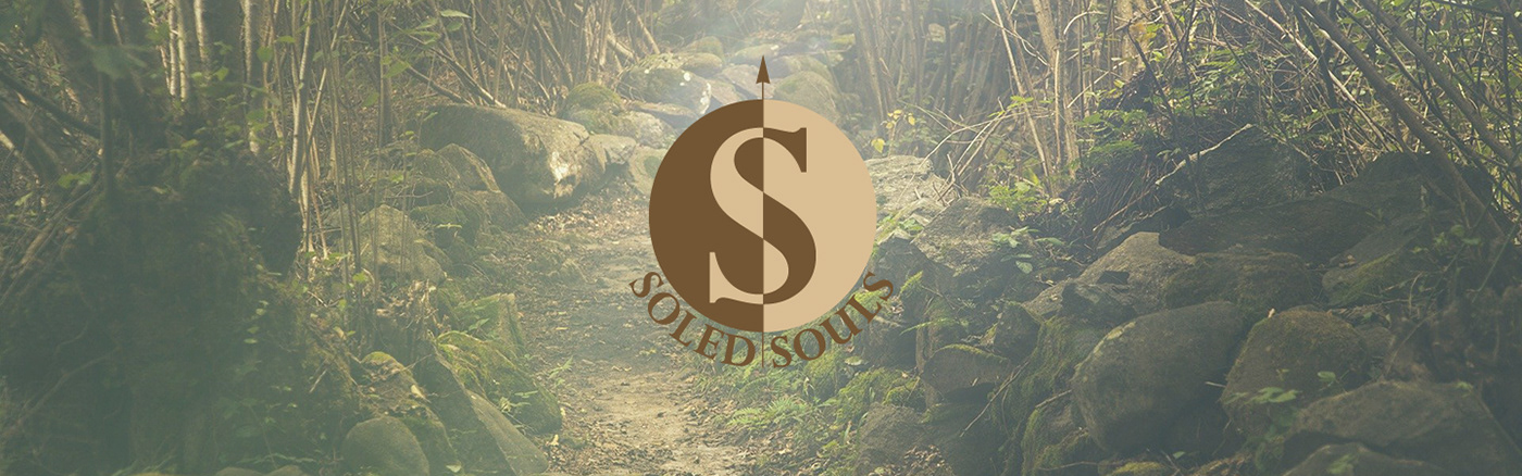
Soled Souls
Brand Identity / Graphic Design
Brand Identity / Graphic Design
Soled Souls is a fictional shoe brand that primarily carries hiking & camping shoes. For this project, I created the logo, postcards and banner designs.
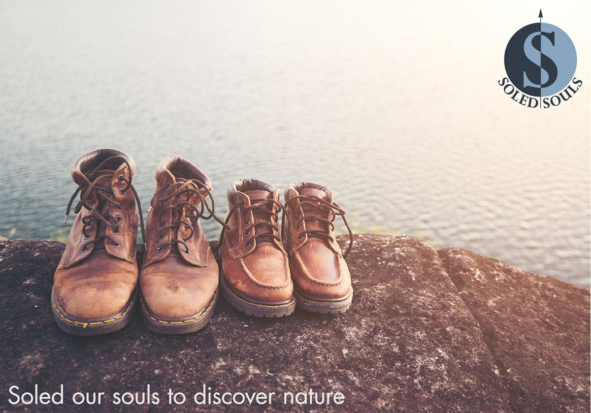
The sole is the bottom part of one's foot or shoe that touches the ground when you stand or walk. Although not commonly used, to sole or to shoe also means to equip a person (or a horse) with footwear. Thus creating the meaning behind the brand name, a soul wearing shoes for their next adventure.


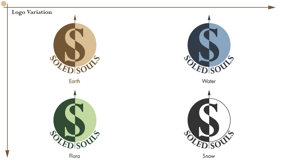
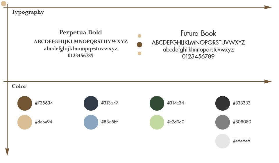
There are four color variation for the logo, the colors represent Earth (brown), Water (blue), Flora (green) and Snow (black & white) – elements you find during hiking.
Each logo is composed of a light and dark shade of one color. The contrast visually establishes two Ss within a single S. It also represents the variation in natural light, such as the difference between the sunrise and sunset. The logo is topped-off by an arrow pointing up North, similar to a compass showing the way forward.


Photograph by jcomp / Freepik (Water Postcard)
Photograph by Pixabay (Tree Banner, Snow Banner, Earth Postcard, Flora Postcard)
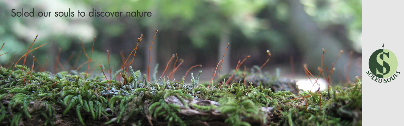
Photograph by Mariko Perry (Plant Banner)


