Charleroi Métropole
Building a solid graphic identity for a post-industrial region at the height of its urban regeneration.
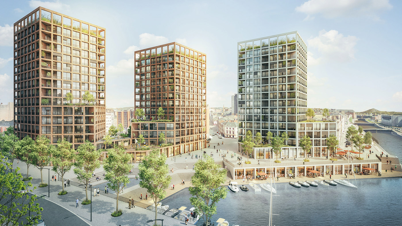
The city of Charleroi and its surrounding municipalities are at the heart of an economic transition. Old factories from the second industrial revolution are rapidly being replaced by a fabric of innovative enterprises and urban housing developments.
In a bid to communicate internationally on this process of modernisation — and to attract businesses, tourists, and future inhabitants — the Wallonia region brought together a task-force of specialist consultants and designers.
In synergy with Pam & Jenny (who crafted the Charleroi city logo) and Reed (in charge of institutional communication), we were assigned the challenge of designing a striking visual identity for the freshly christened region: Charleroi Metropole.
In synergy with Pam & Jenny (who crafted the Charleroi city logo) and Reed (in charge of institutional communication), we were assigned the challenge of designing a striking visual identity for the freshly christened region: Charleroi Metropole.

The metropolitan area is made up of 29 distinct municipalities, each with their own pre-existing graphic identity and administrative bodies.
We therefore worked towards defining a brand book on a regional and institutional scale. Creating strong guidelines for all to use would then lead to not only a recognisable visual scheme but also to a durable and practical visual toolbox for the region.


In collaboration with Belgian type designer Sebastien Sanfilippo, we created a bespoke typeface with an idiosyncratic visual and graphic twist. Each letter also exists as dropcap: accompanied by the display font these are used on posters, billboards, and overlaid on images for a striking effect.


The traditional approach of choosing a fixed range of colours that expresses a client’s personality simply wasn’t versatile enough for such a complex case. Instead, we designed a colour-picking system that defines a new palette to be used for each graphic adaptation — be it a poster, a booklet, signage, or merchandising.


Thinking ahead, we included numerous different examples of adaptations within the Charleroi Metropole graphic guidelines. These span packaging, publications, flags to business cards. Such meticulously laid-out rules form part of the 100-page style guide, and guarantee a consistent, solid future for the Metropole in terms of visual identity.


