The Messiah University logo
The design transition from Messiah College to Messiah University began in late 2018.
In January of 2019, we began the design process with parameters that focused on:
Strengths of the College logo
• It has history and is recognizable in the marketplace.
• The pillar and flame connect well to the college’s spiritual side and mission.
• It balances the theological and academic sides of the college well.
Challenges of our College logo
• The reverse is often used incorrectly.
• The rule around the icon is difficult to hold at a small size. Especially embroidery.
• The icon looked dated. It felt old-fashioned but academic.
Considerations we kept in mind as we designed
• Look for ways to balance Messiah and University so they have fairly equal weight showing the intellectual and spiritual balance
• Use a unique typeface so it can’t be easily reproduced incorrectly and it stands out in the marketplace.
• Provide options that modernize the icon.
We were to:
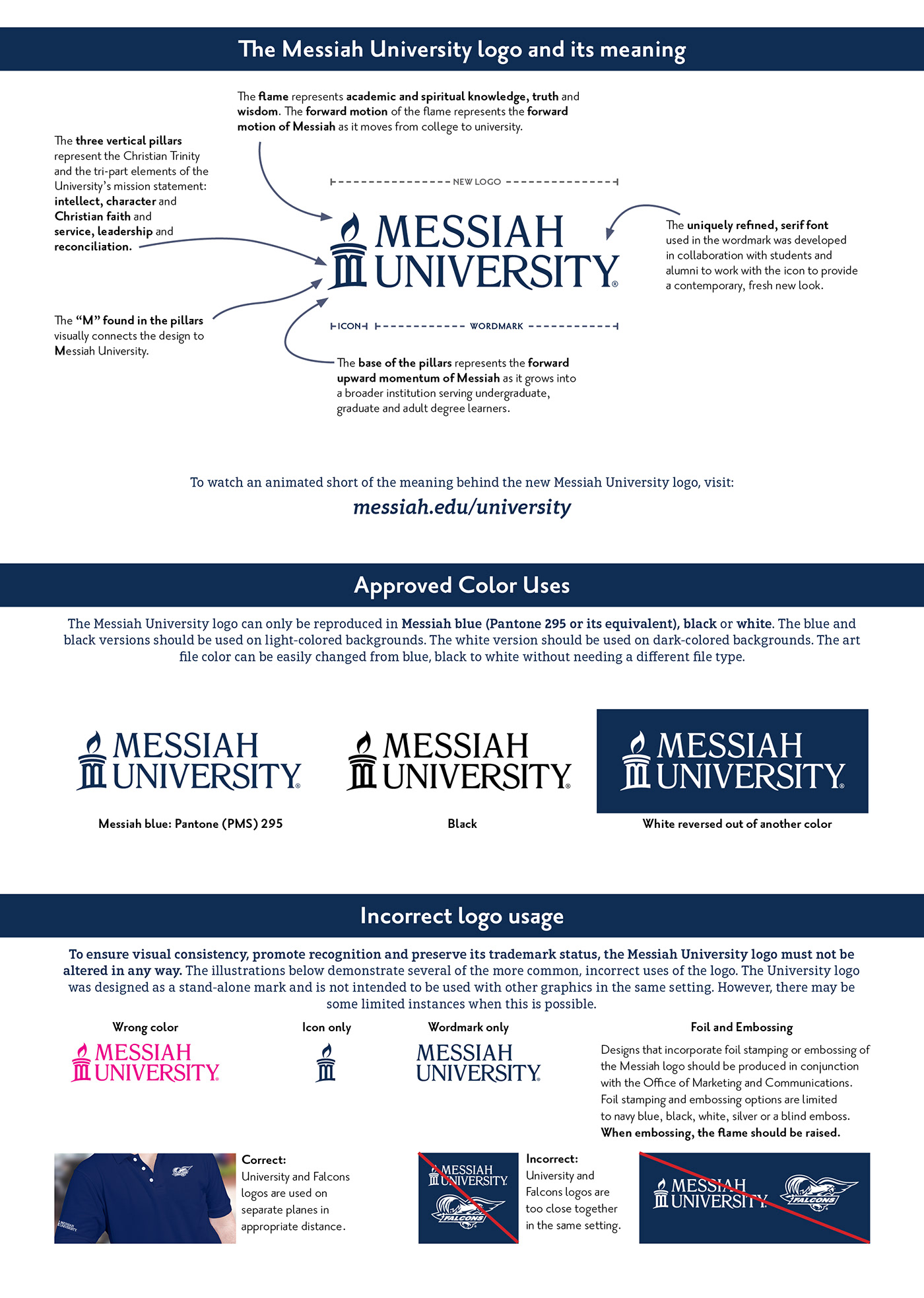
1. Retain the institutional navy blue color (PMS 295) and white
2. Retain the icon symbolism
3. Represent a clear transition from college to university
As chair of the Visual Identity Working group focusing on the college to university transition, I planned and implemented the research, design and review schedule. With a tight 6-month timeline of focus groups (prospective students, current undergraduate and graduate students, alumni, faculty and staff), committee meetings, presentations and approvals, by June 2019, we landed on a logo that bridges the traditional with the new.
Overwhelmingly, this logo tested the most positive across all groups.
Participants liked the “openness” of the icon and felt it looked “fresh, modern,
clean, professional.”
There was a clear pattern that this was the most different for moving from college to university—but still connected to the symbolism of current icon. The focus group participants expressed that it was a good balance between old and new.
The responses showed the focus group participants liked the forward motion of the flame and the hill that the pillars sit on and thought it showed momentum.
It was released on July 1, 2020 when Messiah College became Messiah University.
I art directed video assets to clearly tell the story of the logo and university transition.
These were used as the main assets for the university launch.
These were used as the main assets for the university launch.
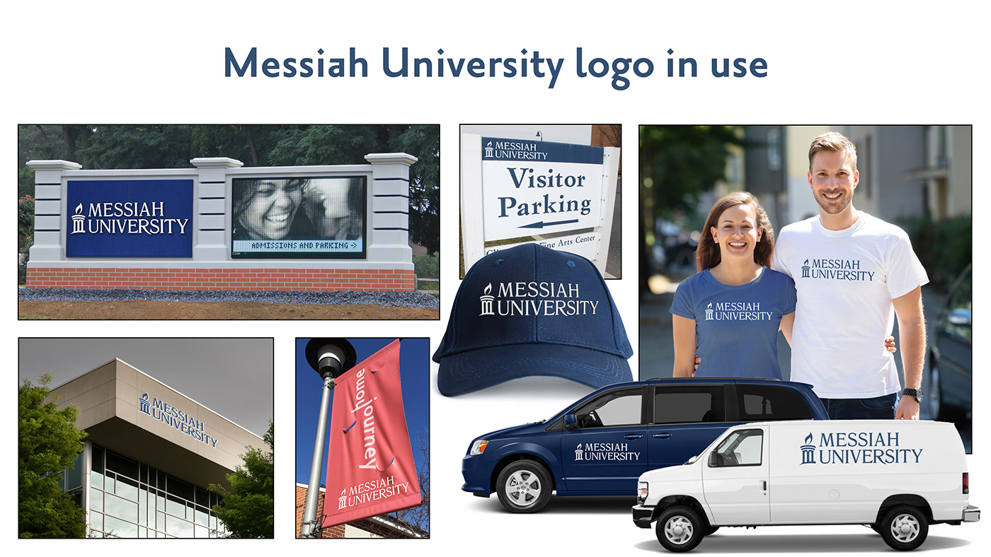
The Messiah University logo in
blue, white and black
blue, white and black
The new logo can be used in Messiah blue, white or black and easily switched between these colors while keeping the flame looking lit.


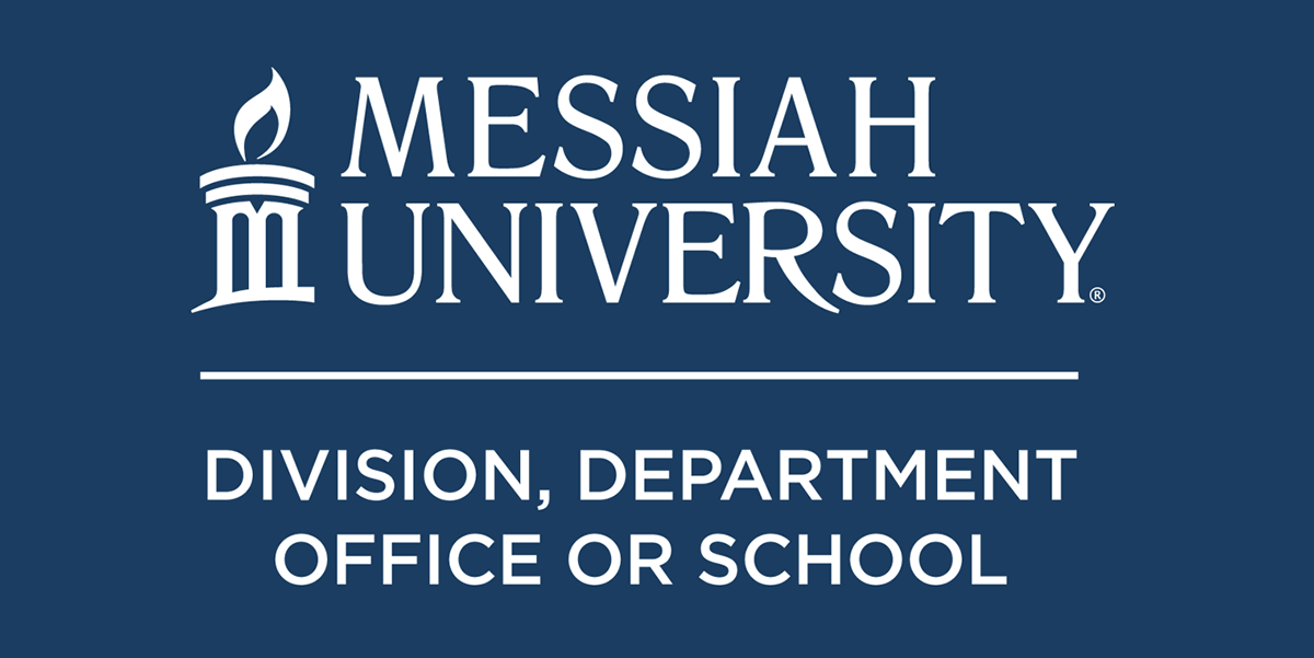
The Unit-Specific Logo
Messiah University has many divisions, offices, schools and departments. In order for them to retain a strong connection to the Messiah University brand, each has a unit-specific version of the logo that is a variation of the one below. This version is designed to easily be embroidered on apparel without needing modifications to the fonts. Once we established a design style for this version of the logo, we had all of the unit logos created in the various colors and file formats and they are downloadable from the visual identity website at messiah.edu/visualidentity
Visual Identity Website
For phase 1 of our visual identity website that was released on July 1, 2020, I organized all the information about the new logo. I worked with our design intern and the web team to create an interactive ribbon website that included the animated story of our new logo and hundreds of downloadable files. A short style guide about proper usage is included with the downloadable logos. Phase 2 of the website will be released in August of 2020 and will include the updated branding elements.
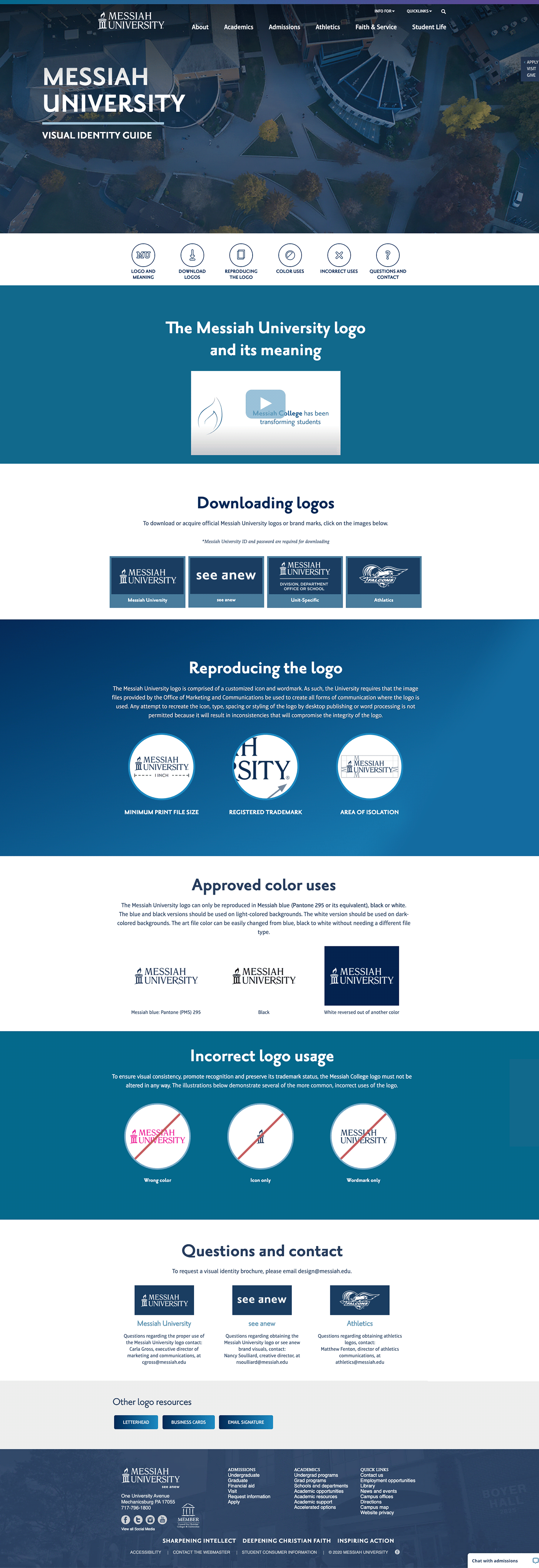
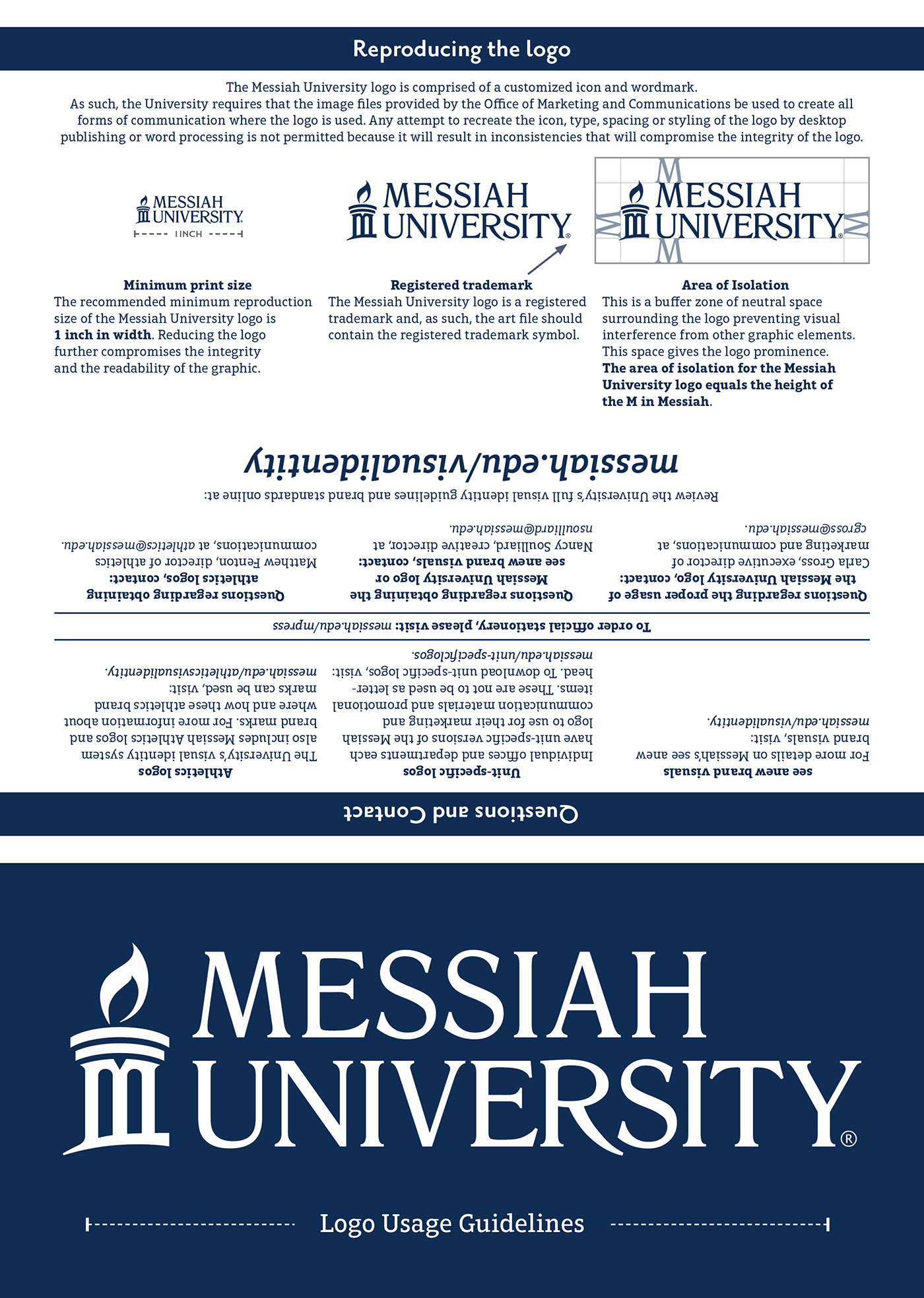
Visual Identity Guidelines brochure
Some clients prefer a printed piece to easily refer to. I created a short brochure to describe the logo, where to download them and how to properly use them.
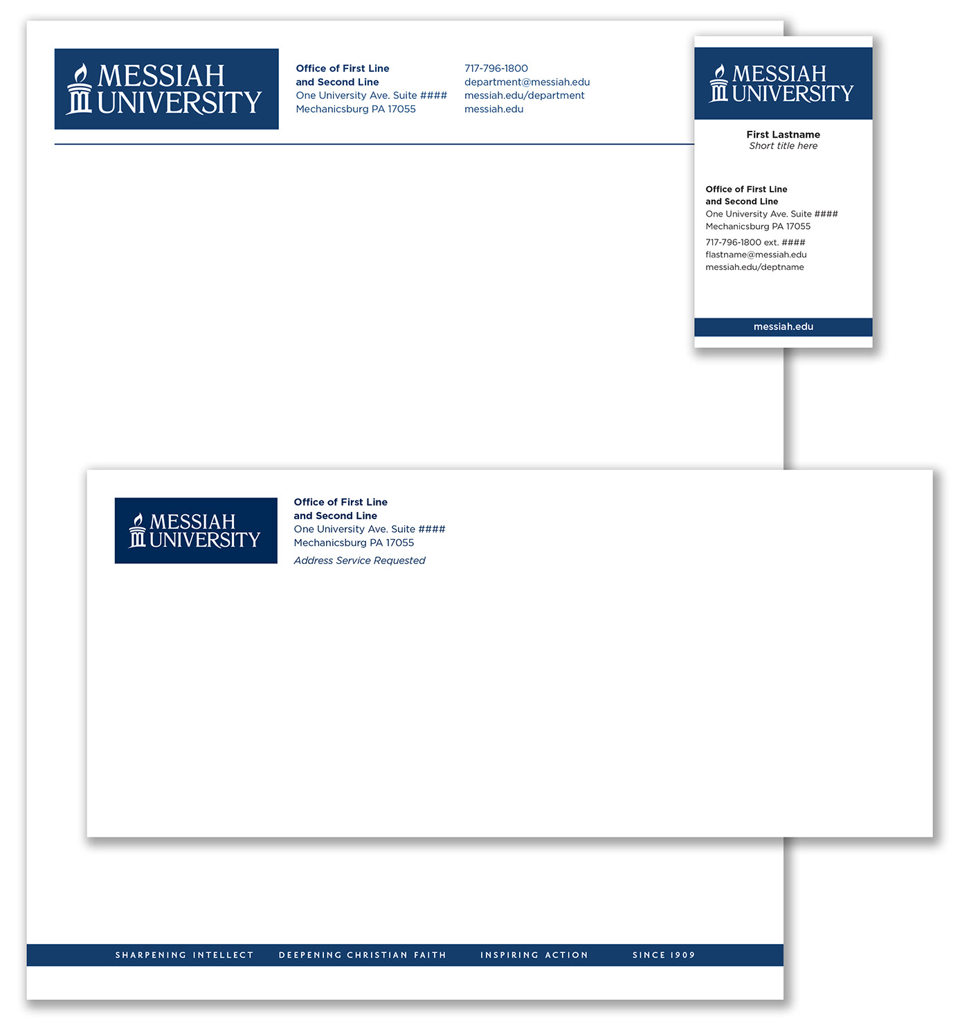
Messiah University Stationery