
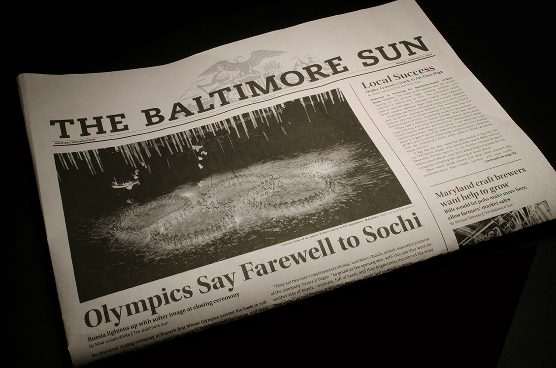
After being assigned the task of redesigning the front page of the Baltimore Sun for our publication design class, I started by analyzing the grid structures of various existing newspapers. I was originally intent on a purely typographic masthead – but after researching the symbolism behind the existing masthead, I realized that it was a key component to the Sun's history.
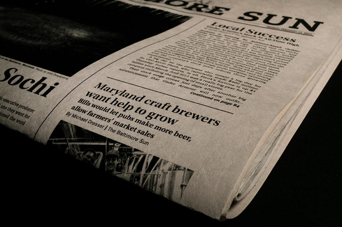
The incorporation of a more modern typeface (PMN Caecilla) with the existing symbols provide a fresh approach to the Sun's masthead, while remaining true to the paper's history. Meanwhile, an array of more positive and local articles are presented in this day's paper, ( although this would not be feasible for every edition of the paper) with the hope of showing the brighter side of the day's news.