Logotype & visual identity

client: Vrrb Interactive
year: 2011
project description: Vrrb Interactive is California based web-developing studio. The founder asked us to design colorful identity with custom logotype. We came up with several concepts from which he chose the one based on logotype which is trying to emphasize the "rrrr" sound in the word by ending the first letter the same way as 'r's are. This also adds some extra rythm to the wordmark. Color system is based on existing set of color papers (Pop'Set) since printing white on pre-colored papers allows for much wider color variety of applications for lower price than printing each and every spot color.

Color key based on Pop'Set papers

Logotype is built on a grid in order to keep the inner relations and rhytm clear and clean
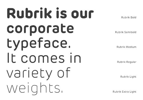
Rubrik OT designed by Miles Newlyn in 2011 was chosen as corporate typeface for it's visual relevance to the logotype, good legibility and fresh new look.

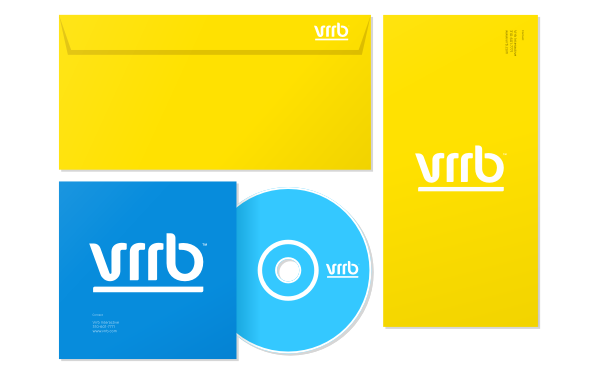
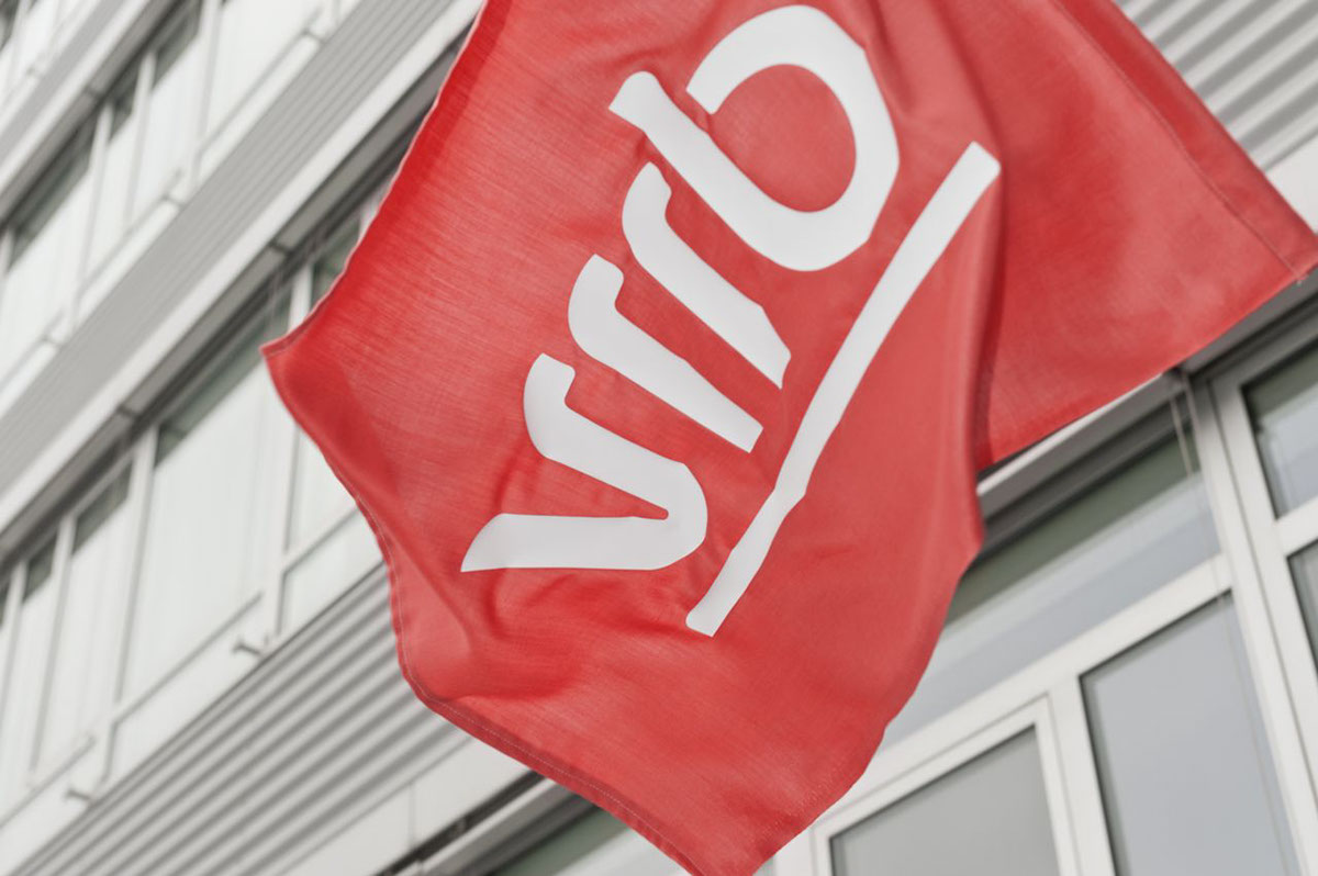
Some other identity applications
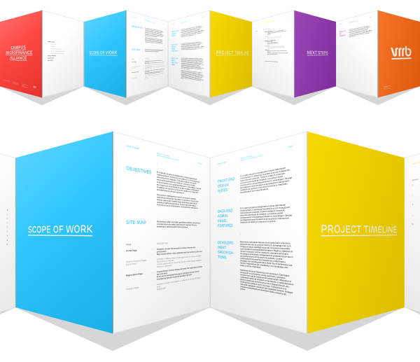
Corporate document templates


Design & concept: FRVR | Jan Vranovský
Photography: FRVR | Dan Friedlaender
Print: Arttisk s.r.o., Prague
© FRVR™ 2012, 2013 | All rights reserved
Print: Arttisk s.r.o., Prague
© FRVR™ 2012, 2013 | All rights reserved

